

3 ways to preview your site on other devices and screen sizes
What's inside this post: Hide
📌 Pin it!
Yeah, –I know, the pic in the thumbnail is mobile, not tablet, but you get the idea!
Today’s post will be SUPER quick, so don’t blink or you’ll miss it.
Kinda like the new town we’re moving to. 😂
#ruralamericaforthewin
For 7.0 users, you may be rollin’ your eyes right now, because it’s had this tablet view for a whiiiiile. So it won’t be anything new to you.
If you have SquareKicker*, you have the ability to see your design in Desktop, LAPTOP, tablet, AND phone views. In other words, you’re real fancy!
But for 7.1 users, for some reason, Squarespace decided to introduce the new 7.1 version without the tablet view and it stayed that way for OVER A YEAR.
If you have the SquareWebsites* Chrome extension like I do, there’s been a new update that allows you to toggle the site view to Tablet in either Landscape or Portrait mode.
And of course, if you don’t have either of those installed for your 7.1 website, I’ll show you how to view it on tablet or mobile screens for free.
Get a design plugin or extension
❶ SquareKicker’s plugin for 7.1
How to toggle different screen size previews on/off:
While you’re in edit mode on your Squarespace site, check out that top bar and look for the yellow/black SK logo.
click the SK logo
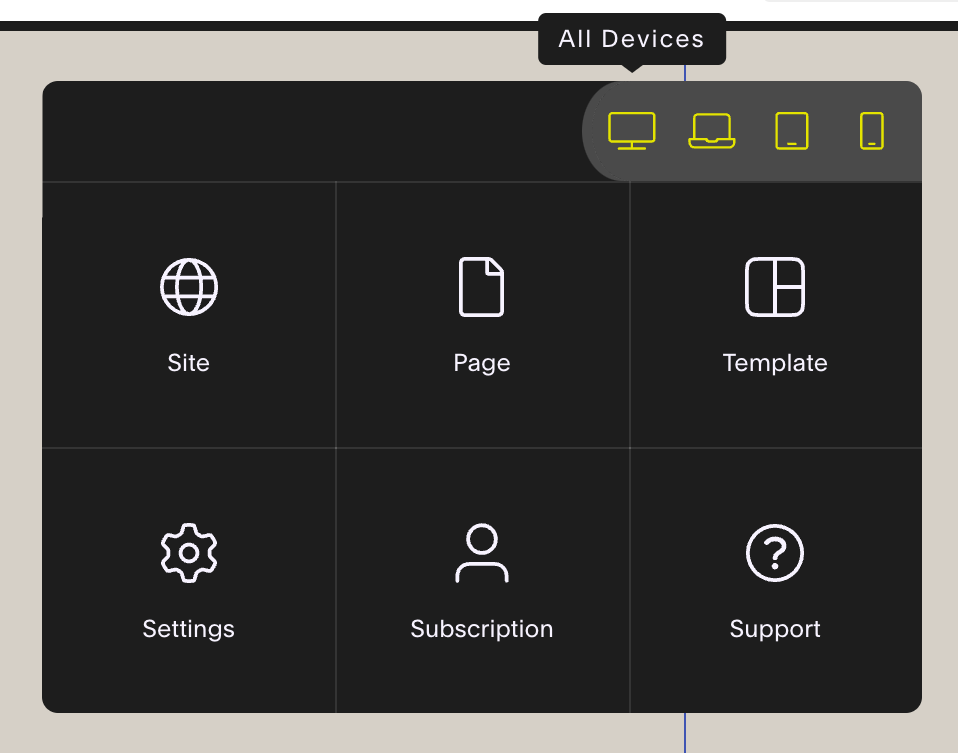
in the yellow tab at the top of that popup dialog box, on the righthand side is an icon of a desktop, click that
When you hover over it it will slide out 4 device options & a blue color will highlight all the screen sizes your changes made within SK will apply to
Click Laptop, for example; all changes made in this view should only apply to laptop size screens & smaller, but not to Desktop size screens.
Click Tablet; all changes made in this view should only apply to tablet size screens & smaller, but not to Desktop or laptop size screens.
Click Mobile; all changes made in this view should only apply to mobile size screens & smaller, but not to Desktop, laptop or tablet size screens.
When you select Desktop again & hover there for a couple seconds, you’ll notice it says “All Devices” – that means your changes will show on all devices.
❷ SquareWebsites* Tools Extension Pro
How to toggle the tablet preview on/off:
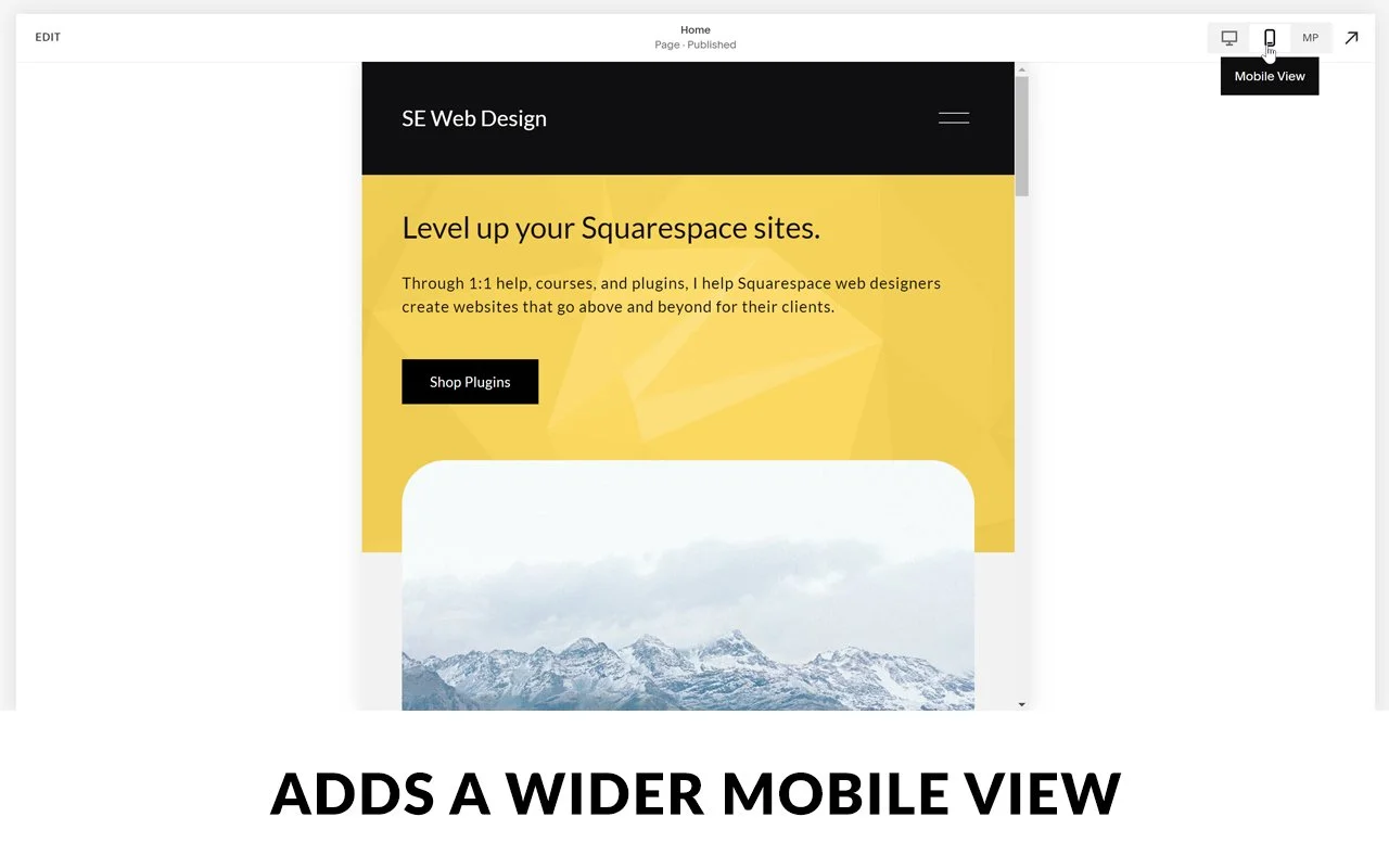
While you’re in edit mode on your Squarespace site, check out that top bar.
The Edit/Save/Exit button is on the left
Page title & status (draft/published) in the middle
SquareKicker plugin icon on the left side of the righthand icons
WTF is that? You gotta check it out over here*
This extension adds a tablet view in landscape (horizontal) & portrait (vertical) view
these views do NOT allow view-specific edits though
it’s just a view of the design in that size; any changes you make will effect the design in the desktop view too
Mobile preview
In the top right, the paint brush icon is the access to (global) Site Styles settings
Out of edit mode: the arrow means you can see the web preview in full-screen;
press Escape on your keyboard to get out of full-screen preview.
Clicking on any of those device icons will display your website in those approximate screen sizes, so you can see how your content will adapt for those smaller screens.

NOT in edit mode 👆🏻

IN edit mode 👆🏻
❸ Fluid Engine Tablet Spacing Fixer
I have this extension installed, but I don’t need it very often. However, when I do need it, it’s the only thing that really works.
It ONLY works with Squarespace’s newer editor, Fluid Engine. (Explained further down & shares more resources on the topic.)
This extension for Chrome works by expanding the pixel width of the “mobile” editor in FE which allows you to start editing the mobile view on smaller tablet sizes AND SMALLER. That means you can’t also edit the ‘real’ mobile preview while this extension is enabled, and if you enable it to make changes in the mobile preview it will override the changes you just made.
Meaning, if you use this extension, you will need to enable it when you need to use it and use the ‘tablet’ size screen to make BOTH tablet and mobile changes, then save & exit, –and stop editing/tweaking. Still check mobile, but just remember you can’t make mobile-specific tweaks while this extension is enabled and if you disable it and make those tweaks it will effect the changes you just made in tablet with the extension enabled.
It’s a bit tricky to get used to, admittedly, BUT Chris has a great video on how to use it below, and you shouldn’t need to use it all the time if you keep basic mobile responsive tips in mind while you design.
Don’t have those plugins or extensions?
❶ How to see different screen size previews in Chrome (free, no download necessary)
You can use this method when you’re in or out of Edit mode.
Using a Chrome browser to view your site, right-click anywhere on your site and select “Inspect”
The screen will split into 2 sections:
1) shows you the code that makes up the structure & design of your website (in two sections: HTML and CSS), and
2) a preview of the page design
On the code side, look for an icon that looks like this a device:

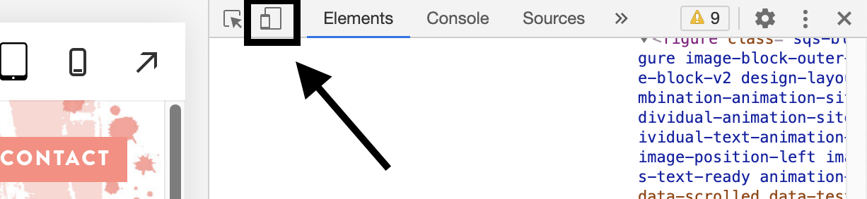
Click that icon to show the device preview instead of your regular website preview
Now that it has switched, got to the top of the menu bar and use those options to select the device type you want to preview with
Need more visual instructions? Check out the How to get device screenshots for mockups, because it walks you through how to use the device preview in Chrome, and an additional method to view your screen at new sizes.
But how does it know to resize?
CLASSIC EDITOR
Real quick, let’s talk about how Squarespace set up its responsive design behavior.
Squarespace’s Classic Editor (in v7.0 and older versions of 7.1) is set up on a 12 block grid. Basically, that just means on most templates, you can add up to 12 blocks literally, side-by-side. with some space on either side before the page’s border. Here’s what that looks like in practice:

See all those Spacer blocks? Yep, you guessed it. There’s 12, side-by-side.
Squarespace’s responsive behavior in v7.0 and older v7.1 sites is dictated by that grid and which blocks are ‘grouped’ with which other blocks.
You can group block by adding a new one, then click & drag to move it around the page; watch that blue insert line to see where it will place that block. For example, if you want an image directly next to some text, you’d move that image block around until the blue insert line is ONLY the height of the text block next to it, rather than the full height of the page. Learn more & see this in action over here:
• 4 things you can do with Spacer blocks
• How to optimize your site for mobile screen sizes
As discussed in that mobile optimization post, once you have grouped blocks that follow each other around as the page responds to smaller screen sizes, next ya need to know in what order they display when they reorient.
Squarespace reads the elements on the page, top to bottom, then left to right, as it moves down the page.
This is why important text is usually on the left side of responsive website pages because for smaller screen sizes, the text will display first and THEN the image (which is usually less important, so it’s okay for the image to appear second).
So keep that in mind as you design your site!
FLUID ENGINE
The newer editor, Squarespace dubbed ‘Fluid Engine,’ or FE for short, works COMPLETELY DIFFERENTLY. It has a true drag-and-drop style editing experience much more similar to what you have in apps like Canva, except the blocks added to each FE section must still sit on a grid. So you won’t have pixel perfect editing capability like Showit or Canva, for example, but you’re a lot closer to that experience than the old editor.
So what is the grid in FE? It’s a literal grid of 24 columns on desktop, and 8 columns on mobile, with however many rows you want the section to have. You can also completely remove the spacing across the top & bottom of the section or granularly adjust it if you want. You can also move blocks to the outer edge of the page, even if it’s outside the grid’s first or last column.
Blocks still must snap into a grouping of cells within each section’s grid, but you can resize the block with handles on the block, very similar to Canva or Showit, as long as the size sits perfectly on top of a group of cells in the grid. You are limited to adjusting the size of the block downward (make it smaller), to make sure the content inside it is still visible, but you can adjust upward (make it larger) as much as you like. The block’s border highlight line will turn red on the bottom to indicate it’s already as small as it can be to still fit the content inside.
With these changes, you can now also align the content inside the block vertically, and sometimes also horizontally (depending on the type of block), and you can also layer blocks on top of each other without needing custom code! Just be careful with layering so that as the design is adjusted for smaller screens, none of your content will be covered up and made illegible for viewers.
One important thing to note about FE is that you can now make position & layout changes specific to BOTH desktop and mobile views!
For more tips on Fluid Engine, check out these posts next:


✪ Free apps - bonus!
I just found this resource thanks to another fellow Squarespace web designer & am adding it as a bonus method because it’s sooooo easy.
Download the Mobile Simulator Chrome Extension
––no I’m not an affiliate for this one!
This app is free and works in your Chrome browser. You can download & use it for free, but there is also a low-cost paid plan (annual) for extra feature access if you want it.
What does it do?
take easy device screenshots with a device frame around it
make easy device GIFs or videos of scrolling through a website
see the website on multiple device sizes
and a lot more!
What does it look like? 👇🏻
Download the Responsively App
––no I’m not an affiliate for this one either!
This app is free and works on Apple, Windows, and Linux operating systems. By far, this is the easiest way to preview how your site will look on other devices!
What does it do?
it actively lets you browse one website in multiple-sized windows within the same screen so you can see, use & interact with it in various device sizes
you can adjust text to preview how a change in copy may look. On refresh though, the changes don’t stick (of course); you’ll have to be in Squarespace’s page editor for that.
you can rotate the viewport to see the website in landscape or portrait mode
when you scroll through the site on one “device” it scrolls the rest of them too, and at the right speed to keep up with the same content
you can take full-page screenshots of the design on each device
enable a touch/tap user experience to simulate mobile-use
you can also access Developer Mode to inspect the code if needed
and a few other things!
What does it look like? 👇🏻