

Fluid Engine Update: Love it or Hate it?
Table of Contents Show

This post was updated on February 5, 2024 –but the video can’t be updated/replaced on YouTube. If you’d love to see an update, please leave a comment on this post or on the YT video! 😊
In 2022, Squarespace introduced ––for the first time in… maybe ever–– an update to their main layout engine.
Basically, that’s just what they call the new editor, which controls how you put elements on the page when you're designing Squarespace websites.
The whole experience has changed. 😳 Buttons look different, react differently, settings are in new places and there are more of them, we even have to edit the section design in mobile view now!
They still want us to use the classic editor in several places (blogs, products, events, mainly) AND allow us to choose when we upgrade the old classic editor to the new one, section by section in all the others.
We’ve NOT been forced into any kind of migration, the way they handled the update from 7.0 to 7.1. Phew! 😪
With that said, it’s been years since the public release of Fluid Engine and now people like you are wondering, …
what’s Katelyn doing?
does she like using Fluid Engine?
do she think I should switch over?
––All the things, right? I get it.
If I were you, I’d want to know too. So that's what we're gonna talk about today.
I’m sharing an update on Fluid Engine, because I’ve had loads of time to play with & use it, decide where/when to use it & where not to, what it does well and what it doesn’t.
In this post, I’ll mostly be focusing on the limitations, because those issues are confusing for people like yourself, and not super intuitive for most people who don’t use it all day, every day.
Unless you understand how it’s meant to work, or what it’s trying to do to help you, –you might just assume FE is shit, Squarespace is shit, and you just need to go find another platform altogether. 😬 –Which I totally get!
Initially, I thought that also, I have to admit. Ultimately, the cons outweighed the pros in all the other platforms & I decided FE was worth learning. Now that I have, I’m very happy I did & that I stayed!
So before you make that decision, take a look at today's post & updates, then see if it helps you understand the issues and ultimately learn how to work around or WITH them, instead.
Because guess what? ALL website builders have pros and cons, and these days ALL of them are trying to be responsive in their own way, which introduces unexpected or less-than-ideal issues.
So…. without further ado 🎩 ––Let's dive in!
watch the video! (not updated for 2024)
Fluid Engine: Love or Hate it?
ℹ️ Abbreviations you’ll want to know for this post!
FE = Fluid Engine
CE = Classic Editor or Classic Engine
SK = SquareKicker
First things first, I do actually love using FE, overall.
There are pros and cons to literally anything that you ever use in your entire life and FE is no different. There are things about it that I don't like, but overall, my experience with it is mostly positive.
Using Fluid Engine on my website
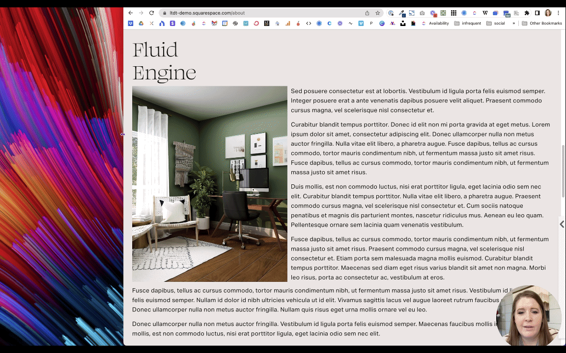
Am I using FE? I actually do have a few sections using it on my website, the most public of which is the top section on my favorites page where I share all my favorite tools & resources:

I wanted it to have this kind of fun off-the-cuff, messy, kind of thing, going on. So I'm using Fluid Engine for that, but that's really one of the only main pages on my website that's using Fluid Engine actively.
I have other pages that are being built or that are not public areas yet that will be using Fluid Engine, but for the most part, I'm still using Classic Editor simply for the fact that my website has been around for a couple of years now and I don't want to (nor do I have the time to) have to granularly go in and change everything over.
I'm also not ready to do that because converting CE Sections to FE sections dumps any SquareKicker changes, which ya then have to reapply to the new FE layout. The code changes a little between CE and FE, and so SK can’t target the elements in the code it writes for us, so those customizations get released (for that section only, and only when you upgrade from CE to FE) & have to be newly (re-)applied.
It's one thing to design a new website with FE in mind. It's another thing to retroactively apply it to something that wasn't designed with those features & limitations in mind during the build.
Using Fluid Engine on my Client’s websites
So that's for my own website.
For my client websites, the first one that I did after Squarespace released Fluid Engine, I did not use Fluid Engine on that client's website. I used almost entirely Classic Editor only.
Since that client project, I almost entirely used FE. I know that's kind of a big jump, but by then I was starting to feel a little bit more comfortable with it. And I was coming across fewer glitches, which is always a good thing!
Now that it’s been a couple of years, I’m happy to say that I almost never use Classic Editor where I can use Fluid Engine instead; this still excludes areas like blog posts & event posts.
One other area that still uses CE is the product details area in the “Additional Information” section on shop’s product pages, which are glitchy AF regardless of the editor being used; I detest editing in those specifically!
Here are the issues that I still hear complaints about most frequently, what causes them & how to work with or around them.
Snapping content to cells
You can't do like halvsies. You can see where it snaps the block to a group of cells in the grid & there’s no halfway on/off a cell, because it just snaps to the nearest one. So that's a limitation.
A lot of people are looking for Showit-like pixel perfect drag-and-drop, but that’s not exactly what Fluid Engine is doing.
The difference is that while Showit will let you put elements almost anywhere you want, it’s also NOT AT ALL responsive across devices while Fluid Engine is.
That grid is set up to allow for element resizing for various screen sizes, while Showit only has 2 versions of the website in a world that has a bazillion device sizes. One (Showit) is a better design experience in this regard, but the other (Squarespace) is a much more modern & adaptive approach to a growing variety of sizes browsing the web –yes, even without a tablet ‘breakpoint’ –which leads me into the next topic.
No Tablet Breakpoint
UPDATE (Feb 2024):
1. with this free Chrome extension, you can force the “mobile” breakpoint to happen at a tablet breakpoint in the editor, which will allow you to adjust spacing issues earlier (at a large screen size) if you see this issue
2. responsiveness across very large screens down to tablet size screens is basically fixed by simply changing the Spacing value in Site Styles from the default 1,200px or 1.500px to 3,000px
In the Circle Forum, we have been (metaphorically) beating Squarespace to death with the fact that we still have no tablet breakpoint.
A device breakpoint is built into the code, and with it, we can specify that the browser shows the website one way for a desktop, one way for a tablet, and one way for mobile phones. This basically means the browser has parameters that tell it when to rearrange things to fit better in smaller screen sizes or dictate how elements respond to each other on different screen widths.
Squarespace has still not given us that middle tablet option and we as professionals, are frustrated.
Their response is that the vast majority of people are either accessing websites from a desktop computer (including laptops), or mobile phones, and very few from a tablet –so essentially, it’s not worth exploring adding that tablet view.
The thing is, they’re not wrong. Website analytics consistently show that just 2% of internet users worldwide use tablet size devices to browse, which means fewer people than ever are accessing websites on tablets. That's what the numbers tell us, so I understand why it’s not high on Squarespace's priority list to give us that middle breakpoint.
However, my feeling on the matter –and seemingly the feeling of many, many other professionals– is that I don't care how low the statistic is for people to be using tablet-sized browsers, the fact that there are people using it at all is all I need to know. I need to make sure that the website doesn't look unusable at that middle breakpoint.
Why this is a big deal
With the release of Fluid Engine, Squarespace has given us the ability to make position changes to elements on the page, based on the screen size. But we can only do that for two screen sizes: for desktop and for mobile, –but not for tablet.
So when you check the website for responsive issues and you see something weird happening on a tablet, you’re kind of stuck with limited options.
There's nothing you can do to change layout issues on a tablet because there's no built-in breakpoint specific to that size screen in Fluid Engine, which will allow you to make changes only for that screen size without also affecting the layouts on either desktop or mobile.
So that's where I am with that and I'm not alone. We're still gonna beat down Squarespace's door over that, because we lost that middle breakpoint when 7.1 came out, and we haven’t gotten it back YET.
In the interim though, because that percentage is so incredibly small, it's actually not that big of a deal in the grand scheme of things; there are way more important things to worry about.
So take this one with a grain of salt for now.
Yes, you need to be aware of it. You need to be able to check it as best you possibly can and try to prevent issues from happening; just keep that in mind as you build on desktop because whatever you do on the desktop version will also affect tablet.
I'll show you what that means specifically as we continue through today’s list, but this has been a huge learning curve for the professional Squarespace web designer community, and I’m sure it has been an issue for you too.
-
Toni asked a great question shortly after posting & I thought it was worth sharing here!
My answer:
I don't typically point out specific tablet issues unless there is a serious problem to solve or if something my client wants to do won't work responsively. The place (Markup.io) where I ask my clients to leave design changes & feedback does allow them to preview the site on 3 different device-sized screens, so they can see it and leave screen-size specific comments and I do point that out to them so they know to check their draft site on all 3.That said, as long as you can see the issue happening in the resized browser window while you're in desktop mode within the editor, you can fix a lot of those things, you just have to KNOW (the secret that) you can do that. 😃
How to explain these types of things to our clients:
I just focus on educating my clients about how the platform is trying to make their website user-friendly for most device sizes because desktop AND mobile versions are by far the most popular ways to browse websites, but it can't be a 100% perfect experience for ALL devices because there are just too many variables. I explain that while initially annoying, it's ultimately a really good thing, even if it sometimes requires design compromises. I don't really get a lot of pushback from that approach. 😁 If you do get pushback, sometimes it just takes a 5-minute Loom video recording so they can see how the content adjusts between screen sizes, or a quick Zoom call/screen-share call so they can see it for themselves.
No Text Wrap
UPDATE (Feb 2024):
Wrapping text in 1 block around another block is still not a thing in Fluid Engine, but I've been surprised I haven't really cared or needed this as much as I'd expected. Ultimately, I don't tend to use blocks of text that's long enough to need a wrapping function anywhere other than blog posts. Since blog posts use Classic Editor, it's almost never an issue. Keeping text in bite-sized chunks for viewers is always a good thing anyway!
My second biggest complaint with Fluid Engine, which has not technically been a problem yet, is text wrap ––or a lack of it. We cannot create text that wraps around an image, without doing it manually.
🤯 I know, right?!
If you’re not sure what I mean, I'll show you exactly what I mean right here.

In Classic Editor, if I want to add an image into a text block, I can just upload one or pull one from the asset library, and drag it onto one of the four corners of the text block so that the text will wrap around the image. That's all I needed to do.
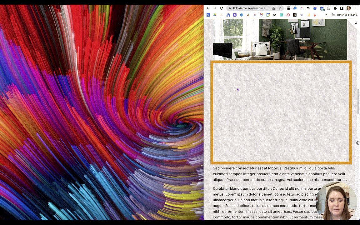
This is not something you can do on Fluid Engine. What I mean by that is, when I convert/upgrade a section with the layout (pictured above) from Classic Editor to a Fluid Engine section, it removes the text wrapping & just overlaps the two on top of each other like this:

Not great.
The text box is sitting in the exact same place as it was before, but it will not wrap around the image.
If I wanted to create that same effect, I need to rearrange the text block to sit next to the image, and forcibly break the text where I want it to go underneath the image by selecting the rest of it, cutting it, adding a new text block & positioning it to go across the page underneath these two blocks, and pasting the copied text into a separate block.

That’s a lot more steps to get a similar effect. Right?
Let’s go one step further though.
On Classic Editor, when you resize the browser window to mimic a smaller screen size, the image retains roughly the same percentage of space that it took up on the larger browser page. This works because it's based on the 12-column grid system you’re used to in CE.
It's responsive because it's just going to resize the image to fit into approximately that same number of columns as the screen gets smaller, –until it's too small to do that, and then it just stacks the elements on top of each other.
🔕 This GIF has no sound; it’s a visual pulled from the video at the top of this post
On Fluid Engine, it reacts completely differently. The first image is 13 cells or rows high and so is this text block next to it, so what happens if I resize the browser window?
Squarespace increases the size of each cell, so that they can stay locked in the same position, but in order to do so they both get taller and narrower. So as we resize the screen until a certain point, it keeps these elements locked together at the same adjusted height, so that they stay together because FE knows they're supposed to be side-by-side.
What it's doing at the same time, is cropping the image completely incorrectly (and maybe unexpectedly).
If this was a picture of two people (example below), then half of them would get cut off because their focal point is in the middle between the two people, and if you put the focal point on one of their faces (because you can't have more than one focal point) one of them would not be cropped but the other one would be –depending on the screen size.
So this is not an ideal solution for image responsiveness or text wrapping because of the issues that accompany it, even though it's keeping the page layout the way that we wanted. We don't actually want the image to crop that way; we want it to stay in the same ratio like it's doing on the CE version.


Spacing Issues on Tablet
UPDATED (Feb 2024):
1. with this free Chrome extension, you can force the “mobile” breakpoint to happen at a tablet breakpoint in the editor, which will allow you to adjust spacing issues earlier (at a large screen size) if you see this issue
2. responsiveness across very large screens down to tablet size screens is basically fixed by simply changing the Spacing value in Site Styles from the default 1,200px or 1.500px to 3,000px
The previous complaint is a problem with text wrapping and a problem with responsiveness, right? Because when it crops down, it's doing so in a funky way that we're not expecting.
But worse than that, when we make the browser window just a hair smaller, that block is still taking up the same amount of rows, but the image inside suddenly isn’t anymore, creating all this extra space… Why? 🤷🏼♀️

📸 screenshot from the video
If you forget to check for things like this, there's going to be a lot of really weird spaces like that in your FE sections.
So if we go back into edit mode on desktop, we have
the text block at the top for the title which we can expand the box for all the way across the page because I don't want that text to wrap too early.
the image block set to Fill in the design settings
and the text block next to it.

Then if we switch to mobile view, we’ll see the text inside the text block is aligned to the bottom of the box, and if we turn on the grid, then move the image block over one column so we can see the cells it’s sitting on top of, we can see it’s taking up 1, 2, 3, 4, 5, 6, –7 cells in height whereas the desktop version was 13 rows of cells high.
But it looks fine on mobile, though... Right?
And on desktop it looks fine, too.
But when we look at it on the tablet size, we get that weird space underneath the image. Why does it create that extra spacing on tablets??
The editor seems to get confused in that middle breakpoint size where the blocks in each section are locked into a certain group of cells in order to maintain that desktop layout, but the number of cells in the grid changes from 24-across to 8-across when it his 749 pixels.
Anything around that screen size is likely to display extra space underneath blocks, especially in layouts with objects laid out side-by-side (at least two columns), while the editor tries to decide which way to display the content: mobile or desktop.
This is the kind of thing that drives me absolutely insane with Fluid Engine and there's nothing I can do about it because we don't have that middle (tablet) breakpoint, where we can specify that changes only apply to the middle range of screen sizes.
We have no control over item positioning or block edits on anything between desktop and mobile-size screens.
When you look at either Desktop view or Mobile view, they look fine in both versions of the editor, which is the only place that you can make changes to the blocks.
So on this middle breakpoint where we can’t easily make the necessary adjustments, and we have these weirdly giant spaces showing up, it causes usability issues –in my opinion.
Because I don't know about you, but if I am scrolling a website and I see a title, image, text, …and then there's nothing underneath that text for a few scrolls of my thumb, I'm going to think that's the end of the page. I'm not going to scroll any further.
So that's a usability issue because there may be more data after that spacing-break, but it just may not be obvious to the visitor and that's a problem!
Curious how I handle this with my clients? Look back up here for my answer. ↑
The current fix for Spacing Issues on Tablet
Updated Feb 2024
You do have to continue to check for the problems in order to manually fix them, but that’s the case in most builders.
You can resize your browser’s window size while you’re in Edit mode, making it smaller until you see this happen, then you can click on the block and resize the text box. If you resize the text block to get rid of that extra space from a resized browser window, resize the window (back to a normal size again), and make sure you check to see that everything looks right on both desktop and mobile versions in the editor, then SAVE your changes.
Or you can download this free Chrome extension from Chris Schwartz-Edmisten which will force the “mobile” breakpoint to happen at a tablet breakpoint in the editor, which will allow you to adjust spacing issues earlier (at a large screen size).
You can also adjust the Spacing value in Site Styles from the default 1,200px or 1.500px to 3,000px and all but wipe out most spacing issues; this change allows the blocks to adapt better to a wider range of screen sizes.
Why is this even an issue? Fluid Engine is built with a CSS grid, which is inherently responsive. It thinks that that the blocks we add need to take up a certain number of cells, even though the screen size doesn't need all of that extra space on tablet-size screens.
While Squarespace has since fixed the worst of these issues it’s still not perfect, but with the 3 suggestions above you’ll be far less frustrated or consumed by it.
Typically, one or all of these will allow you to fix the issue, without needing any custom code.
That said, we often get frustrated by what we don’t understand and Fluid Engine’s responsiveness is something that developers & engineers understand, but “we mere mortals” don’t necessarily.
If you can’t let this go & want to understand so you can use & predict its behavior much better, then I suggest you take Rache’s Standout Squarespace Foundations course, which is the comprehensive introduction to using Squarespace (for clients) without learning code, but is taught by a developer who understands the interworkings of how Squarespace functions & operates. Rache comprehensively explains in Standout Squarespace* how responsiveness works in Squarespace.
Basically, statistically only about 2% of internet users worldwide are using tablet to browse the internet, and while it still frustrates me that it's not possible to fix tablet-specific issues without extra steps, I care A LOT LESS because I know basically no one is ever looking at it AND because the free Chrome extension I mentioned earlier helps to solve that problem in severe cases with unacceptable issues that can't be left alone.
With a lot of the bug fixes Squarespace has released since Fluid Engine came out (was that in 2022? 🤔), I have to admit that this is a problem FAR LESS often if I adjust the site-wide spacing to 3,000px and use that free Chrome extension. It's not a perfect solution, but essentially the problem is fixed nonetheless.
Checking & Changing the Mobile version
Updated Feb 2024
Another puzzle piece from Fluid Engine that matters to a lot of people is the fact that they're not used to having to check the mobile layout of their design.
Don’t get me wrong, –you COULD check it before, but now you actually NEED to.
The #1 takeaway here
In FE mobile vs desktop specific changes are limited to layout & block alignment ONLY. Changing content inside the block or editing section settings in either view will affect both Desktop and mobile versions.
Here are some specific tips that may help with adjusting the mobile version:
Example 1: If something is out of order, click on it & drag it to the correct position, or use the arrows as shown in Example 2.
Example 2: The up/down arrows in the block’s settings bar will let you re-order the element easily & quickly. The alignment button will align the content vertically &/or horizontally within the block, –which is not the same as text alignment (left, center, right).
Example 3: The layering options in the block’s settings bar will let you change the layering of a block if it’s overlapping with another, so you can decide if it’s on top of or behind another block.
Building Columns can be more tedious
Updated Feb 2024
You can really achieve some interesting layouts in Fluid Engine, very easily!
The fastest way to do this on Fluid Engine is to select the group and duplicate it, then slide it over. And repeat for each new column.
You just have to do the math basically, because desktop view has 24 cells across, which means you can have an even number of columns as long as it divides evenly into 24. Like:
4 columns of 6, or
3 columns of 8, or
4 columns of 6, with extra cells as spacers in between…
This used to get pretty tedious (when FE was first released) if you decide to change your mind on the number of columns you wanted as you lay it out, because one thing that you couldn't do is select a group of blocks and resize them together as a group.
BUT, that’s changed! You can now select a group of blocks & resize them together easily. Sometimes they resize a little unexpectedly if the math isn’t evenly divided, but it still takes a lot less time to manage.
PRO TIP:
If you wanted these columns to be pushed apart from each other a little bit more without adding blank space between them, then you could actually go into your section settings and control what the gap between each cell is.
By default, it's going to be 11 pixels between left and right (horizontally), and 11 pixels between top and bottom (vertically), between all the cells in the grid.
If you want to push the columns further apart from each other, you can increase the space between cells to a larger horizontal gap between cells, in the section’s settings menu. You could also decrease or increase the vertical space between cells if you need to fine-tune your layout further.
Extra rows while editing
Updated Feb 2024:
This is not happening nearly as often & is usually fixed by adjusting the spacing in Site Styles as mentioned above.
Another thing that I've noticed when playing around with Fluid Engine sections is that you often get all this extra space at the bottom of the section when you're creating and moving things around, especially in mobile view. When you start moving things around, the section just starts to grow. Right?
Just click the little blue icon in the bottom right corner of the section & drag it up. This decreases the number of rows in the section and will get rid of the extra space you don’t need, –each time.
Desktop vs Mobile Edits
Updated Feb 2024
One thing that confuses people is that because you can make mobile-specific changes to your design, you might also think that every change made in that view is mobile-specific –but it's not.
If I give a text block a background color, change the font to bold, maybe make the word(s) a different color, etc., when I switch back to desktop, all of those changes that I made inside the element carry over to both layouts.
Fluid Engine is allowing you to make position-related changes on desktop view and on mobile view, but not individual changes to the content inside each block.
Changes to the content inside the block will show up in both places.
So just to say this one more time with the people in the back!
The things you can change specifically for the mobile view of your website in Squarespace are primarily just the position of the block in the section, how the block is resized, and the alignment of the content within the block (ie: how close the content is to the boundary line of the block, typically it’s vertical top, middle or bottom, but some blocks like buttons & images also have horizontal alignment options.
Responsive Websites Require Compromise
There's still a lot of compromises to be made when designing responsive websites.
This is not an issue specific to Squarespace’s Fluid Engine or their Classic Editor. This is an issue for any platform I've ever used to build a website, including Weebly, Showit, Shopify, Webflow, Squarespace, Wix.
It’s a responsive problem to solve, not a platform problem. They all handle it in different ways, this is just how Fluid Engine is handling it.
You just have to be aware of how your platform handles responsive behavior, and check both versions of your website, because this is the “new” reality of web design: we have to accommodate our website visitors who are using ALL KINDS of different devices when they stop by.
Final Thoughts
There are more details to manage in FE, but ultimately they end up being a good thing, overall.
Everything takes a little bit longer and that's the downside, but with the extra features we get with FE, ultimately you do have a little bit more control as long as you're managing those details.
So that's where I'm at with Fluid Engine. It's a love-hate relationship, and I use the word "hate" very lightly because I do actually enjoy using it most of the time, now that I'm getting a lot more comfortable with it.
As we are with all new things, there is just a learning curve that we have to figure out.
Squarespace still has some glitches on their part that they’re still working out. That's all very normal for new things, especially for software when you literally millions of people using it. There's just so many variables.
So while Squarespace works out all of those kinks, we are experiencing those glitches differently.
My Recommendation for You
Do what brings you joy. If you don't have time to learn a new editor, then it's okay for the time being.
Squarespace has said they were going to keep our access to Classic Editor for the main editing experience through the end of this year, 2022, but now it’s 2024 and we still have access to it. We have no idea what that timeline will. continue to look like in the months & years to come.
If Fluid Engine still feels uncomfortable or rage-inducing, just use Classic Editor when you need to. Remember that pages can have both Classic Editor sections and Fluid Engine sections on the same page but when you have a lot of both sections (on a long page), sometimes it can cause the editor to open & load very slowly.
“Everything is figureoutable.”
In the future, your CE sections could become outdated & new-feature-resistant, just like 7.0 did, but that didn’t happen overnight and ultimately this won’t be the end of the world even if it did.
They are still giving us the ability to upgrade Classic Editor sections to Fluid Engine when we want to, which I personally am very thankful for so we can decide that for ourselves without being forced into.
In the interim, if you wanna pick it up and start learning it, create a page in your not linked section, and give yourself a sandbox area to ‘play’ in where no one's gonna see it.
Fluid Engine is a platform-wide change for 7.1 websites, and this is the direction that they are moving in regardless of whether or not you like it.
After talking with other designers at varying levels, getting familiar with it myself, I do really like it, –glitches aside, lack of tablet view aside, text wrapping, issues aside. I know all of those things will get fixed in time, so I'm not worried. Squarespace is always introducing new features and that being the case, I think that you've gotten my final word on the issue!
My Personal Opinion
Fluid Engine. Do I like it? Yes!
Am I using it on client sites? Yes, I am.
Does it take longer to build those? Nope! Can still build within my 2-week timeline!
Ultimately I think the limitations I’ve mentioned today are not so negative when you compare it with the new things that you're able to do with the Fluid Engine builder, and so much has been fixed since it’s initial release too!
So while it's frustrating that things take a little bit longer and there are more details to check as you design, the flip side of that is that I can do SO MUCH MORE with it without using code, and that's always a good thing!