

How to build Blog Archives in Squarespace –without plugins!
What's inside this post: Hide
Kind of on a whim, I made my own Blog Archives on 7.1 recently and decided to do another Build With Me session showing you how to create one on your website with no plugins –paid or free.
I know, right? Seems impossible?
It's not actually!
And if you've been around for a while, you had a 7.0 website, you've now moved over to 7.1, and you're wondering whether those summary blocks are still needed to design a blog page that actually looks decent. I'll be answering that question too.
(What am I talking about? This is the original method of using Summary Blocks to create a strategically designed blog feed with features you actually wanted on the page, circa 2017 –give/take– and usually just used for 7.0 websites.)
So without further ado, let's go ahead and dive in and I'll show you how to do it, step-by-step!
Content Creators: How to create a user-friendly archive for your content, with only built-in features!
Prefer to see it? Check out the video.
Prefer to read through it? The video transcript is below.
First, what are the 3 basic Squarespace blog styles (trends)?
Squarespace had some blog limitations for a few years now, and it wasn't until version 7.1 was released sometime around 2019/2020 that we started to get more.... well, more! So, it's hard to go back that far because I don't have any clients that are currently using the old method of styling the blog page anymore.
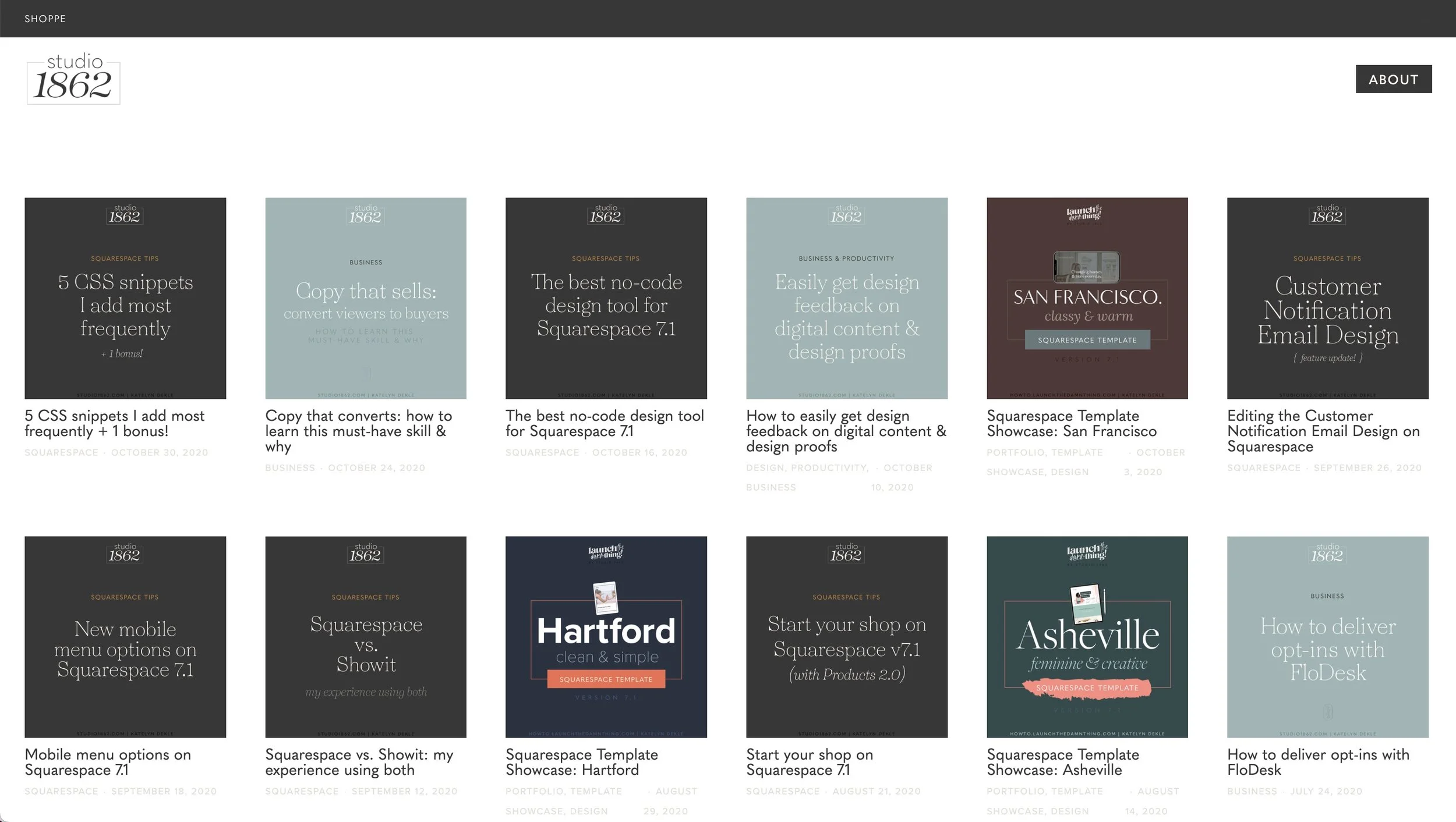
Because of that, I recreated that old style on a 7.1 site so I can just show you what it looks like:
I also have my old blog –or what's left of it– on my old 7.0 Brine family template, so you can see the difference:
On my old website, you can tell that I just have the blog feed and that's it. You can't add sections underneath it or on top of it, which means you also can't give the page a freakin’ title. That’s dumb. 😂
No wonder countless people were trying to figure out how to make their blog look more interesting and more user-friendly!
Style #1:
Create your own feed with strategic Summary Blocks
Because you couldn't create a custom blog page on the Brine family or any other template in Squarespace on 7.0, we ended up creating our own blank page and customizing it with a series of summary blocks to pull in the blogs automatically.
Note: This is something that you could do on any custom page in Squarespace on 7.0 or 7.1, Classic or Fluid editors; you can do it in all versions of Squarespace, you just don't need to in 7.1 anymore.
LEARN HOW to create a styled archive page for your blog on 7.0
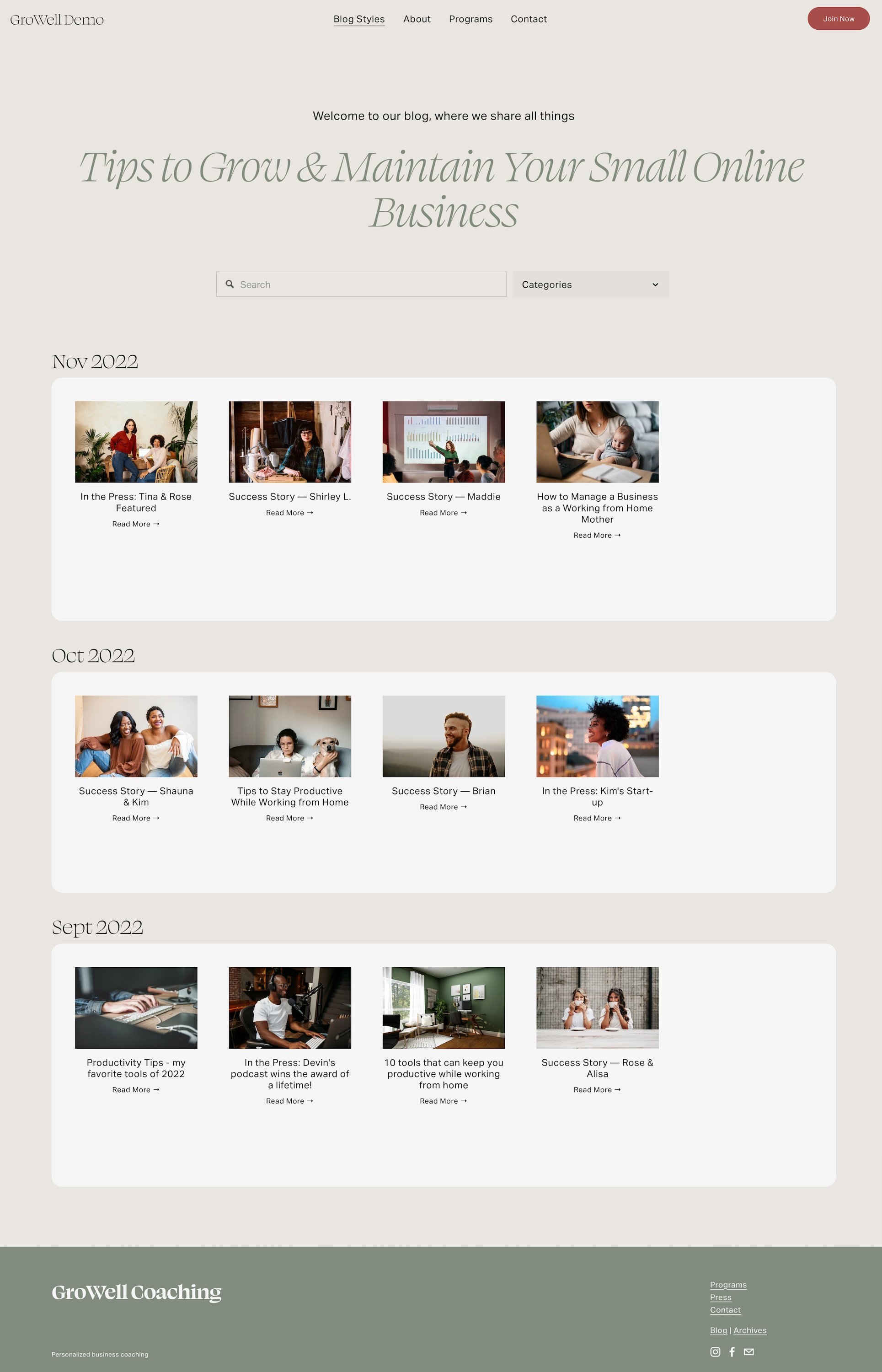
This is what it might have looked like: a custom page where you can say like, ‘welcome to our blog. This is what we do here.’
You could add a search block and archive block for a dropdown to show your categories, and then underneath that, you would have a series of summary blocks with a text block on top of each one for your subheadings.
I've highlighted the summary blocks in this example with a light background color just so you can see which elements are summary blocks on the page. I don't think you have the ability to put a background color on blocks without custom CSS in version 7.0, though I haven’t checked that.
So what you would do is add a text block, a summary block, then text & summary, text & summary, and so on…
Post Organization:
On the posts that show up in this section, you would already have to have in place a series of tags and/or categories that would allow you to filter each summary block to show the posts that you're telling people you're showing here.
The main thing is that when you create a new post (& apply to all the older ones too), you would have to tag them knowing it's going in a specific section of your styled blog page.
I was posting either weekly or every other week at that time, so each year would have between 20-50 posts, give/take. Because it was not feasible for me to organize posts by month like the example here (too much effort, not impossible to do though!), I actually just organized mine with the tags for each year’s quarter (ie: Q1 2022, Q2 2022, Q3 2022, etc). So one tag would work for about three months at a time.
Then on the blog page, I’d filter each summary block to only show however many quarters at a time & stacked them on top of each other in groups if needed, only labeling (with a text block) above the summary block group when it was displaying a new year.
Keep in mind, summary blocks have a limit of 30 posts per block unless, you have the SquareWebsites Pro Tools extension* (and I didn’t at that time), which will allow you to extend that to up to 250 posts per summary block. Within that 30 post limit, I still only needed 1-2 summary blocks per year with my post schedule & tagging system.
So just know whatever system you implement, it has to be able to contain no more than 30 posts per summary block, –unless you have/want that paid extension– since this whole post is to show you how to do this with only Squarespace’s built-in features.
Okay, so that’s the method and you would just continue on down the page in that same vein, right? Updating the page for each quarter, for my example, or however often you needed as you continue posting new content.
Style #2
Customize it by adding sections to the default blog page on 7.1
On 7.1 is we have a better default blog page. We can add a section with custom content on the top of the feed, and then on the bottom of the feed, we can add another section with more custom content.
LEARN HOW:
How to design & organize your blog home page on Squarespace 7.1
You can actually add multiple sections to the top or bottom if you wanted to add more info, like a ‘meet the author of the posts’ section, or links to another related page, a call to action, or add a lead magnet, etc. There's all kinds of things that you can do that are more custom on the 7.1 blog than you can do on the 7.0 blog page.
Style #3
Customize your blog feed into an index
What we're going to look at today is how to build a blog archives page like an index without any plugins, which is most useful for your audience if you already have a lot of posts, because you want people to be able to find them.
Do you know which version of Squarespace you’re using?
If you don't happen to know which one your website is, then just click on Help from the main menu, then look down at the bottom of that Help panel and it'll tell you version 7.1 if that's what you have.
If not, then you need to go into Design, then look at your template and if it gives you a template name. If so, then you're on 7.0, because that's when templates actually mattered.
On 7.1, templates do not matter; they’re all the same & all have the same functionality. Which one you choose just depends on how close the pre-designed layouts already are to the end result that you want, vs on 7.0 where each template has different settings, capabilities & limitations.
Again, on 7.1, whether you're in Classic Editor or Fluid Engine, your template doesn't matter because all versions of 7.1 have the same limitations & access to either editor –at time of posting.
Building Your Content Archive
In a previous post, we walked through how to build a custom page for your blog on 7.1, adding content above & below the post feed section.
MISSED THAT POST?
How to design & organize your blog home page on Squarespace 7.1
That looks great, but what if you want to actually have a legitimate archive or index of your content? Well, that's actually pretty easy to build too.
Add a new blank page
I'll add a blank page because that's how I always prefer to start, then I'm gonna call this Blog Archives, but you can call it whatever you like!
We're going to edit the page, then create a new section. I'm using Fluid Engine in my example, but this layout will also work with Classic Editor (you're just gonna have a little bit different mobility & layout adjustments with moving things around the page on CE).
Page Title
Add a text block for the page title, and type in your page name, "blog archives." Then we're gonna make it Heading one, for the SEO value of the most important text on the page, and we're gonna drag that up to the top of the section (on Fluid Engine).
LEARN MORE ABOUT HEADINGS:
Are you using the wrong headings on your DIY website?
Search Block
Next, we'll add a search block and then drag it over to the right of the “Blog Archives” title text. On Fluid Engine (FE, from now on), we’ll also need to resize that block’s height & width so it only takes up the space we want it to, within our preferred section layout.
Archive Blocks
Now we start adding the dynamic index content!
We'll add a series of archive blocks to create this, but I want to add a name for each so it’s clear what each set is so I'll add another text block. We'll drag that text block down beneath the top row where we have the page title & search block, and this is going to be the label for the archive block underneath it. So I'm just gonna leave that in heading three or four.
Now we'll add the first archive block. If you search for ‘archive’ in the block-picker menu’s search bar, you'll find it faster than just scrolling through the options.
Click ‘Archive’ and you’ll see once it’s added to the layout that the default setting is Index, but you might not be ready to add that layout just yet, so you’ll want to click the Pencil icon for that block & choose the settings for how that archive block filters & displays.
First, under the Content tab, choose the source material, where it's pulling data from; it can only see collection pages like Blog or Events pages (but not Portfolio pages).
Then under the Display tab, select one of the other layout options.
Index creates an actual index (like you’d see in the back of a textbook, for example) based on whatever parameters you set. By default, it's usually grouped by month and it's showing the post item’s date.
List literally creates a list either horizontally or vertically, which works great for categories, etc
Dropdown creates a single hide/show, or collapsible list, sort of like an accordion block, but without the ability to add more dropdowns in the same block.
Once you select your layout preference, also choose the remaining settings underneath to customize it further.
List Archive
I’ll choose List for this first archive block because I want it to automatically show a list of Categories, which isn’t long. I’ll also turn on the group count option, left-align it, and uncheck the ‘break into columns’ option, so it will list them vertically in a single column.
If you keep the ‘break into multiple columns’ option checked, you may notice the spacing can be funky/not exactly evenly spaced. There's nothing we can do about that without some custom CSS, so if you don't like the spacing there then the first thing I would try is to change the alignment of the columns from Left to Center. Or you could actually just take the break into columns off, keep it left aligned and it would create one column for you with no weird spacing. Your choice!
That's it for the categories archive block!
Next, (on FE only) we’ll click and drag our mouse over the group (subtitle + archive block) to select both blocks and click the duplicate icon, or Command/Ctrl + C to copy, then Command/Ctrl + V to paste the copy of the selected blocks.
By the way, –you can't duplicate blocks like this in Classic Editor; only in Fluid Engine (which is why I'm using Fluid Engine for the demo on this post!)
This next archive block is actually going to be titled "month posted" so I’ll change the subheading in the text block, then change the archive block to display content by month.
I’ll uncheck the ‘break into multiple columns’ option.
Then copy that group again just like we did before, but instead of pasting that copy into the current section, we’re going to create a new blank section and paste the group there.
Now we have the same block settings as before, but in this new section; we just grabbed it from up here and we pasted it into the new section!
Index Archive
Now we just need to change the title of the subheading in the text block here to "all posts."
But this archive block is going to be special, so we're gonna change its settings; keep it pulling from our blog page, but instead of showing as a List, we're gonna choose Index and check the option to break into multiple columns and resize the block so it goes all the way across the page.
We’ll still keep the Index content inside that archive block as aligned left.
group (posts) by category,
sort (posts within each category) by name,
and I want the dates to descend (show newer posts at the top of each group within the index) so I uncheck the box to sort Ascending,
show (post) item date,
show (post) item group count (next to each category),
–and we're good to go for this block!
Now you have a list of all the posts for that collection page, however many they happen to be.
Archive blocks are like summary blocks in that the content inside them is dynamically updated for you every time you add a new post to the collection, but it's not like a summary block in that it's not limited to 30 items. I haven’t found a limit yet on how many can be shown in an archive block!
You don't get the image and the other cool stuff, but you do get a clickable title that will take them right over to the post, and it's automatically staying up-to-date + categorized for you.
Styling the page's content
Now that layout might look a little boring, so what are we gonna do to fix that?
We could actually drag the groups of text + archive blocks into columns. Maybe add another group for the year, or if your blog collection has multiple authors you could filter the archive to only display the list of authors.
You can also duplicate content in Fluide Engine sections just by selecting multiple blocks, holding the option/alt key (notice the cursor changes when you press that key on your keyboard?), then click the selected group and drag elsewhere in the section to quickly duplicate that group. How cool is that?
So if we group this archive block’s content by Year or Author, and then change the display settings to show in a Dropdown, instead of a List… that changes up the visuals while making it a little more visually interesting.
The one suggestion I have is to NOT group by tags because there is actually a limit on how many tags it can show in a dropdown. I've tried it and it will not show all of my tags because I have –I don't know– hundreds, maybe by now? So don't use archive blocks with tags. Everything else seems to work perfectly fine though.
So I’ll rearrange the layout a little by scooting the blocks into more of the middle of the section. Now let's add a few line blocks, one under each subheading, in between it & the archive block below it. Done!
Now our section looks like this:

Don’t forget to check your design on Mobile!
One thing you will be used to on Classic Editor is that everything's responsive by the nature of the platform.
In Fluid Engine it is, …but it also isn't. So if you want this to look good on mobile, you have to remember to fix the mobile view.
You know that there are changes to look at over there when there's a little blue dot over there on the mobile icon in the top right corner of your editor.

If we switch over to the mobile view of our page, everything I added to the section is displayed here in the order I added it.
I added the page title text block first.
I added the search block second.
I added the first subheading text block for Categories third,
then the archive block underneath it fourth,
and then I duplicated that text & archive block together and made the second group fifth.
Did the same thing for the last group of text/archive blocks sixth,
and the last blocks I added were the three line blocks so they're actually showing up at the end of the section because those are the last things that I added to the section, and they’re NOT in the right place.
Again, on mobile view, it's not organizing your content in the order that it's laid out like it did in Classic Editor. It actually adds the elements to the page layout in the order that you added them to the page. That's really important to keep in mind.
BUT, you CAN change the layout on mobile-only, though!
Thankfully Squarespace recognized that this would become a problem (for many reasons) and they gave us a way to rearrange the blocks for a mobile-specific layout. You just have to remember to go in here and edit it, and those layout rearrangements DO NOT affect the desktop layout.
HOWEVER, I should also note that changes within those block settings WILL change on BOTH. Only layout arrangement will be specific to desktop or mobile. For example, you can’t add a ‘hard return’ (press Shift + Enter) in a text block to force the text to wrap inside a text block on mobile only, because that change will affect desktop too.
With that in mind, if we grab the line block and we drag it up to the right place & repeat for the other two line blocks, we can fix the layout issue!
Now they’re back where they belong and if you want to rearrange some other little elements, you can do to make it look pretty user-friendly for mobile.
Then when we switch back to the desktop view, nothing has changed even though we rearranged our blocks on mobile. So this is where Fluid Engine is shining! It’s an extra step, but it’s something Classic Editor didn’t allow us to do!
I will say, that the in between screen size (ie: everything between desktop and mobile) is a little shaky & completely outside our capability to make changes; not gonna lie. While it is responsive, it's weirdly responsive and sometimes it does some weird things. Because there's literally no way to edit anything in between the two massively different screen sizes, you basically just have to go with it and make sure that whatever changes you make on desktop don’t totally screw up the view on tablet because that’s what the browser will use until it switches to the mobile grid.
What the hell did all of that mean? 😂 I’ll show you in the next post –or get a sneak peek of the behavior in the video at the top of this post!
Pro tips:
Browser page search
One of the other things I think we all know now, but just in case you don't!
If you're on a website and there are too many posts or too much text to scan quickly, you're looking for something specific and you know that this one keyword is in on that page somewhere–– if you press Command/Ctrl + F on your keyboard, you’ll get a browser search bar for the page!
You type in the word or phrase you’re looking for and your browser will actually highlight all of the instances on the page. You can also use the arrows in that popup search bar, to jump down the page & cycle through them too.
So you can find something really specific on that page, with just your built-in browser page search.
Squarespace Search block settings
One other thing you can do for your page visitors, is to edit the settings for the search block you added to this (or any) page on your site, to only allow a search through a specific page or collection.
So on this Archives or Index page we’ve just finished, I’ll set the search block to only search the content of my blog –not my entire website.
That’s a pretty cool built-in feature!
Add a link in your footer
The last thing we're gonna do is scroll down to the footer and put a link to the new archive/index page down there so people actually know it exists! It’s not important enough to put it in our header, so I think the footer will work just fine.
You could also add a link to this page from any section on top or below your home blog collection page feed, if you don’t want the link in your footer!
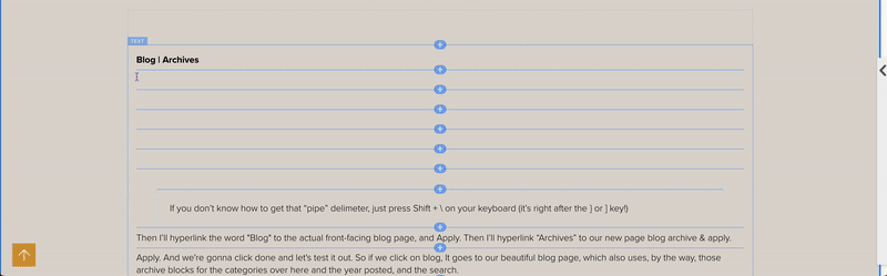
In my case, I added a line of text in one of the columns in my footer, and typed, “Blog | Archives” there.
If you don’t know how to get that “pipe” delimeter, just press Shift + \ on your keyboard (it’s right after the } or ] key!)
Then I’ll hyperlink the word "Blog" to the actual front-facing blog page, and Apply. Then I’ll hyperlink “Archives” to our new page blog archive & apply.
Now we're gonna click done and save, then test it out!
If we click on Blog, and it goes to our beautiful blog page, then do the same for Archives –and they both work, then you’ve linked them correctly!
A real Archives/Index page example
As you can see, I've recently added my own archives page so you can take a look at mine with a lot of content!
I've actually been blogging since 2016, but I repurposed a lot of that first year's posts and rewrote them completely, reposting them in 2017 or later, because those first posts were legitimately terrible. #truestory –So in the Month or Year sections, it's only showing the posts that I have republished (changed the post date), not the original post dates.
Click on the image to see the full page screenshot.
You can see all of the content organized by Category, by Year, by Month in the top section, and then in the index, it’s showing ALL posts organized into columns by alphabetical category.
📌 Note: I have styled all of this with Custom CSS, adding hover effects for the links & background colors for the categories so that you can see them at a glance on the page because there’s so much content to scan through on this page.
In the All Posts section, if you're wondering, –yes, this is just a text box by itself at the top and everything underneath that in this white section is one single archive block.
Want the Custom CSS I used?
// BLOG ARCHIVES
/** Index layout - post titles **/
.sqs-block-archive .archive-block-setting-layout-index .archive-group-name-link {
  font-size: 1.2rem;
  font-weight: bold;
  background-color: grey;
  padding-left: 5px;
  color: black;
}
/** Index layout - post link weight **/
.sqs-block-archive .archive-block-setting-layout-index .archive-item-link {
  font-weight: 500;
  color: black !important;
}
/** Index layout - post link hover effect **/
.sqs-block-archive .archive-block-setting-layout-index .archive-item-link:hover {
  font-weight:bold;
  color: red !important;
}
/** Index layout - meta data (date) size **/
.sqs-block-archive .archive-block-setting-layout-index .archive-item-date-after {
  font-size: .9rem;
}
/** Index layout - column spacing adjustment **/
.sqs-block-archive .archive-block-setting-layout-index.archive-block-setting-multicolumns .archive-group-list {
  column-gap: 20px;
  columns: 250px;
}
/** FLUID section - search block**/
.sqs-search-ui-button-wrapper.color-dark .search-input {
  border: none;
  border-bottom: solid 2px black;
  background-color: transparent;
}
/** remove the black outline on search bar on click **/
.sqs-search-ui-button-wrapper.color-dark .search-input:focus {
  outline: none;
}
📌 Pin it!
Well, that wraps up today's post. I hope you enjoyed creating your own blog archive/index!
I encourage you to create content for your website too! It's the only way that I market my business and my services and it’s the way that Google brings me new clients because I'm (preferably) not that active on social media.
Blogging is my preferred method of helping people & I wholeheartedly believe that this is a way that you can actually make a full-time income in your business by just genuinely putting good content out there to help people solve their problems!
Which, in turn, helps them actually find you because you have so much searchable content (all these posts) with good solutions to people’s problems.