

How to design & organize your blog’s home page on 7.1
What's inside this post: Hide
Blogging is NOT dead.
I believe that “content marketing” (what it’s actually called) –whether via YouTube or Podcasting or writing blog posts or some combo of that– can be a HUGE driver of traffic for online businesses, and I speak from experience.
I’ve grown my business without ads AND without relying on the regular use of social media because I produce great content on a regular basis and I have done so for years. It works really well for me because I genuinely love teaching people how to do shit.
It works because the content helps give your audience little wins for free, all while the content itself provides updates for Google showing that your website has value and stays up-to-date, which increases your search engine ranking and that in turn sends you more traffic –and the cycle starts over again, giving your new audience little wins for free, etc……
But here’s the thing. If someone clicks over to your blog from Google and they loved your post, and they want more –can they find it? 😬
❓ If all they can see is “older” and “newer” pagination at the bottom, they have no concept of how many posts there are to digitally thumb through. How likely are they to page through & look for something of interest?
❓ If someone wants to know what other topics you cover on your blog, how will they know? Do you list them anywhere? How would someone know A) what those categories are, and B) which posts are in those topics?
❓ If someone wanted to search your blog for something they were interested in, would they be able to? Would they have to use Command/Ctrl + F to search each page? How can they search through your content to find what’s relevant to them?
Now that I’ve got ya thinking about how to practically answer those questions on your own website, –don’t worry! You can fix all 3 of those things super easily.
There are 3 key elements I usually add on blog pages for myself and my clients, because –let’s face it– the stock or demo blog page isn’t super helpful.
Luckily, Squarespace has several somewhat little-known features built right into the platform to help with that and make sure your audience has a better experience navigating through your blog’s content to find what they’re looking for.
A quick note:
Some of today’s page-layout tips aren’t applicable to version 7.0 (the original version of Squarespace), but there is a workaround if you combine today’s tips with the classic strategy of using Summary blocks on 7.0, you can create something similar (& still free) on your older site.
With that out of the way, let’s jump into it!
As always, if you prefer to watch take a look at the video below, and if you prefer to read, keep scrollin’ for the walk-through below the video.
How to customize your Squarespace Blog
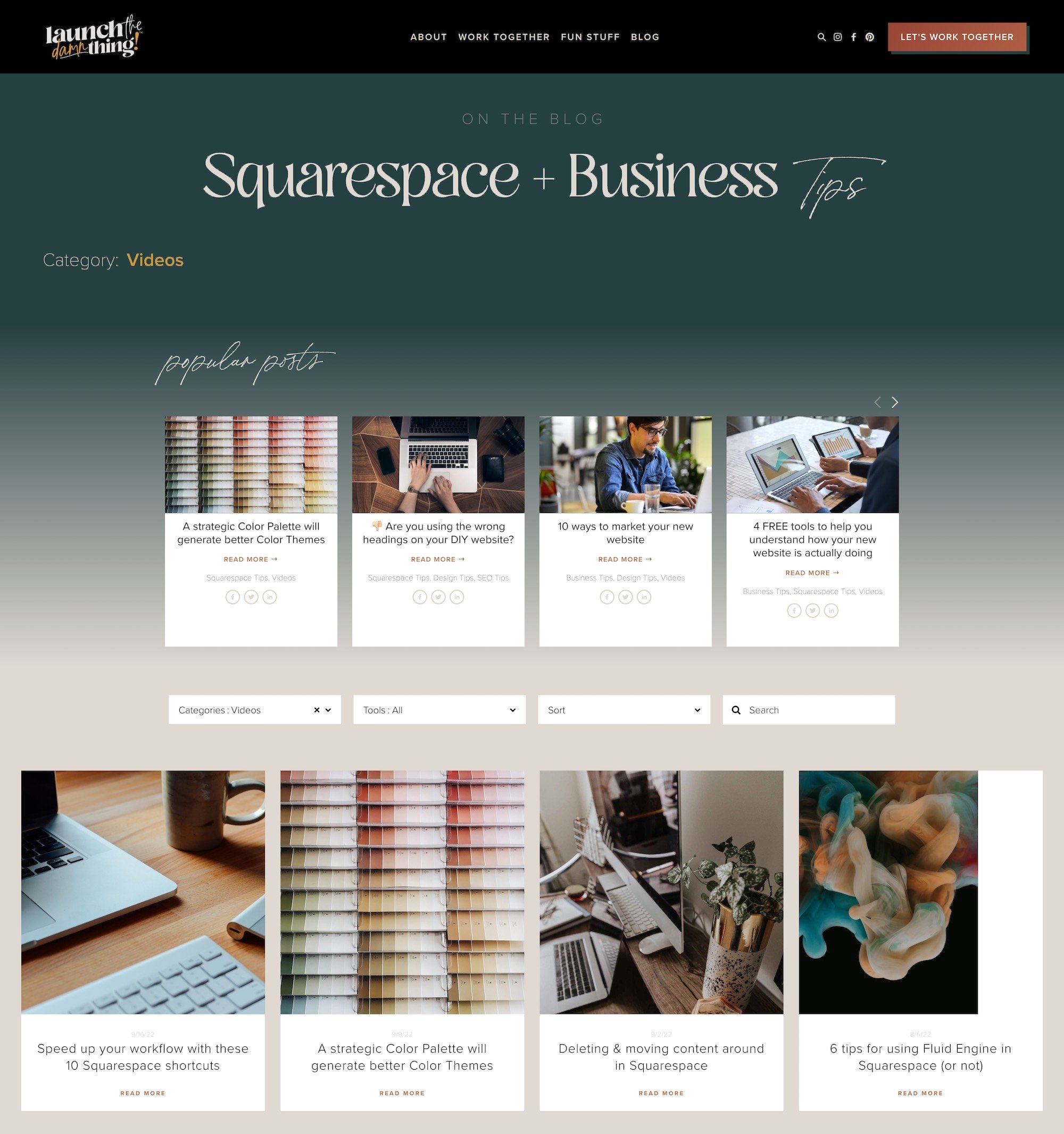
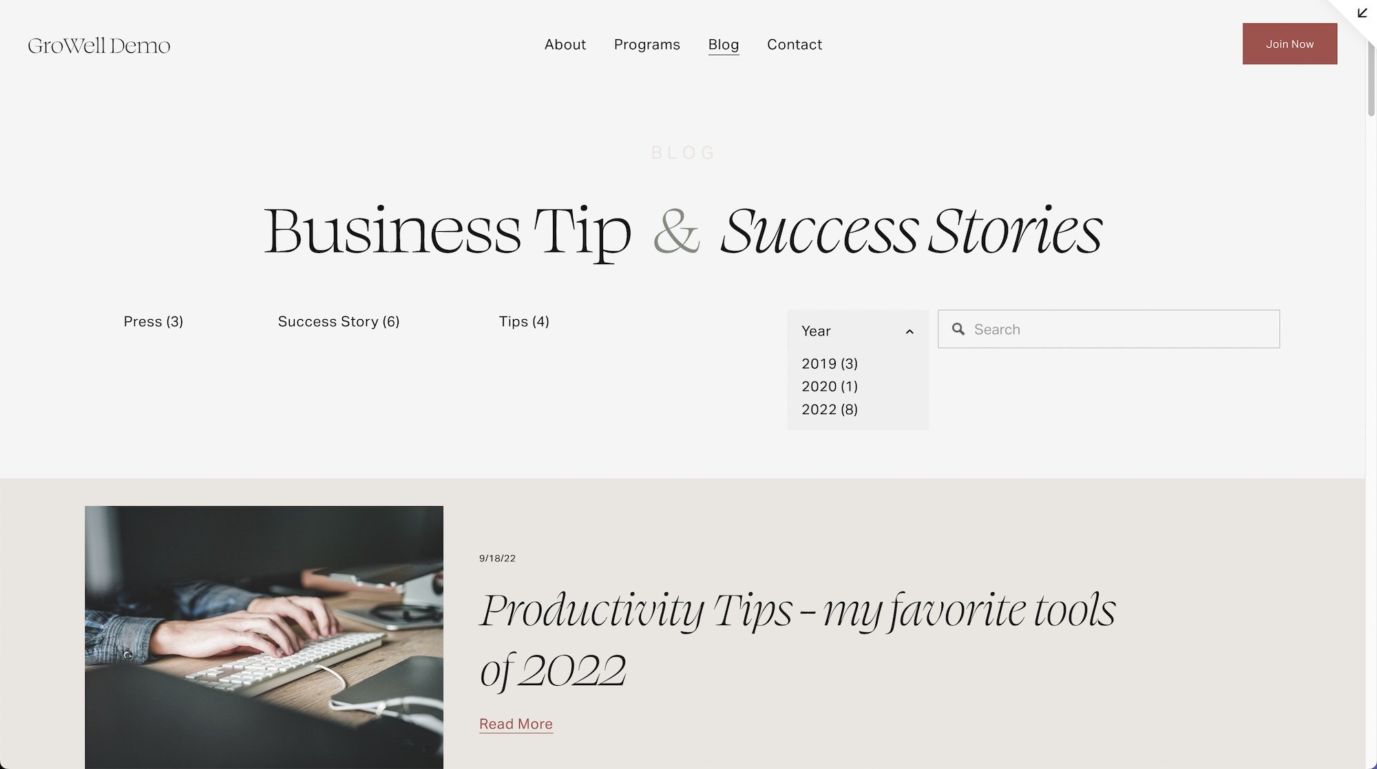
Example screenshot: full Blog home page
This is a demo site that I made to show you an example of the 3 elements I think are must-haves for any blog on Squarespace. Actually, I think they’re important for any blog collection on any platform.
First of all, this is a home blog page where the most recent 20 (or less) posts will automatically update. In this view, we're not in any of the individual entries.
The thing that's different about 7.1 vs 7.0 (the older version of Squarespace) is that on 7.1 you have the added capability of putting extra sections on top of, or below, the actual blog feed so you can spruce up the page a bit & add more features WITHOUT needing code or plugins, or even creating an extra ‘archives’ page as I suggest here in this post, how to customize your home blog page on 7.0.
Everything in the middle here will automatically update as new posts are added –just like it does in 7.0– but the difference is you can style the page a bit further on 7.1.
This demo site does not have any plugins or custom code to create features, etc –it’s all done with native Squarespace elements & settings.
You're fully capable of creating everything you see here in that example screenshot, even if you're not a pro.
How? Let’s dive in & take a peek behind the curtain!
❶ Blog home page settings
These settings actually apply to the main blog feed and are separate from your design settings for the blog and the settings for the individual blog posts, –some of which you might not know about because they’re kinda buried in page settings instead of in the design settings.
Blog page settings in Squarespace: where to set the number of posts per page in the home feed
Number of Posts per Page:
You can actually adjust how many posts show up in the feed on this page, under the settings for the blog collection, which you can get to from this window (pictured below) or from your main page’s menu by clicking that gear wheel, then go into the general settings for the blog collection, scroll down and adjust the slider for the “Posts per page.”
I have a plugin that allows me to show more than that, but Squarespace by default limits you to about 20 posts max. You can show fewer than that though if you prefer it.
In my example below, I have it set to show just 10 posts. I don't have 20 posts in this demo blog collection, so I took it down to 10 just so I could show you what the built-in pagination looks like.
General
While you're in the settings for your blog collection, you also wanna check your Page Title, and your Page Navigation Title which is just what shows up in the actual navigation areas of your website (your header navigation, and the title of the page in the Pages menu while logged into Squarespace).
SEO
You should select an SEO title and SEO description for this particular page. If the collection by chance is something that you're using for internal purposes, like a testimonial section or something like that and you don't really want people to be here, you can hide all the pages in this collection from Google so it will not crawl them and provide them in search results (a wise thing to do, to avoid confusion, if you don’t plan for this collection to be public).
Otherwise, leave those toggles off because you do want Google to crawl if it's content marketing related, like blog posts, podcast show notes, YouTube show notes, and the like.
Social Image
You can also set an image that displays with the link when you share on social media platforms, texts, etc that works for the blog as a whole.
RSS feeds
You can also set a feed. Squarespace gives you an RSS feed for your blog, by default and that URL is formatted like this:
https://www.YourDomain.com/pageslug?format=rss
or
https://www.launchthedamnthing.com/blog?format=rss
If you want to replace your RSS feed for the blog itself; you can set that up with FeedBurner and put that in. You can learn more about that over in Squarespace’s help article here.
You can also link up your podcast feed so that wherever you're hosting your podcast, whether it's Podbean, Buzzsprout, or wherever, you can have that update your Squarespace “blog” (in this case, add new podcasts when the feed updates from the podcast host) automatically by replacing your built-in RSS feed. So you can set up the podcast to be posted, or even hosted, on your blog through Squarespace if you want to!
Blog page settings in Squarespace: where to manage & edit categories & tags + where to add blog page-specific code if ever needed
Advanced Settings
There are also some advanced settings in there that are smart to know about, even if you don’t think you’ll use them right away.
Editing Categories & Tags:
Once you get your blog going and you realize you need to edit a category or a tag that already exists, you do not have to do that in the individual posts. You can go in here and edit them for the entire blog collection, and from there they will auto-update in the posts.
So if you wanted a particular category or tag to be capitalized or if you’ve misspelled a word, for example, you can fix it without having to search post-by-post.
Deleting Categories or Tags:
If you wanted to delete any of your tags or categories, you could do that from the same area, by selecting groups of them & clicking Delete.
Merging groups of Categories or Tags:
You can also merge any group of tags or categories if you have duplicates or multiples that are too similar. Just select the group, then click Merge, pick the new name & save your changes.
So it’s a good thing to know this area exists AHEAD of time, in case you ever need it. If you’re a content creator or aim to be one, you WILL eventually need to come in here and make some changes. I’ve been blogging for years and just realized last week that my tag for Fluid Engine-related posts was labeled “Fluide Engine” –so, even the pros make mistakes sometimes! 🤦🏼♀️😂
Blog page settings in Squarespace: how to use the search filter to find tags in a long list
Searching through your Categories or Tags:
Also, if you have a really long list of tags, as I do now on my blog, you can search through the tags with the search bar filter shown at the top, by typing something to lookup. Then it'll filter through the list to help you find it –thankfully!
Code Injection:
If you have any page-specific code for your blog collection (usually this is in relation to a coded feature plugin, etc), you might have some in your header code or your blog post item code injection.
If not, you can completely ignore those for now; just know this is where they are if you need it later.
A good example of how these areas might be used is if you want to install the Universal Filter plugin by SquareWebsites* which installs via somewhat extensive code. The code installation places a set of filters with a search bar onto your blog home page which works much more seamlessly than the free methods I show you below; I use it on my own blog now and have installed it on client websites as well.
However, I will say the Universal Filter isn’t easy to customize unless you’re familiar with the types of code used and if you’re a novice to websites or code in general you will be overwhelmed with the installation, so if you want to purchase it, make sure you reach out to the shop owner for help or plan to hire someone to customize it for you.
Another option that is simpler to install is SquareWebsite’s Numbered Pagination plugin*; that one is cheaper and doesn’t come with the filter & search functionalities, just the actual numbered pages to replace the Older Posts / Newer Posts that Squarespace has, standard.
**FYI, I am not an affiliate for SquareWebsites, so those are not affiliate links! Just great resources I trust and use all the time myself, from a reputable developer.
That’s it for your blog settings!
Now let's jump into the actual page design layout and the post settings themselves.
❷ User-friendly page design tips
First and foremost, you want this page design to be super user-friendly, otherwise, people aren't gonna stick around.
Squarespace Blog Settings: built-in pagination (automatic)
Why are we talking about this first when it’s at the bottom of the blog home page feed? Because it’s one of the things Squarespace doesn't do well right out of the box to make this page user-friendly, because all you really get as your ‘stock’ structure options with a blog page template layout is this automatic pagination at the bottom and a title section at the top.
But the pagination just says “Older” and “Newer” posts. That's it.
So if I click “Older Posts” (highlighted in the example screenshot), it cycles to page number two. Then on page two, it would load and say “Newer Posts” in that section on one side (if there are any) & “Older Posts” on the other, unless there aren’t more posts beyond page two –in which case, it will just point back to the newer posts again.
That’s good…but not great. Right? Because as a visitor to this website, you have no idea how many pages of content there are if all you get is a vague reference to Newer vs Older (ie: are there 2 pages of older posts or 10,000? 😂)
Option 1:
You can buy the $10-ish (USD) SquareWebsite’s code plugin which restyles this area with a snippet or two of custom code, changing it from the unhelpful Older/Newer Posts to numbered pagination, such as 1, 2, 3, … 9, 10, 11 etc. allowing viewers to see how many pages of content there are.
Option 2:
There a few ways around having to buy and install paid plugins, like creating your own additional section above the blog feed with built-in tools (blocks) that may not be as sexy but can still help visitors find content in easier ways (rather than just paging through them), –like the following:
Squarespace Blog page design example
Adding a descriptive page title
First of all, you need to prominently display (in Heading 1) what this page is and what kind of information it will have inside.
Just calling it “blog” is not really helpful, because blogs can-and-should be specific to your niche or industry and newcomers might not know what that is yet.
So ya gotta spell it out for them!
I usually do some sort of combination of both “blog” plus a description, because viewers understand (generically) what “blog” means and Google just needs to know the type of content housed in this collection of entries.
LEARN MORE: Are you using your Headings incorrectly? 😬
Archive Blocks
Beneath that, we have an archive block with an automatically populated list of category links & the number of posts inside each category. Did you know that your blog has built-in pages for each category or tag?
For inquiring minds, those links are formatted like this, in case you ever want a direct link to a specific tag or category in your blog collection:
https://www.YourDomain.com/pageslug/category
https://www.YourDomain.com/pageslug/tag
or
https://www.launchthedamnthing.com/blog/category/Squarespace+Tips
https://www.launchthedamnthing.com/blog/tag/Fluid+Engine
Will-Myers.com’s Breadcrumb to Category or Tag pages code plugin displays right underneath my blog title, on the left, only when activated.
Give that category link a try for your own website & see if you can tell whether or not Squarespace has filtered your blog feed list below to show just those with that tag or category.
If you can’t tell or aren’t sure if the content on the page has changed, there’s a FREE code plugin you can grab from Will-Myers.com that will place breadcrumb meta data in the top section of your blog when a visitor is viewing a blog Category or Tag link on your website.
I have this installed on my website and it works perfectly! An easy feature to add so that visitors know what they’re looking at when they click on those Archive Block links, to know they’re seeing a filtered view (of only that category or tag) of your blog content.
To pre-answer your next question, no I don’t recommend that you use these Archive blocks for things like Tags or any other metadata that you probably have A LOT of. It won’t be able to display the full list, so it works best for showing shorter lists of things, such as Categories, Authors, Years, Months, etc.
Search Block
Next to the Archive block list in my example screenshot above, we also have an Archive block displaying as an on-page dropdown menu, and then a Search block –all features that are built into and readily available in Squarespace for free.
Fluid or Classic?
You can achieve a layout like the one in my example above, using either Fluid Engine or Classic Editor.
If you’re not familiar with the new Fluid Engine editor, make sure you check out my Fluid Engine tutorial posts here (←that’s a link to my Fluid Engine tag! See what I did there?) 😉
❸ How to build the top section with search & various content filters
First, we go into Edit Mode on the blog home page, then click Add Section above the blog feed. Pick a template layout from the template picker or start with a blank if that’s an available option.

Then we’ll change the section settings, which could be changing the section’s Color Theme, content width or height, adding a background image, video or effect, etc.
In this case, I’m walking you through recreating the design I already have so let’s change the background color by selecting a different Color Theme, and let's make the Content Width “Large” and the Content Height “Small.” Then we type in the title & description of the page before we add blocks underneath.

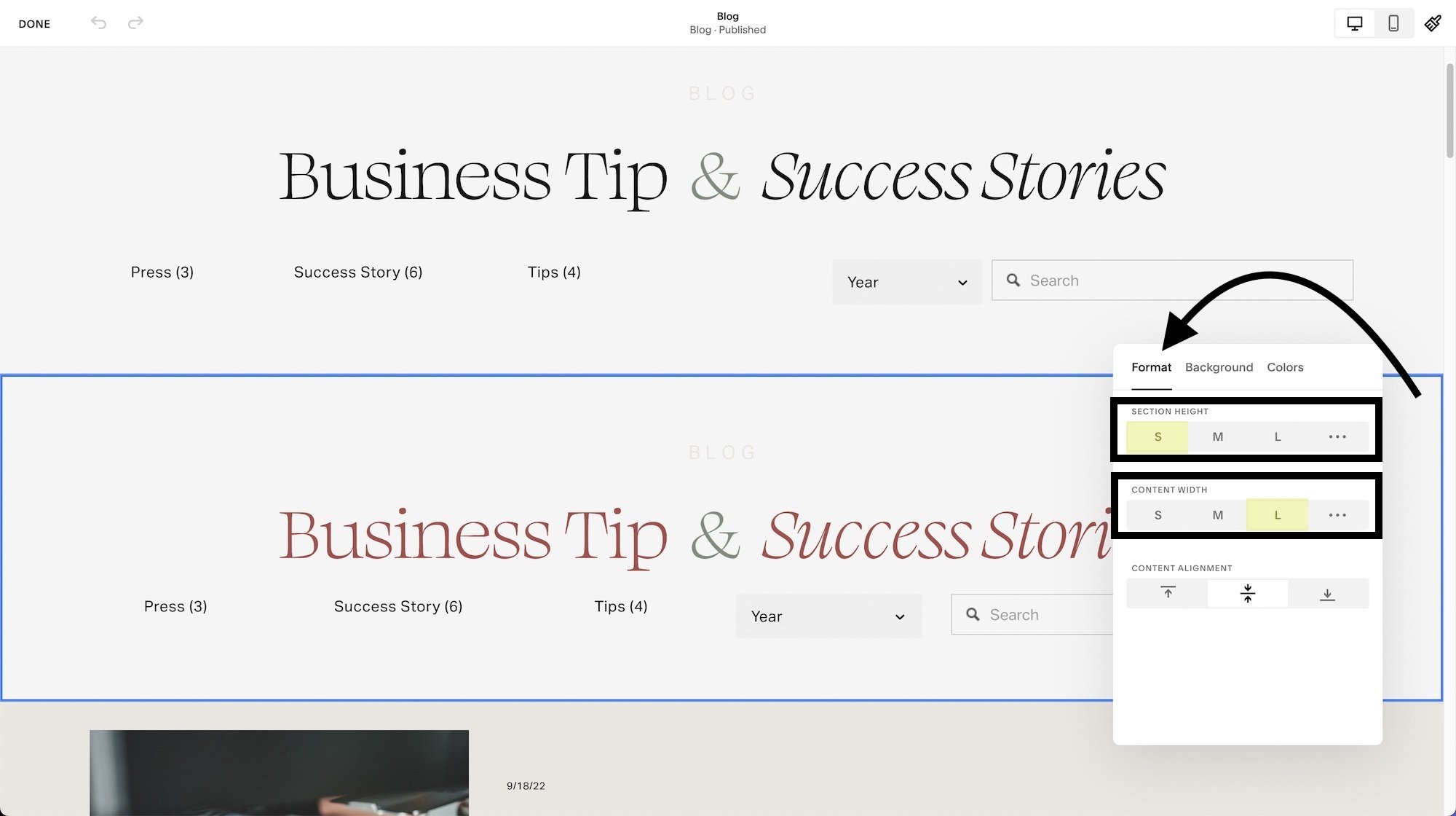

For the Color Theme, I chose one slightly different so we can tell the difference between the original and the copy as I recreate that original design with you for this tutorial.
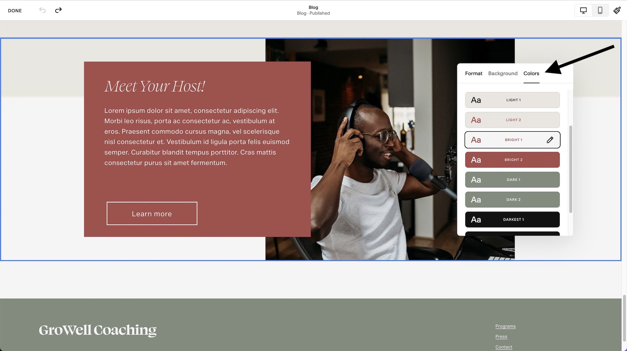
We can also add the Archive block. In that block’s settings, filter it to the Blog data, choose “List” for the display type, then select ‘centered.’ For the data displayed in the list, we’re only going to show categories, and we're gonna choose to show the group counts for each category. You can see those settings in the example images below:
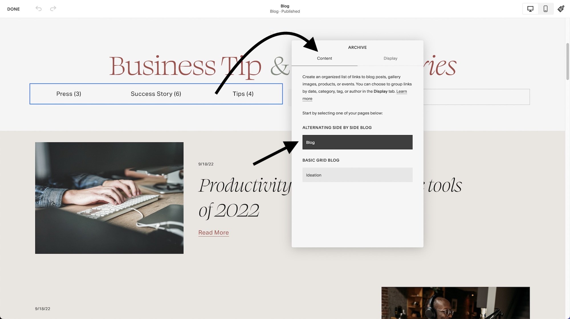
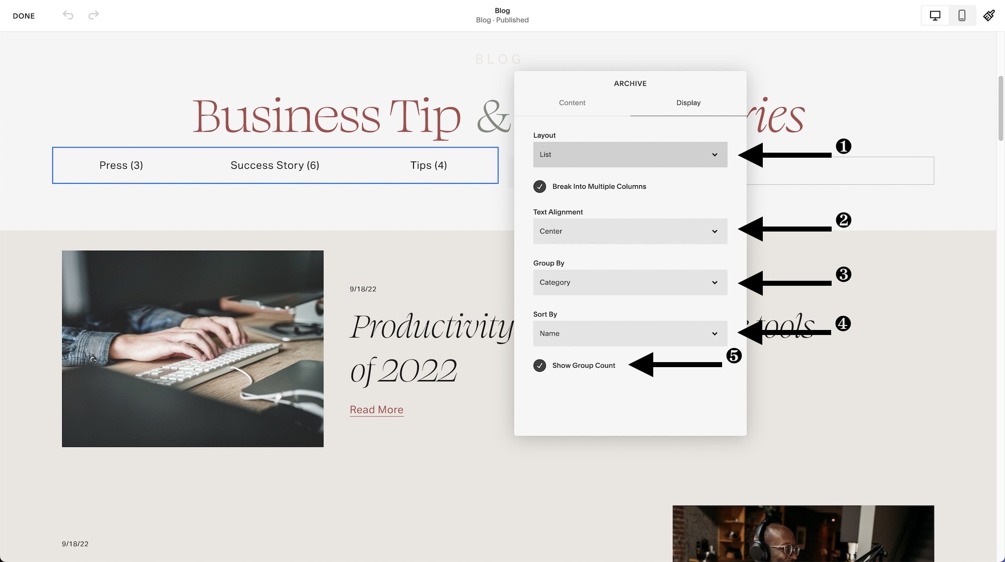
Remember, you can access the Archive block in either Classic Editor or in Fluid Engine.
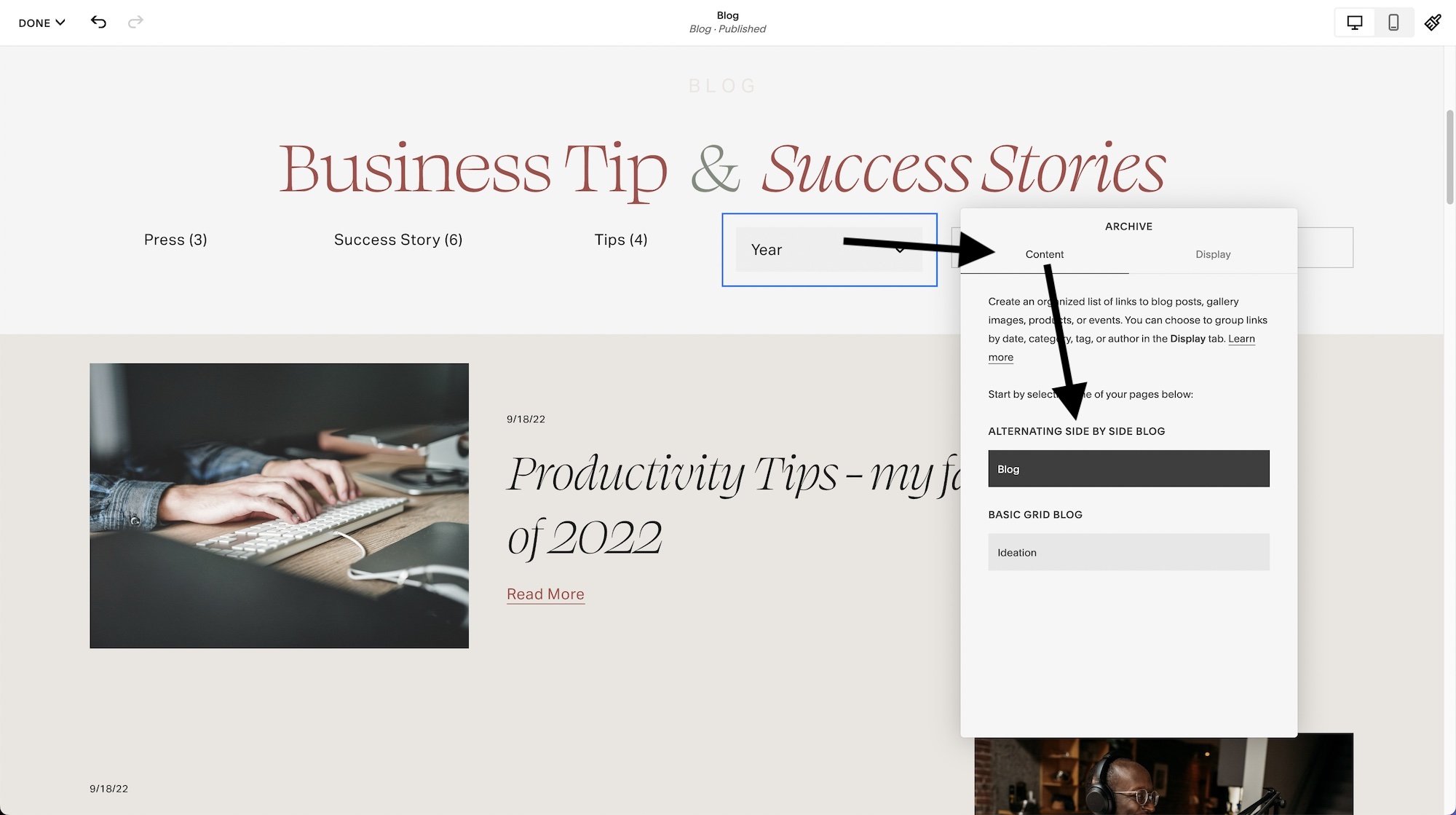
Then if you want to also add the dropdown for the year or to list Active categories or tags, or any other available options, you’d want to add another Archive block but instead of choosing “List” in the design Layout, you may opt to select a different layout option, like “Dropdown.”
Then rename the dropdown for whatever information it will display; in my example, it’s showing the years of content posted so I’ll label it “Year” because “Archives” is just not a very sexy word to use there!
Then I’m going to group the contents in this dropdown by Year, sort the dates ascending/descending, and show the group counts for each Year listed in the dropdown to show how many posts were published for each year listed.
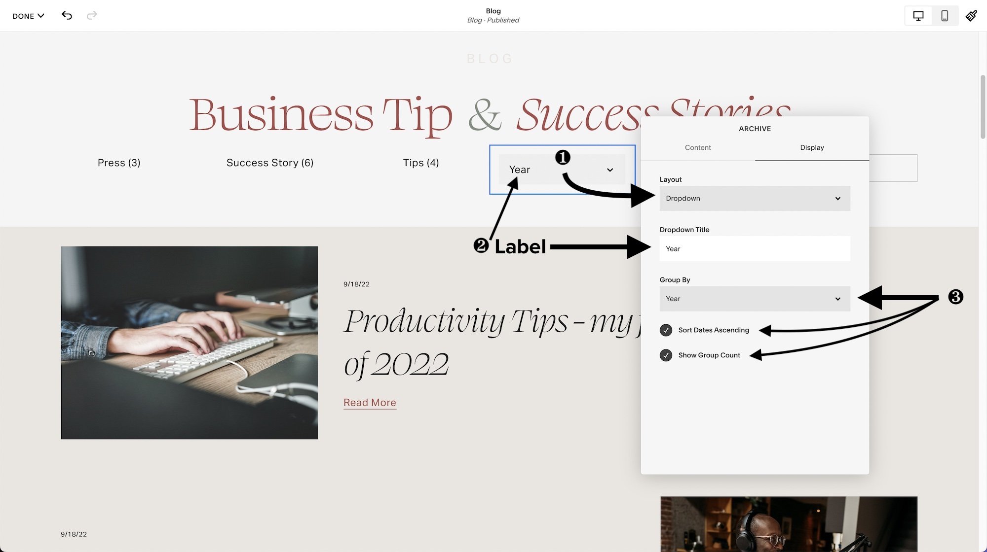
Then I’ll drag the block over to the right of the Archive Block List, so that the Dropdown Archive Block sits to its right.
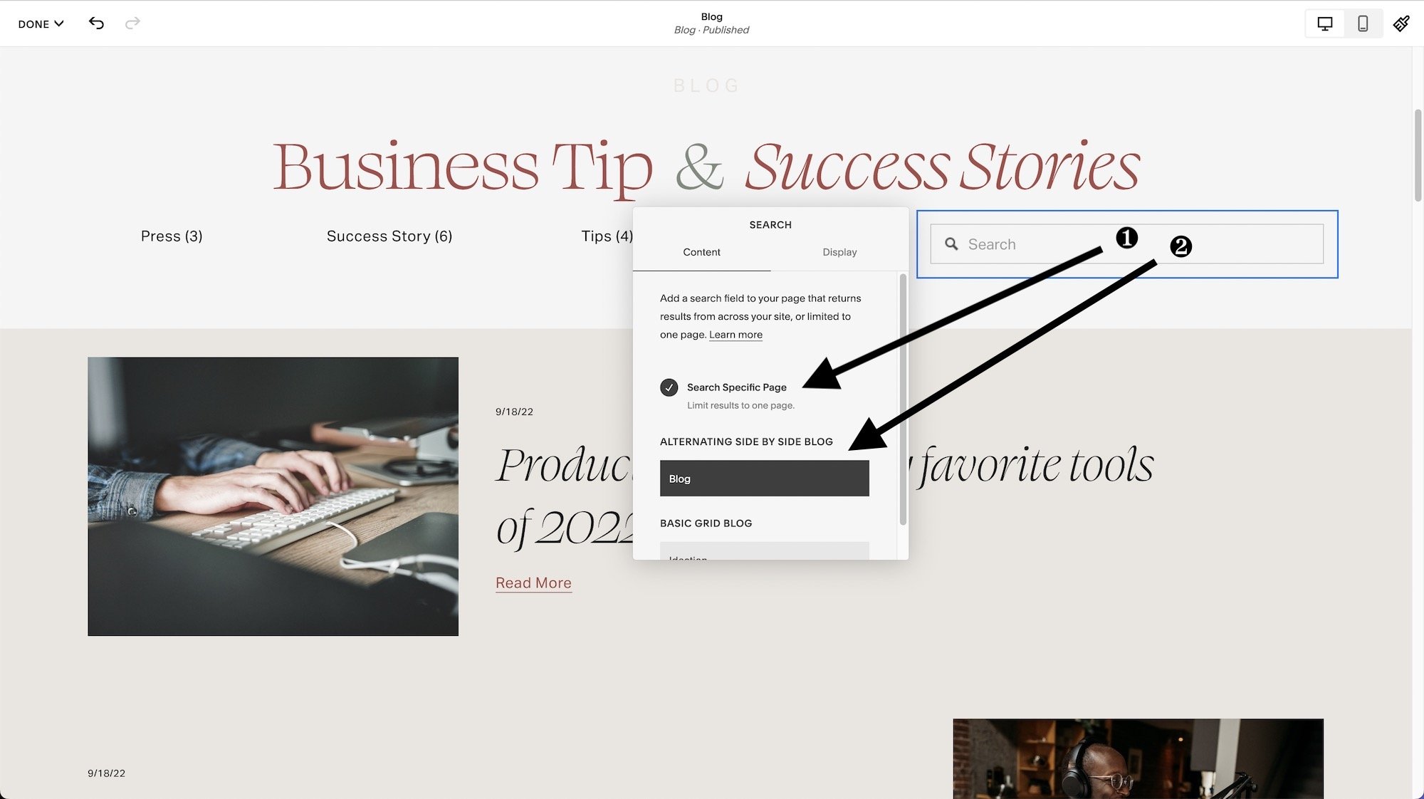
Then I’ll add one more block: the Search block.
I want that block to just search this Blog collection, specifically, rather than the entire site. Not mandatory, just personal preference in case you have additional search blocks on the rest of your site (like in your footer, for example, which is always a great place to put one).
I’ll set the display to whatever best fits the color theme in that section; in this case, the dark version will show up better on the lighter background. And I always like to have that quick preview on because that's just a user-friendly thing.

Then, if I just drag that Search block over to the right of the Year dropdown and make the year a little bit smaller by dragging the width inward a bit, then we actually have all 3 blocks on the same line across the page: links to the categories with a count for how many articles are in each one, a dropdown for the year and the search bar for the collection content.
If you save these changes, you can see how this actually looks & functions in preview mode (outside of Edit mode).
On the Year dropdown, there are three posts from 2019, one from 2020, and eight posts for 2022 ––I highly encourage you to post content way more often than this demo is showing.
Learn more about Content Marketing here:
the final design layout with the Year Dropdown block expanded
The way the Archive Blocks actually work is based on those built in URLs for blogs, categories & tags. As I mentioned earlier, Squarespace generates an automatic URL for each and the Archive Block connects those dots, so to speak.
So if you click on any of those categories Listed or shown in the Dropdown in either of those Archive blocks, the URL it takes you to will match whatever data link you clicked on.
In this case, each of the listed categories has its own URL: /blog-name/category/Category+Name
The Year in my example blog collection is actually just a specific Tag labeled for the year posted (manually, per post), so those Year links in that Dropdown are just tags in each post (2022, 2021, 2020, etc) and the links that display all posts with that tag will look something like: /blog-name/tag/2022.
What Squarespace is doing when someone clicks on that is reloading the page, and filtering what’s displayed on the reloaded page to show only the content assigned to the type of data requested on click. In other words, if you click a tag link or a category link it redirects you to the ‘home page’ (so-to-speak) but only displays the content matching that data request.
It works very similarly in shop collections with those Categories.
OPTIONAL: Content sorting & filter plugin option
As you can see, with those free & built-in features, you don’t need a paid filter to have that kind of functionality.
That said, when you’re ready for extended functionality, filtering, AND sorting, I highly recommend the SquareWebsites.org “Universal Filter” plugin*. That's what's on my blog, but I also have well over a hundred posts in there now, and as the content grew, it made more sense for me to have a better filtration, search, and sorting system.
But I didn't install that Universal Filter on my blog for years, honestly; in fact, I just installed it in early 2022!
I was on a semi-regular posting schedule from 2016 to 2019/2020, posting every other week, then in 2019 or 2020 switching to a weekly posting schedule for a while then tried posting 2x weekly for about 6-8 months before switching back to weekly postings. If you do the math, that’s roughly 25 posts per year x 3 years, plus another 50-ish posts for the years afterward … which is about 180+ posts & growing.
So if you’re on post number 4 or number 53, –don’t feel obligated to up your game just yet! Not unless you just want to because you can get by with the free tools built into Squarespace for a long time before you need anything else. And really you don't ever need anything else, –that's just my personal preference. But if you do, this is the perfect solution!
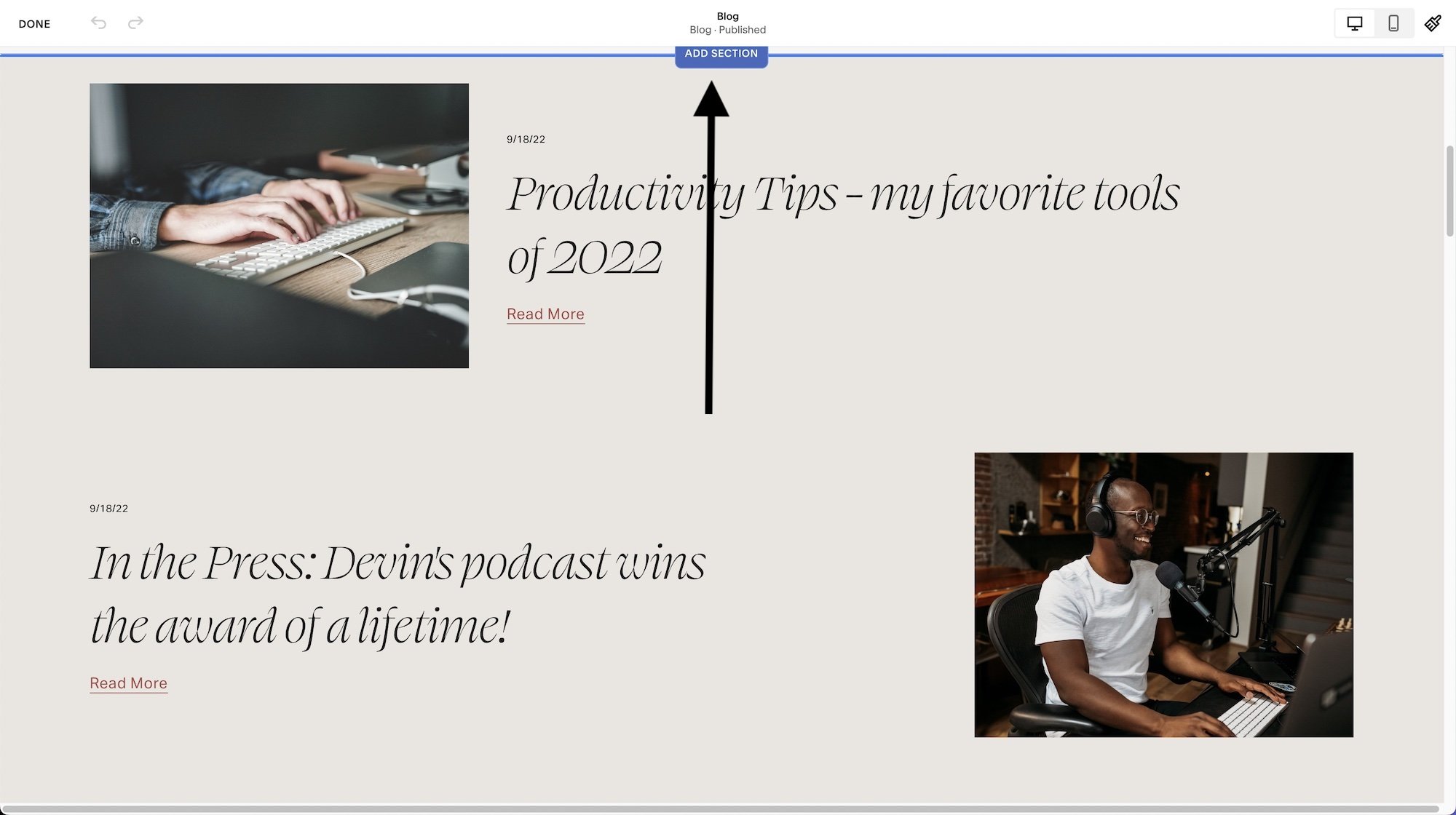
❹ Add a section to the bottom of your blog home page
I encourage you to add one more section beneath the blog feed that could display who's “talking” in the posts, whether it's podcasting and those are your show note posts, or whether it's articles or YouTube videos and those are show notes for the videos. Or if you’re a service-based business, you could use this section as a call-to-action, to ask visitors to work with you and book your services.
Whatever it is, it could be really useful to have a little blurb at the bottom of your blog’s feed.
Especially if the blurb is a mini-bio and most of your traffic is coming to your blog from Google –because they haven't met you yet. They don't know who you are or why they should stick around.
If you put a little blurb there that introduces yourself and redirects them to your about page or your services page, maybe they'll get to know you a little bit, then learn about you and you might get a couple of extra fans!
Ready?
First, we Add a new Section and choose a page layout from the template picker.
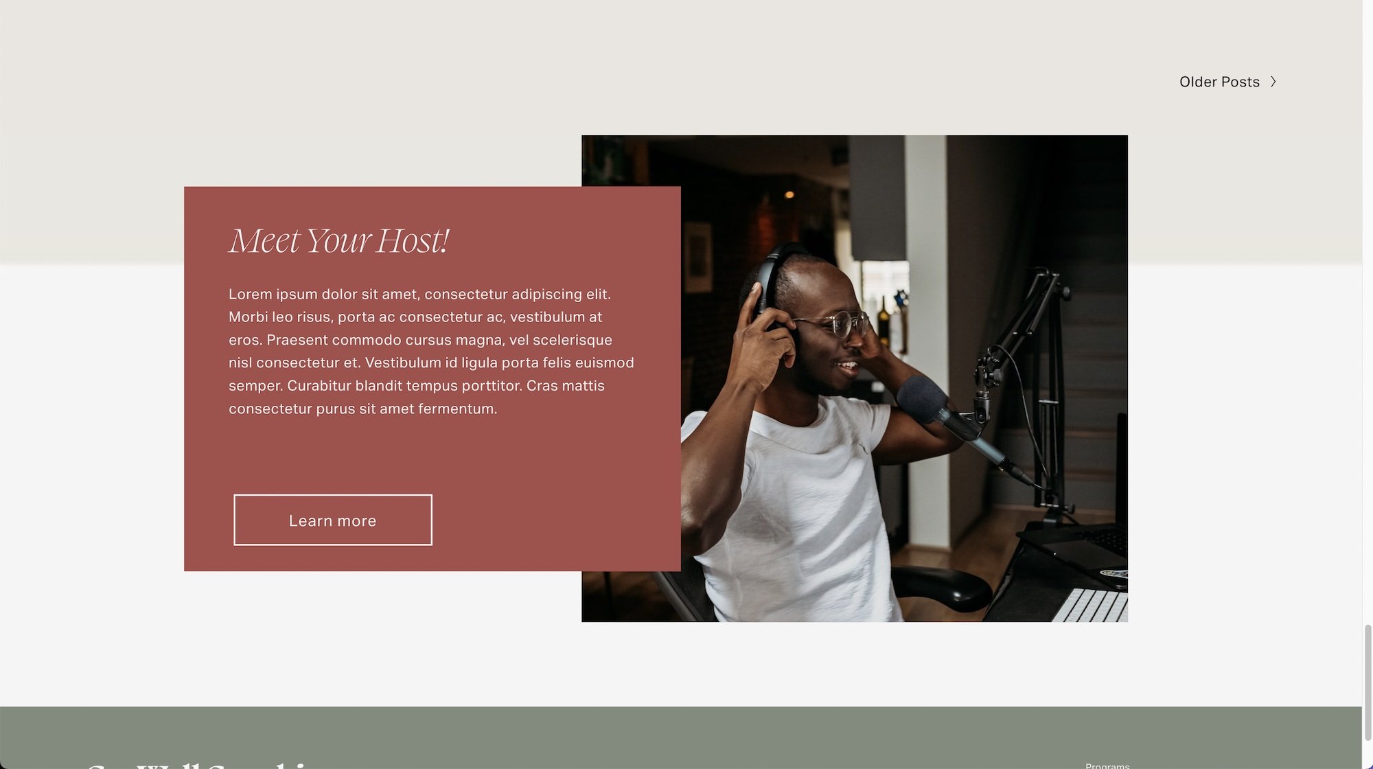

How to fake a section overlap look with a background image:
For this example, I actually just scrolled up to the top section between the new first section we just added & the blog feed below it, then took a screenshot of the color in an empty area where the two Color Themes meet on the edge between the two sections and uploaded that screenshot as the background image. It’s a little blurry, so if that bothers you, keep reading for an alternative/better way to do it.

Now you can (& should instead) create this same effect with Canva very easily! In fact, I encourage you to actually do it that way instead, because it'll provide you with a better image resolution than a small screenshot, blown up to 2,000+ pixels in width, making the line between the colors blurry.
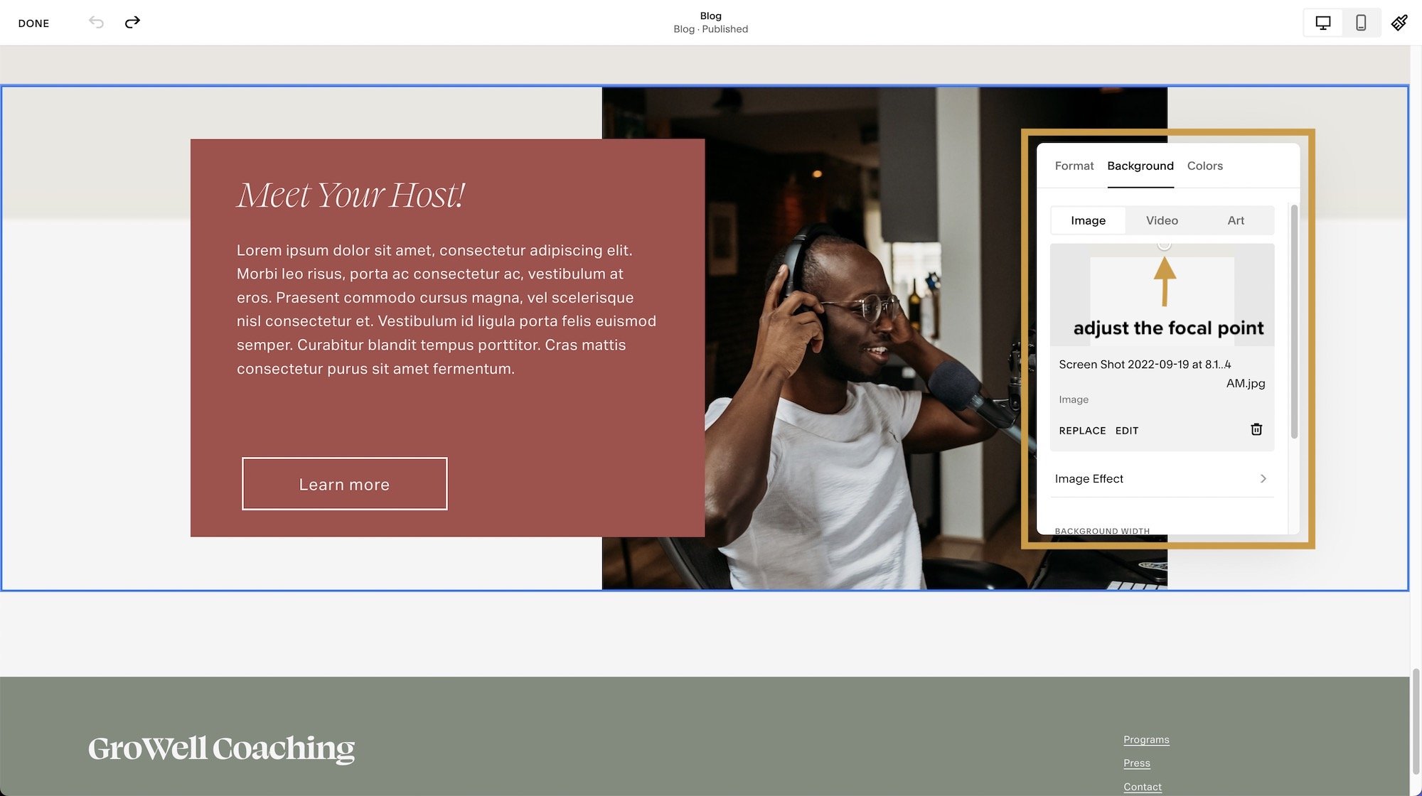
Either way, you save the file to your computer, then in Edit mode for the background of this section, you’d upload that screenshot or Canva design image and move the focal point of the image up to the top so it focuses & crops to keep that point centered.
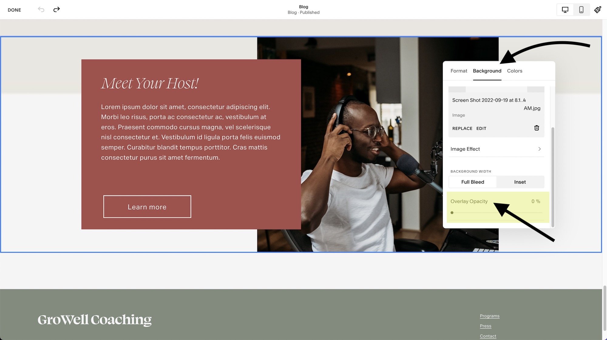
I also turned the overlay opacity all the way off (0%) so that this background image won’t have an overlay color, affecting the coloration of it.
Now it should look a lot more like the blocks in the new section are overlapping the blog feed’s section above it, which is a really neat effect!
Then, of course, for the elements inside the section…
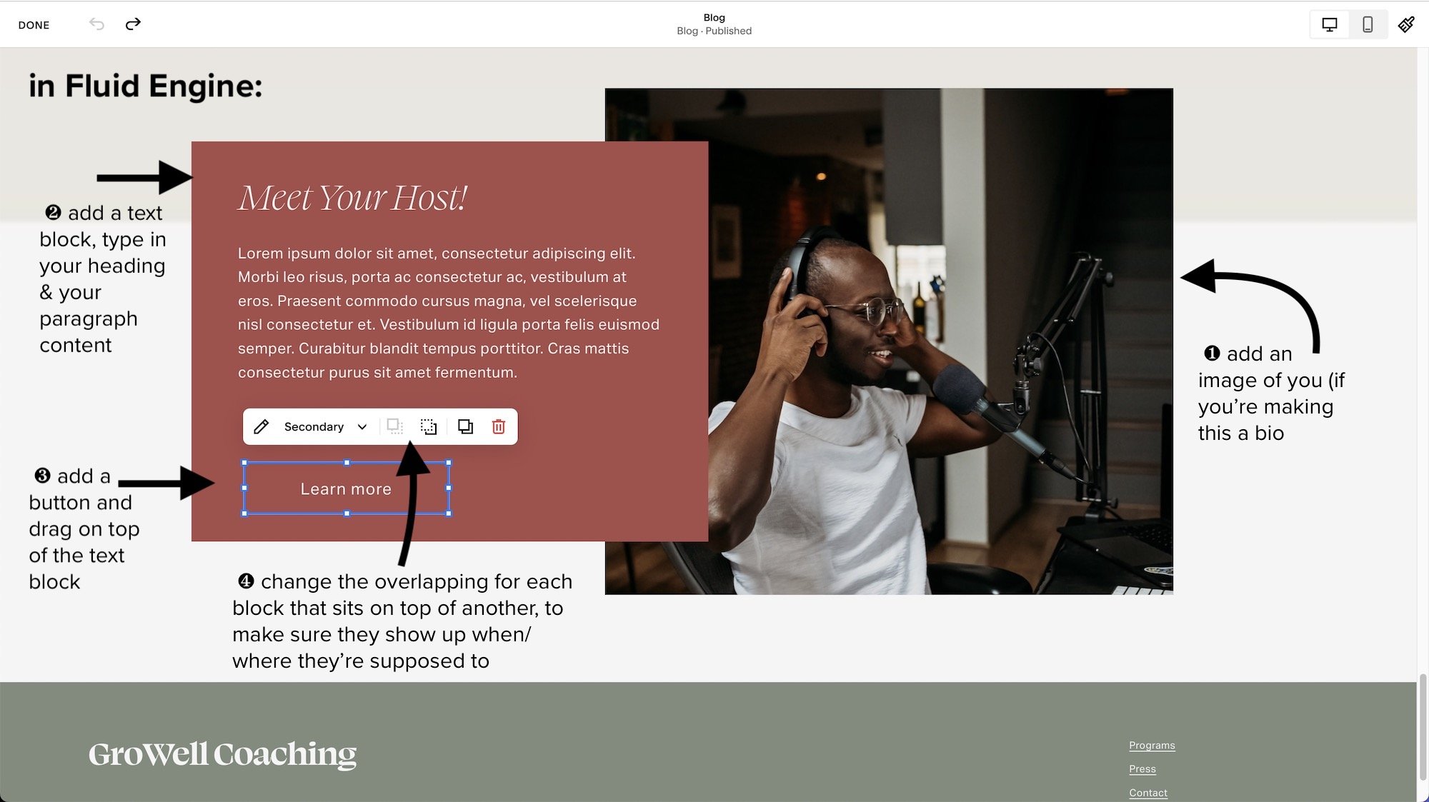
In Fluid Engine, I have a text block with a Heading 3 and a little paragraph (use the same text block, otherwise you run the risk of one overlapping the other on smaller screens which makes the text hard to read), a button & an image to complete the look. Make sure ya give the button plenty of space between it & the paragraph above, so when the paragraph text exands in length on smaller screens, it won’t overlap poorly with the button beneath it.
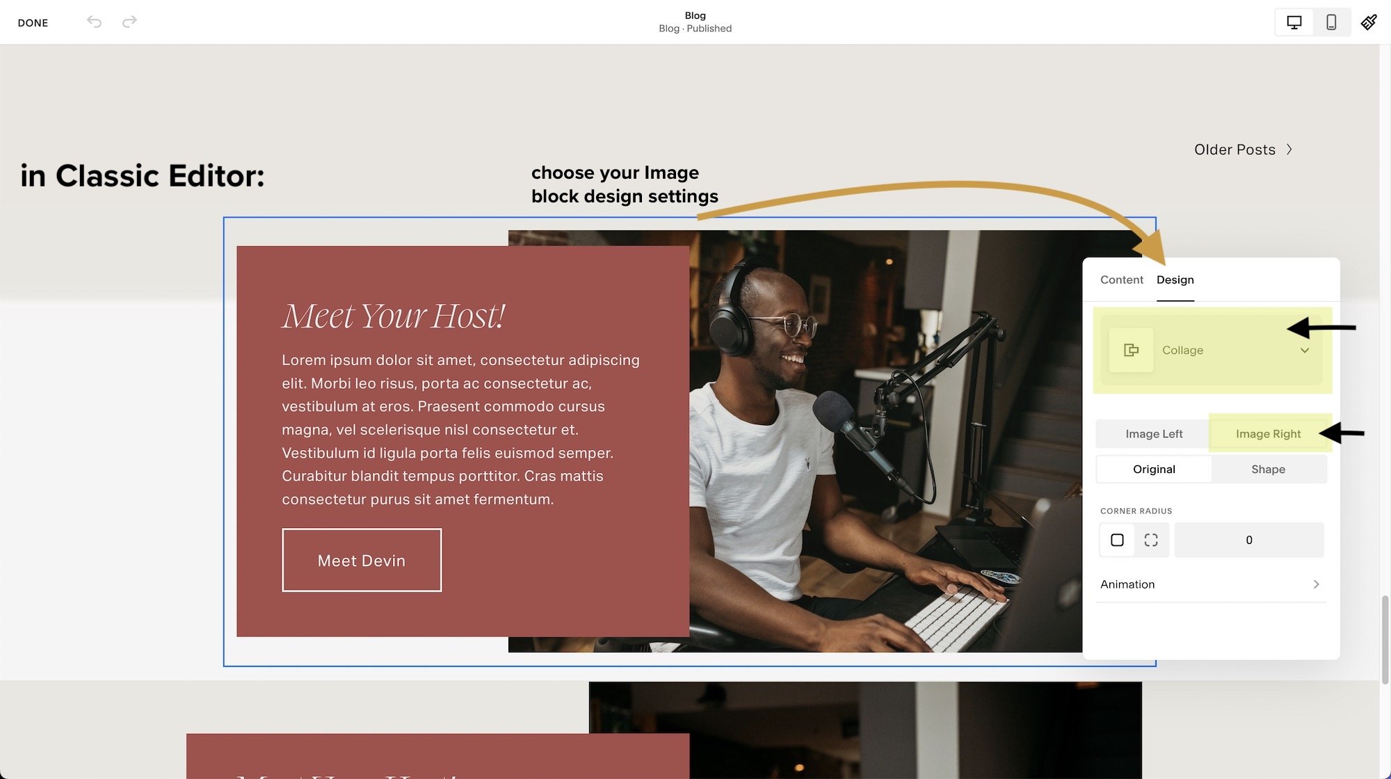
In Classic Editor, I add one Image block, then set that block’s Design settings to Collage, set the image to show on the Right, then under Content I tell it to display a link as a button, give the button text & a click-through location:
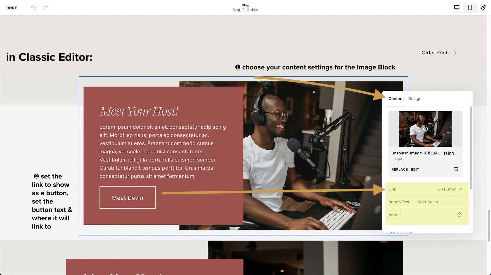
To get the background color behind the text block, you can do this in either Fluid Engine or Classic Editor by clicking the pencil icon to edit the Text block settings, and turning on the Toggle for background color, then choosing your settings for the background of that block.

Text Block - click the Pencil icon to access the settings for that block
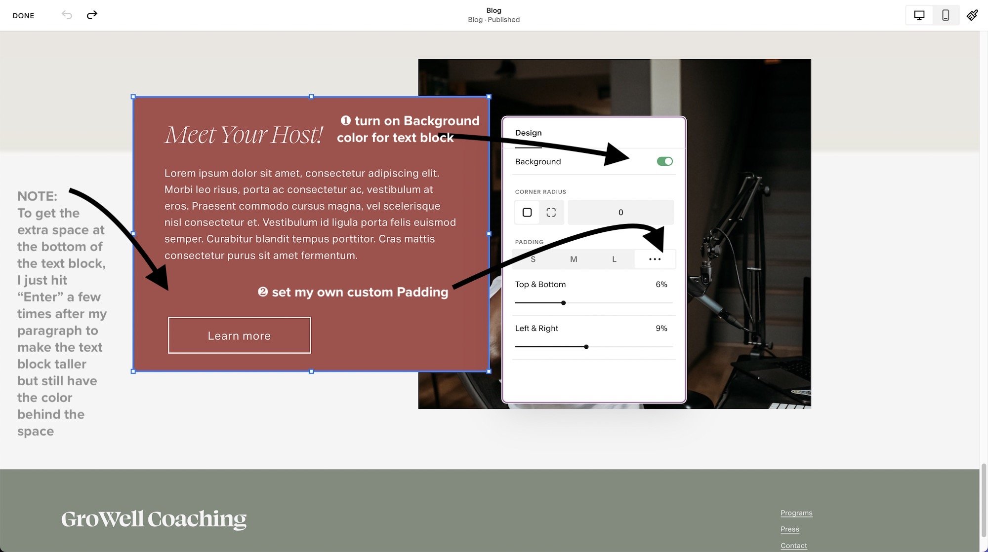
Text Block backgrounds - choose your settings for the background once the toggle is turned on
When I refresh the page, I have the button overlapping the text block, the text block overlapping the image, and the image on top of a section that looks like it overlaps the section before it. Voila!
Styling the CTA buttons in a Collage layout
In Classic Editor:
I don’t think you can dictate whether the button on the Collage Image block displays as whatever your style is for Primary, Secondary, or Tertiary buttons without custom CSS.
If you want that CSS (which will ONLY affect buttons on Collage style Image blocks in Classic Editor, and these don’t exist in Fluid Engine), it’d look something like this:
/*Image Collage Button*/
.sqs-block-image .design-layout-collage .image-button a {
  transition: background-color .25s;
  border: solid 2px #fff !important;
  background-color: transparent !important;
  color: #fff !important;
}
/* Image Collage Button Hover */
.sqs-block-image .design-layout-collage .image-button a:hover {
  color: #000 !important;
  background-color: #fff !important;
  border: solid 2px #fff !important;
  opacity: 1 !important;
}
Just swap out the colors, redefine the pixel width of the border or remove it if you don’t want one, etc.
That CSS snippet above, is set to mimic the style of the Secondary button in the demo example shown in the Fluid Engine section I built here:
Fluid Engine section - this button is a Secondary button that I’ve styled to look like this
To get this effect in Classic Editor, you may need the above CSS snippet or to go into Site Styles and adjust your global button styling options
In Fluid Engine:
The button is its own block, so you can choose the settings for it however you like, setting it to display as Primary, Secondary, or Tertiary styles.
That’s it!
Those are all the things that I suggest that you do for your blog, as far as page layout and structure.
❺ Blog (per) post settings
Which are the most important & what do they all mean?
My top tips for creating better organization in your actual blog content is to make sure you always, always, ALWAYS go through the tabbed list in the blog post’s settings when you post new things.
Content:
So in the content section, putting a thumbnail image in there, you can skip the excerpt because a lot of times that messes with the ability to turn on or off the read more link in Summary Blocks elsewhere on your website.
Re: A note about excerpts on blog posts & summary blocks
If you want the read more link, but not to show the excerpt, unfortunately in Summary blocks, you have to have the excerpt “showing” for the read more link to be there. But if you leave the excerpt empty in the blog post settings in this case, the “excerpt” can be “on” and not show anything because nothing is there to show. So I always leave that empty and place that text in the SEO description for the post instead.
Change your post URL; make it something readable and include dashes to separate words. I’d aim for 5 words or less in the URL slug for the post, wherever possible.
✅ DO this: …com/blog/example-post-url
🛑 NOT this:
❶ …com/blog/put-in-the-whole-blog-post-title-like-this-instead-of-just-including-relevant-keywords-to-the-post
❷ or …com/blog/putinthewholeblogposttitlelikethisinsteadofjustincludingrelevantkeywordstothepost
🛑 Why ❶ While the first example of what not to do isn’t the end of the world, it’s definitely too long for people to remember and will be harder for you to grab the link & share simply because of its length.
🛑 Why ❷ The second example of what not to do is genuinely hard to read, both for humans and Google’s bots that crawl your site looking for content. Never use URLs that are run-ons like that!
Make sure you change the author if there are more people working on the blog than just yourself.
Options:
Then you can set your status for the post: Draft, Needs Review, Scheduled, or Published.
You need to set your tags. Those are things that are specific to the content in that post, so these are NOT broad topics. So in that post, if it's talking about productivity tips and my favorite tools, then it would make sense, in that case, to add tags for things like Squarespace, ClickUp, ConvertKit, QuickBooks, Dubsado, Novo, Ember (☕️ that's my copper coffee mug – which is like my fifth limb!)
But when you choose your categories, it would just be something much broader, such as Tips or just Productivity.
Then turn on your comments, If you want people to be able to comment on posts.
SEO:
This is where you can put an SEO-worthy description, or what could have been in the Excerpt under the content tab. It's also an extra opportunity for you to insert natural keyword phrases that are related to any product or service that you offer while still referencing the post’s content with an appropriate title.
If you can do this well, this will kill two birds with one stone, and both 1) help your Search Engine ranking for that post, and 2) help real people find your content for this blog post in real Google searches.
This area gives you a character limit for both the title (shorter) and description (longer). It'll tell you what your word count is or how many characters you have left on the righthand side of the text field area.
For your SEO title, I usually do some sort of variation on whatever the actual title is. So if the title was, “Productivity tips: my favorite tools in 2022” –if that's what the title of the actual post is, then for the SEO title, I might word it slightly differently, like “My favorite productivity tools and software of 2022.” It’s conveying the same concept but worded differently so that I can try to target both wordings and maybe have different sets of keywords that are along the same line.
I also TRY (emphasis on try; I don’t think it’s a big deal if you do/don’t, –per post) to choose a social preview image. This is the image that shows with the link to the post when the link is shared on social media; like on Facebook, for example, there’s typically an image associated with that particular link shared.
Share:
If you have platforms connected to your website, like Instagram, Facebook, LinkedIn, Twitter, Google Search Console (that last one is new to this area). When you have external platforms like those connected to your website, you can Enable or Disable the ability for Squarespace to “push” that new post to those external platforms.
Basically, that means when Squarespace publishes your blog post, it can also “push” the title and the link to that post to any of those platforms as a post over there too.
My favorite way to use this area is to Enable sharing to Google Search Console if you have that connected to your website (you should!), because Squarespace can tell Google when it publishes that new post on your website, that there's a new post to crawl & provide to people searching for that content. When you Enable the sharing here, it'll share the post with GSC immediately, as opposed to waiting around for Google to look or accidentally find it, like five months later or whenever it locates it by some other means.
Example blog post settings
Check the video above to see the behind-the-scenes example settings for a blog post on my website.
In that example,
Content:
I have the featured image.
I do not have an excerpt.
I have a post URL.
I'm the only author.
Options:
I had it set to schedule the post for me.
I have tags & categories set for that post.
These tags are all specific keywords related to the content in that particular post & to my target audience. They're not broad topics.
In the categories, I have “Videos” because I had a video in that post, and I added “Squarespace Tips” because it was a Squarespace-specific tip.
Always, always, always, always, always, always, ALWAYS have tags and categories on your blog posts. It'll help you as you get further down the road and begin to scale your blog as a whole.
I just cannot express enough, –like, it's such a pain in the ass to have to go back and do this after the fact! So save yourself the trouble and make sure you're doing it well from the get-go; you will be so thankful later.
Comments:
I also always have comments on by default, so I just make sure that's on.
SEO:
I did not do a description for this one in the example (my bad!),
but I did do an additional title. I had something like “speed up your workflow” in the actual post, and in the SEO title, I put “10 Squarespace shortcuts to speed up your workflow.” Same concept, but worded, slightly differently.
Social image:
I don't have a social image for this particular blog post in the example, but often it'll pick up the thumbnail image. So I just have that thumbnail set.
Share:
In the example, you can see I have my Twitter account and my Google search account connected, as well as my LinkedIn, Facebook, and Pinterest. I also have Instagram linked (but not connected).
The difference between linked and connected social media or external platforms is that a link is literally just a link to that profile page, like the social icons in my Header Navigation bar.
But connections give Squarespace limited permissions to share website content to those external platforms if I want it to.
So when I posted that blog, I enabled the connection to Google Search Console so that I could tell Google I had a new post. I chose not to push to LinkedIn, Twitter, Facebook, and Pinterest, 1) because I'm lazy, but 2) you can’t format the caption for when it posts or add additional content. After you Enable any of the sharing options to the external platforms that work with Squarespace (not you, Instagram), it tells you what it's going to say in the post’s caption with those “variable fields.” The variable field for the title is something like %t and %u for the URL of that post. That’s about it.
I don't think it'll let you actually type a further description or longer caption of any kind in there, so you're limited in that regard, –which is one of the reasons why I don't tend to use it. If I'm gonna post my blog on these platforms, I use something like Planoly to schedule that instead so I can set the caption to be what I want.
But I do use the Google Search Console because I want Google to know that this post exists right away. And I don't wanna have to worry about Google waiting, maybe six months or three weeks to find it later than I've posted originally.
📌 Pin it!
final thoughts
Those are my biggest tips for the settings per post, and recommendations on how to lay out the actual blog home page.
On v7.0, I used to say, that you could create something like this with a series of summary blocks, but on v7.1, you really don't need that system anymore. If you just follow the tips that I gave you for this blog homepage, you'll have something super user-friendly that people can navigate and they can search through your content a lot easier and hopefully stick around a lot longer!
That's it for today's post. If it helped you leave a comment below or subscribe to my YouTube channel & hit that bell to get notified when there are new videos!