

4 things you can do with the Spacer Block in Squarespace
‘I added an image to the page, but it’s HUGE! How can I make it smaller without cropping it?’
Questions like those pop up in my inbox a lot, and for good reason. There’s not an obvious answer!
If you’re new to Squarespace, or even just new-ish, you probably don’t know some of the multifunctional qualities of their most useful block elements. So over the next few posts, I’ll go through them one by one and spill the beans for each of them.
Now, let’s dive into the 4 other ways you can use a Spacer Block on your website (besides, of course, just adding space to the page between elements)!
Covering the basics, first
Squarespace’s platform is based on a grid blocking system. Every element (block) you add to a page takes up a block of space, whether that’s a square or rectangular space. You’ll notice that after adding elements to a page, each block has a rectangular or square boundary area around it.
For mobile view, it reads those blocks from left to right, top to bottom. So if you place an image block on the left, and a text block on the right, for mobile screens the image will be shown first at full screen-width and the text block will show directly after that.
Here’s a little bit about how mobile view works in Squarespace too, since they are not designed separately on this platform:
PRO INSIGHT: Your internet browser window knows what screen size you’re viewing the site from and (for websites using a platform like Squarespace) the design will automatically adjust the website layout to fit the page’s content into that screen size.
CAVEAT: Screen sizes can vary wildly between brands & models so your website layout will probably look a little different on each of them, and that’s okay. Your goal is to make it look the best on the screen size your viewers access your site from most frequently, so paying attention to your analytics is important for this!
If your viewers visit your site the most via desktop, then it should look the best on desktop view. If they visit it the most on mobile, then you need to make sure nothing wonky is going on when the elements on each page re-adjust for mobile screen sizes, and check your mobile design on at least two different mobile devices (because Apple’s iPhones have different size screens among themselves, as well as being different from Samsung and the like).
Example layout:
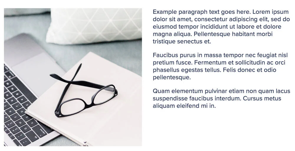
Desktop view
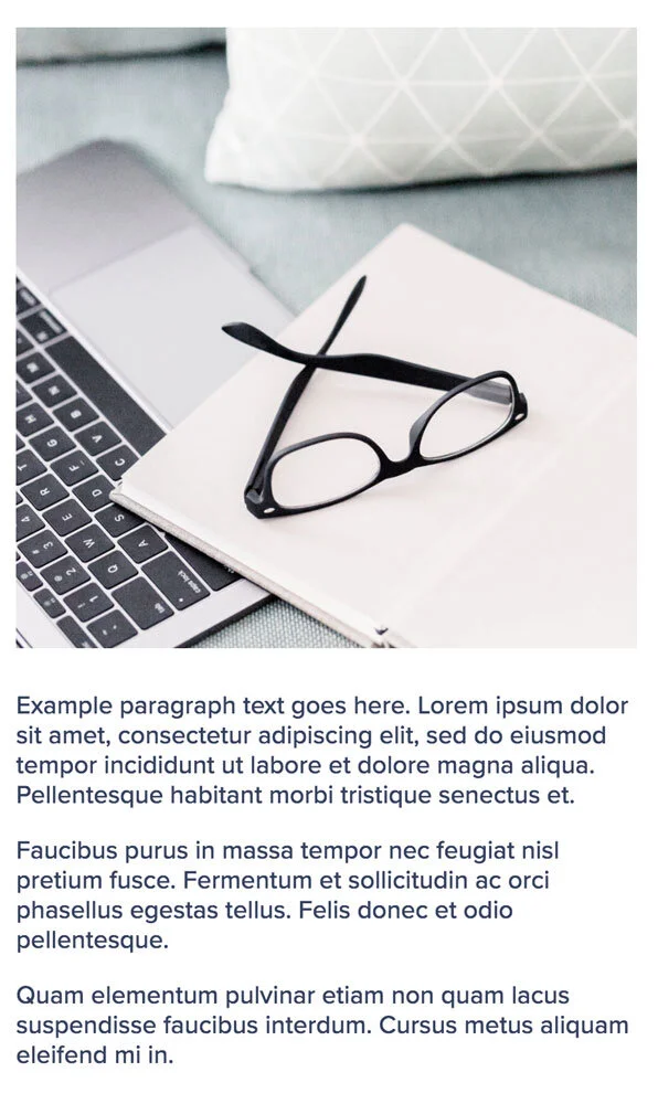
Mobile View
Now that you understand a little more about how things get rearranged between screen sizes, let’s dive into the 4 things you can do with the Spacer Block!

Featured freebie!
If you need help organizing all these free tips you’re digging up, you might need to be using a free project management app! This comparison chart will help ya pick one!
4 Ways to Use Spacer Blocks in Squarespace
1. CREATING A GRID-BASED LAYOUT WITH COLUMNS
Say you want 4 columns, each with an image & a text block for a title underneath the image, going across the page. Spacer Blocks work great for this!
You’d add either 4 or 6 spacer blocks to the page, all in one long string across the page. You’ll add just 4 Spacer Blocks if you want the columns to span the full width of your website page, and you’ll want to add a total of 6 Spacer Blocks if you want to control the indentation space on either side of the grouped columns.
Here’s a quick video walkthrough:
2. FAKE SIDEBAR
You can also create a fake sidebar with Spacer Blocks, but using them like we did with columns, but only using 2 or 3 spacers across the top of the page. You can adjust the width of each spacer to dictate how wide the section underneath it will be. Here’s a quick video:
3. PAGE INDENTATION SPACE
If your template has a narrow indentation space for the width of your page content you can manually edit this per page by using Spacer Blocks. (You can also change that setting in the Styles area of your Design Settings.)
Here’s a quick video:
4. RESIZING IMAGES
You can also use Spacer Blocks to resize images, without having to crop them! It actually works in the same way I showed you in the video for #3, but here’s the quick walkthrough: