

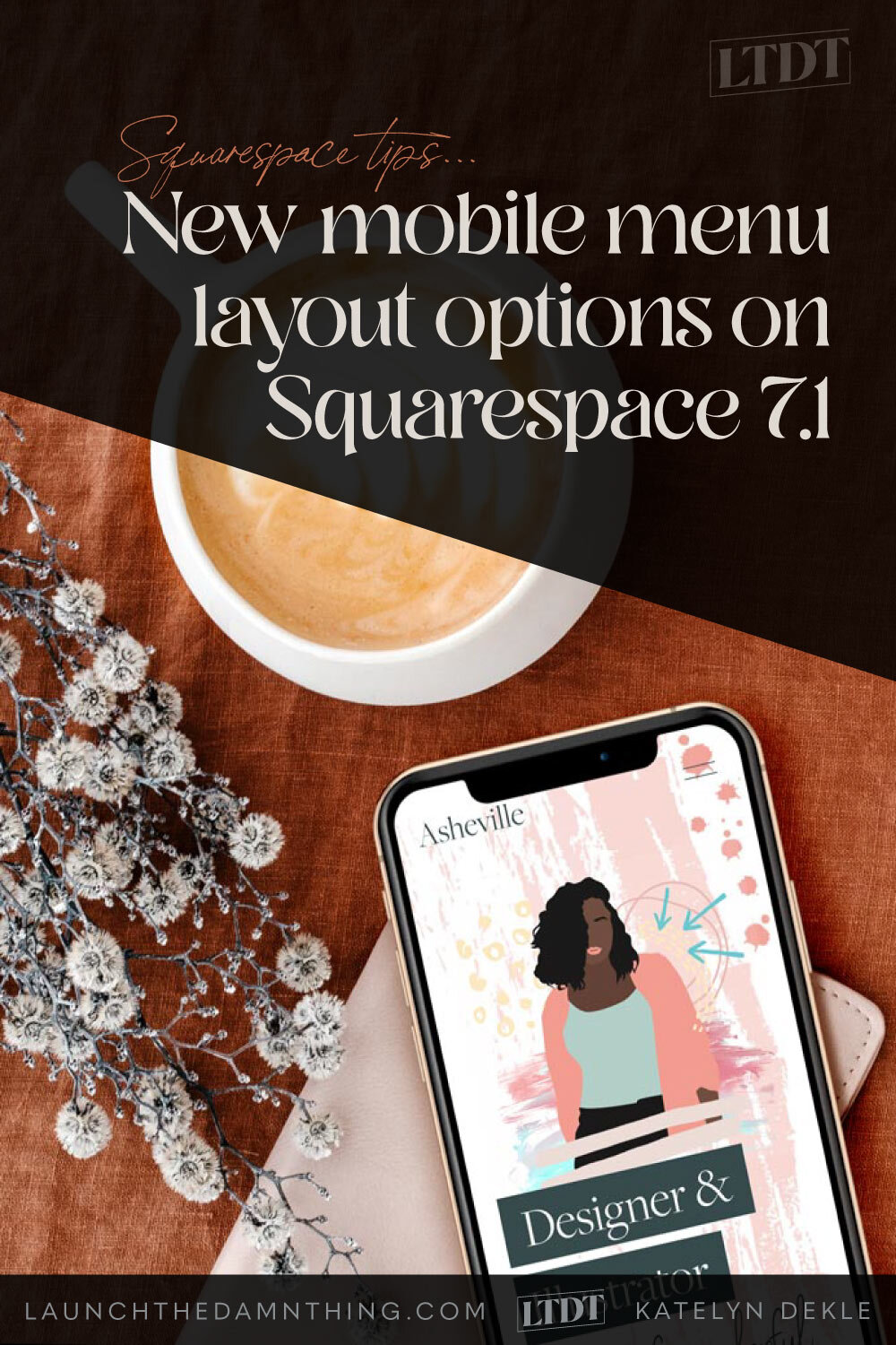
Mobile menu options on Squarespace 7.1
Have you already started a 7.1 site this year and realized there was like… no styling options for the mobile menu there?
Weird, right?
Well, Squarespace (finally) recently released some more styling options for their 7.1 site’s mobile menus. YAY!
So let’s go over what’s available now, real quick-like.
New Mobile Menu layout options for Squarespace 7.1 sites
First there are now 3 versions of the header options for your header:
Global (site-wide)
Desktop
Mobile
Now let’s investigate each one.
Squarespace mobile menu style settings - popup edit menu
To get there, make sure you’re logged into your account.
Click EDIT on the top left of your website preview area.
Once it switches over to edit mode, hover over the Header area.
Click the white button that says EDIT SITE HEADER button.
Wait for the settings to pop up, usually somewhere on your upper righthand corner.
Use the icons in the top right of that popup menu to navigate to the different sections of the settings there.
NOTE: you can click this menu & drag it around on the screen if it’s in your way / overlapping something you need to see.
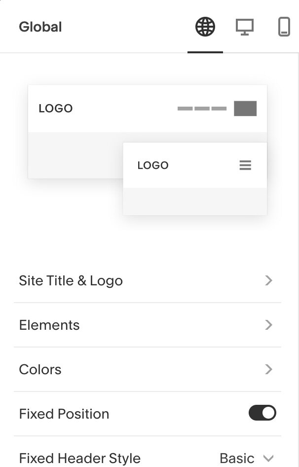
Global style settings (site-wide)
Global settings change the header, site-wide. You can add your site title & logo here, choose to add a cart or social media icons, colors (or a transparent background), dictate whether the header stays in place even when the viewer scrolls (“fixed”) & what style the fixed header will have.
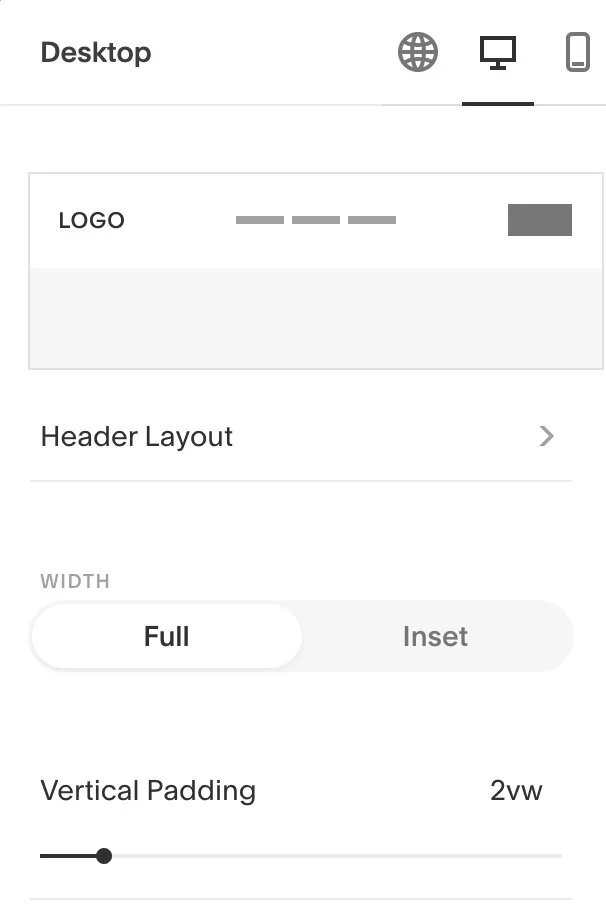
Desktop settings
Desktop settings only change the look of the header on desktop-width screens. You can control the layout, whether it goes edge-to-edge (width) across the screen, and edit the spacing for vertical, horizontal & links (shown in the following image).

Desktop settings (continued)
(The remaining options for desktop style settings, scrolling further down the menu.)
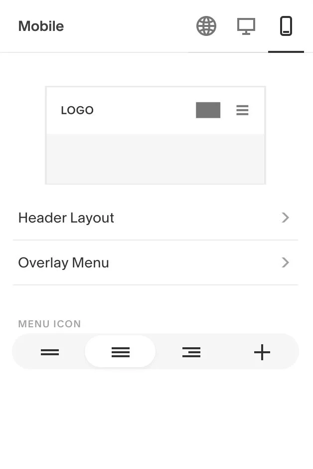
Mobile settings
Mobile settings only change the design on mobile-size screens. You can edit the header layout now (yay!), the overlay menu (which is the popup menu with your links in it) and choose the main header menu icon.
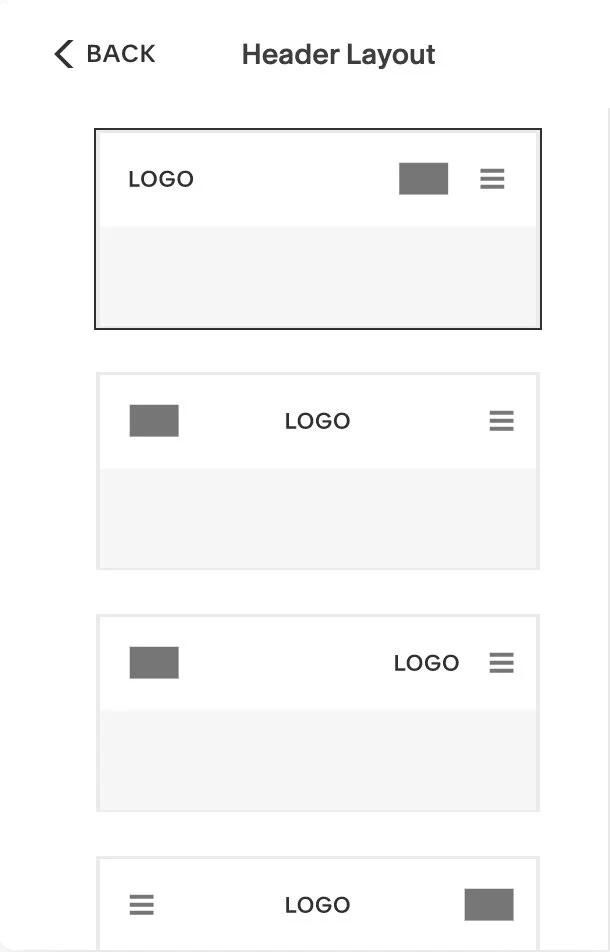
Mobile settings - Header layout
Here are some of the header layouts for mobile screens. You choose this the same way you’re used to choosing the desktop layout for the header.

Mobile settings - overlay menu
For the overlay menu, you can choose link spacing separately here, and then whether the links align to the left, center or right.
Those options are still fairly basic, but I’m not complaining here. It’s obvious they knew “more” was needed here, so here’s to hoping they release even more options in the coming months.
As a reminder:
This ONLY applies to 7.1 sites.
NOT 7.0 sites.
If you’d like to see how this works & how to access that menu within your site editor, take a peek at this quick video below:

Nix the expensive developers.
Want a website that’s this simple to edit yourself?
Squarespace sites are headache-free, and my templates come with setup guides!