

A strategic Color Palette will generate better Color Themes
What's inside this post: Hide

Via Giphy
Hands up if you’ve spent countless hours editing every single f*cking color… in every single (–or MOST, if not all, –let’s be honest here!) Color Theme in Squarespace’s Color Themes?
🙋🏻♀️
If you’re anything like me, you were thinking… “there’s got to be an easier way to do this” but you haven’t found it yet?
First of all, I’m sorry I haven’t shared this sooner!
There’s not much to be found on this topic, it seems, so I’m coming to your long-awaited rescue! 😂
It took me a while and some trial & error, but I finally nailed down how choosing the color palette STRATEGICALLY affects the way each Color Theme adjusts.
Now I’m realizing, all these years later, that a lot of people still don’t really understand how it’s meant to be set up and they’re still wasting so much unnecessary time setting everything individually.
How to strategically set Color Palettes for minimal edits to individual Color Themes’ Settings
This tutorial requires a lot of visual aid, so I’m going to plop today’s video right here.
If you prefer reading and you’d like to SEE it without the video, then scroll past it for a written explanation and some visuals to go with it.
Setting your Color Palette:
First of all, this is way easier to edit, see and manage from a Template Style Guide –and if you don’t know what that is, make sure you read this tutorial post also to help you get that set up.
READ MORE: How to get the most out of Squarespace’s Site Styles (in 7.0 or 7.1)
There’s a popular color theory out there that can help you choose your color palette if you’re feeling overwhelmed by this part. Paige Brunton covered this really well in her 60/30/10 Rule video over on YouTube, so I won’t get into that now but that’s what the percentages below are referring to. (If you haven’t watched that video, you can ignore the percentages!)
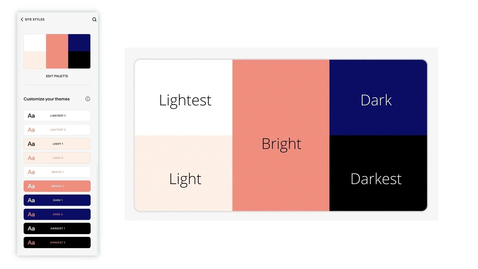
the 2 colors on the left are lighter
top left = LIGHTEST (ie: 60% or white)
bottom left = LIGHT (ie: shade between Light & Lightest; our 30%)
the 1 in the middle is complimentary & bright (accent)
BRIGHT (ie: 10% or CTA color)
the 2 on the right are darker
top right = DARK (ie: shade between Bright & Darkest; our 30%)
bottom right = DARKEST (ie: 60% or black)
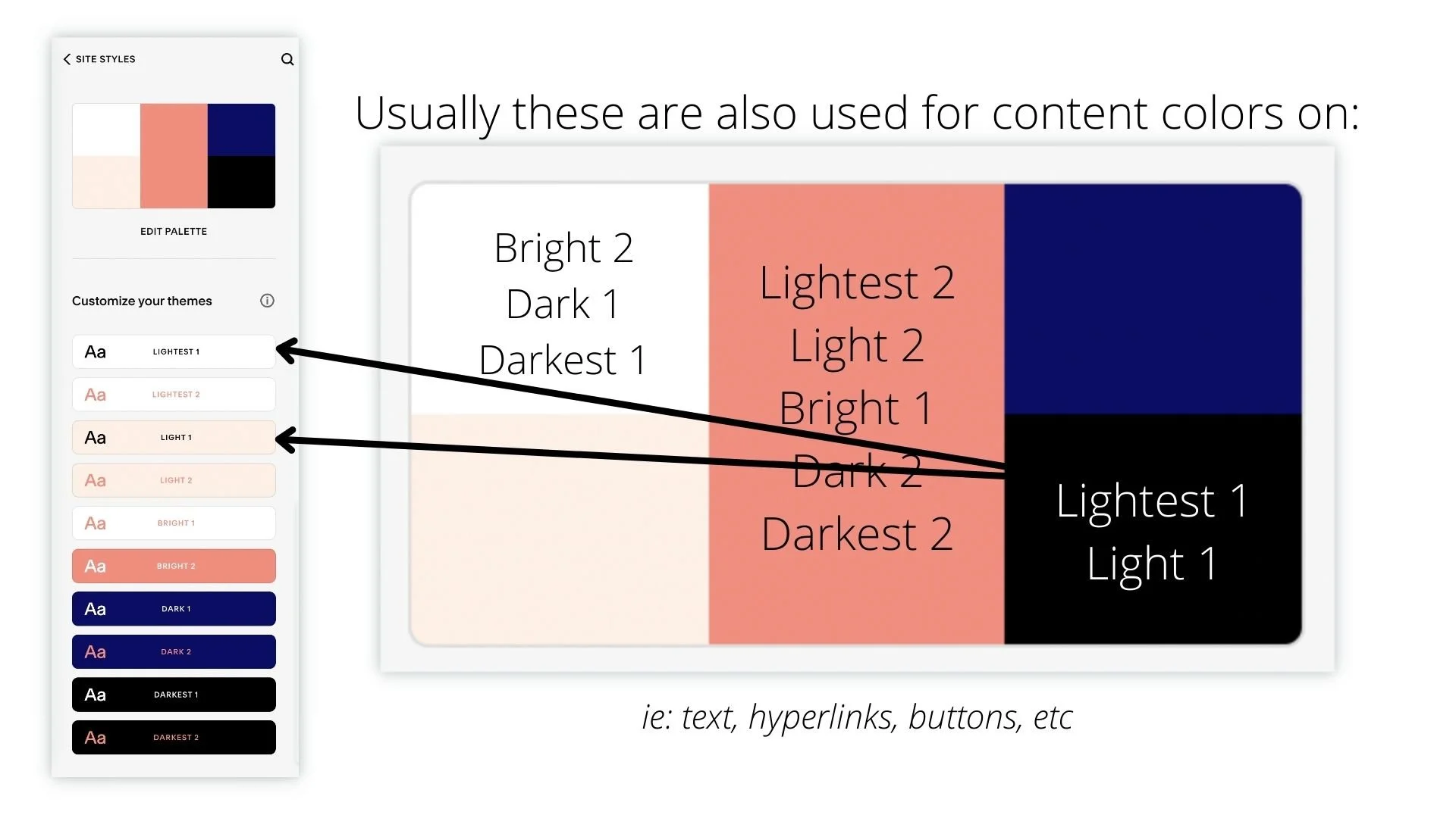
Then... your Color Themes will adjust
based on these basic parameters:
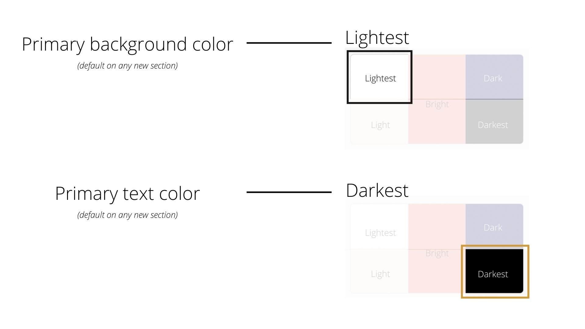
LIGHTEST uses the "lightest" background color for both, but
Lightest 1 typically uses the "darkest" color for the text
Lightest 2 typically uses the "bright" color for the text
LIGHT uses the "light" background color for both, but
Light 1 typically uses the "darkest" color for the text
Light 2 typically uses the "bright" color for the text
DARK uses the "dark" background color for both, but
Dark 1 typically uses the "lightest" color for the text
Dark 2 typically uses the "bright" color for the text
DARKEST uses the "Darkest" background color for both, but
Darkest 1 typically uses the "lightest" color for the text
Darkest 2 typically uses the "brightest" color for the text
BRIGHT 1 typically uses the "lightest" background, with the "bright" color for contrast
BRIGHT 2 typically uses the "bright" background with the "lightest" color for contrast
Squarespace’s system typically tries to adjust based on the contrast between the two colors, so you may notice that with some color palettes the way that Themes Lightest 2, Light 2, Bright 1 &/or 2, Dark 2, and Darkest 2 will behave differently than you might expect. (You can see this happen in Example 1 in today’s video at the 5:00 mark.
Need a visual aid for that? I get it!


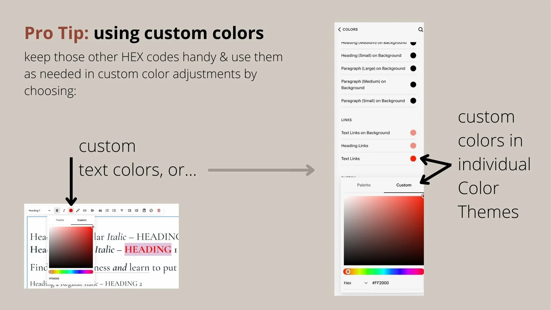
Another Pro Tip:
But there’s good news! You don’t HAVE to use every single Color Theme on your website. If you know you only need some of them, then ignore the others and no one will ever know you didn’t edit all 10. 😉
📌 Pin it!