

How to add a ‘fake’ sidebar with no code + no paid plugins!
Table of Contents Show
Maybe you don’t already know this, but 7.1 templates don’t have sidebars, ––anywhere. Womp-womp.
Of course, you can create your own anywhere, but if you do that piecemeal, you’ll have a lot of elements to update if you ever decide to swap out your photo or change a link, etc.
There’s also a debate about whether having side-bars is a good thing or not, so let’s tackle that first because you need to know all the facts before you can decide whether having one on your site is the right decision for you.
Should you have a sidebar on your site or not?
Basically, the debate here is simple:
Sidebars are great for navigating & accessing blog content (& other shit) from within each blog post.
Sidebars are great for distracting viewers by tempting them to click on other things & explore… before they finish the content on their current page.
It’s always fine to A/B test, so you could try it for a while & see if it helps/hurts, and then take whatcha learn there and tweak it. Of course, that also means that if you put a sidebar in several blog posts and you decide it’s not a good fit, you will have to go back & remove them individually, as it isn’t a structural element as part of the template, ..but more on that in a sec.
So, if you have viewers who want to devour #allthethings on your blog, having raving fans already, and you want to try to help them find all those things –maybe a sidebar would be a good thing for your site!
But if you know you have a bunch of shiny-object-syndrome –SQUIRREL!– type viewers, … you probably should drop the sidebar idea.

📌 Pin it!
How to create your ‘fake’ sidebar
❶ Create all your graphics
PRO TIP: Make sure that each graphic has a background that will allow it to show up well on any page/Color Theme you would use throughout your site!
I created mine (the ones used in my examples below) in Canva, and saved a different version with a similar layout as a FREE template that you can grab to get ya started!
Once you get it all setup the way you like, make sure you don’t forget to check how it would look on several different Color Theme background colors in your site, to make sure all the elements in the sidebar layout will display the way you want, almost anywhere!
You’ll notice in my example video 👉🏻 that some of the graphics’ bubbles “disappear” when on the same background color.
Once you’ve edited everything to your liking, download (save/export) it all out as PNG files with a transparent background.

FREE Canva template!
Grab the sidebar graphics template & finish the setup even faster!
❷ Create a new blog page on your website
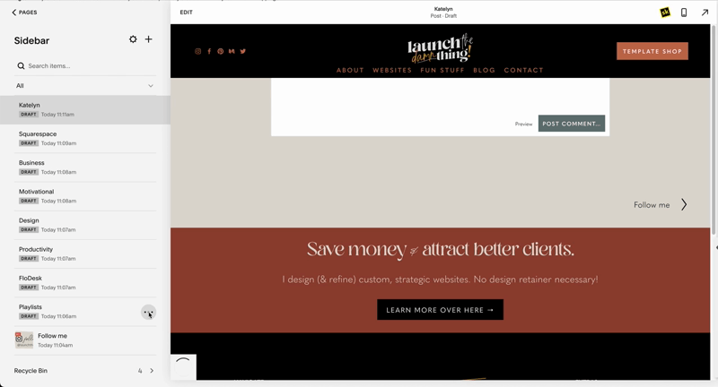
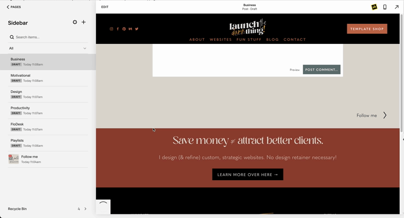
Next, add a new page to your Not Linked section, name it “Sidebar” so you know what it is.
It doesn’t matter which blog page layout you choose, because no one will ever see this collection/page in its raw form, so just pick whatever and save.
❸ Create your “posts” using your new graphics
You’ll create one empty post for each graphic you just saved from Canva.
Start from the bottom & go UP. Create these “posts” in order from your last sidebar element to your first, because they will display in order of publishing time/date (the most recently ‘published’ will show at the top of the sidebar, so you don’t start your “post” entries with the first item in your sidebar or it will show last).
Here are the steps for each ‘post’ you create here:
In the status, choose Publish
Go to Options
Upload the graphic (use the image editor to crop it if you need to, –but be aware that if you want a transparent background you will need to crop it elsewhere, because this editor will crop it + give it a white background by default! I used Photoshop to crop my images before uploading.)
Add the link to the Source URL area; this should be the link to the page you want this graphic to take the visitor to, whether it’s a blog category or a different page on your site, it doesn’t matter.
Turn on the toggle to link post title to the source URL. This makes sure the graphic for the “post” becomes the link itself, rather than needing the “Read More” link beneath it.
Here’s what that looks like:
Once you’ve done that to the first “post” you add (remember, it’s for the LAST item that you want to appear in your sidebar), then you can duplicate it if you want and just swap out the info. Here’s what that looks like:
Once you have ALL your elements in place within that Sidebar “blog” it’s time to go set up your actual sidebar somewhere!
❹ Adding your sidebar to a page
Want to see it in action? I’ve added it to this page! It’ll look a little funky on mobile, but my website’s analytics tell me you’re probably reading this from your laptop/desktop so take a peek and see whatcha think! 😉
The cool thing about this method is that each element within the sidebar is editable. You can always upload a new image or swap out the link and it will update everywhere you’ve added the sidebar in your site!
You add it by simply adding a Summary Wall block and selecting your newly setup Sidebar blog as the content it pulls from. Then you adjust the block’s settings to make it look like a sidebar:
Add the Summary Block & choose the Wall layout
Select the page that it pulls content from (your “Sidebar” blog)
Change the Primary & Secondary metadata to “None”
Under the Design tab, change the number of items to the same number you have set up for your sidebar layout. Mine was 9 so I changed the default number of 10 to 9.
Change the Aspect Ratio to “Auto”
Turn off all the Elements including the Title, Excerpt, and Read More link. You only want the Thumbnail to display for each “post.”
Change the Size and Spacing too;
Size needs to be full width, so drag that slider all the way across to the end. This makes each graphic (“post” thumbnail) as wide as the block’s width on any screen size.
Spacing will adjust the Gutter (space between images) and this will just be your personal preference.
Click off the Summary blog dialogue window to ‘save’ your settings (this is a new UI update, which I don’t approve, Squarespace! It’s not intuitive to not click Save or Apply first!), then
Save the changes to that page.
If you like the layout you just created, you can make a copy (duplicate) and name it “Sidebar copy” or “Sidebar template” then just duplicate that blog post entry (or other website pages) each time you want to use it somewhere else (without having to edit all the block settings each time).
Here’s what the sidebar’s Summary Block settings should look like:


