The Website Content Collection System My Clients Actually LOVE
What's inside this post: Hide
Dreading content collection processes? Here's the exact system I use to gather client info & content for website projects, before I turn it into website copy, ––saving my clients HOURS submitting the content, and saving me HOURS editing it while designing the website.
Let's be real: content collection used to be the bane of my existence. It used to be an awkward dance of trying to pull copy out of clients who either give you novels of information or simple three-word answers. That shit was time-consuming & often gave me more questions than answers. 😵💫
But I've finally begun to crack the code on a system that makes content collection actually enjoyable—for both me and for my clients.
I'm talking about a setup that gathers everything I need upfront, then uses AI to turn those responses into the first draft copy for the homepage, about page, service pages, and more!
Before I explain/show you my solution, I want to validate something for you first: if content collection makes you want to hide under your desk, you're not broken. This is quite literally the biggest operational nightmare in the entire web design industry. It’s realistically a problem that’s so universal that entire businesses have been built specifically to solve it. Content Snare, for example, serves over 1,600 companies across 63 countries and was founded specifically after interviewing dozens of agencies who all had identical content collection nightmares.
Another great example is my favorite Client Portal software (with a one-time payment!), Kitchen.co* which, like Content Snare, was created by a web design agency that had similar problems in-house & literally created Kitchen* to solve it for themselves. They used it internally for years before releasing it to the public, so now we can use it too!
The research is pretty sobering.
According to industry surveys and designer testimonials:
⏱️ Projects often reach 80% completion before grinding to a complete halt waiting for content
📧 Email management alone consumes about 4-5 hours per client project
⏳ Designers lose approximately 40-50 hours per month chasing content
Some horror stories from the trenches reportedly include clients taking "2 years to come up with content" and projects "freezed up for nearly 10 months" while designers wait for basic information. One Content Snare founder interview revealed: "Almost without fail, the biggest problem web designers face is getting content from their clients... It is the biggest pain in the ass!"
Look, I've been there because we’ve ALL been there. At my old in-house design job, during lunch breaks I used to read Clients From Hell regularly (remember that site?! Now it’s called ‘Not Always Right’), nodding along to some of the horror stories I read about clients who ––for example–– thought "freelancer" meant "free work" and was shocked he/she got an invoice from the designer even after discussing prices before doing the work. 🤭😬🫣
This is exactly the reason why I’ve been on a mission to create a system that helps me manage the project processes necessary to keep projects on time, content all in one place, and maintain both my own sanity & my clients’ during a creative process that can otherwise be quite daunting!
For years I used ‘task management’ apps like Notion, ClickUp, or Asana to do this. But in late 2024, I’d had it!! I was breaking up with using PM tools for project management with external parties (ie: our clients, who are not ‘users’ on our accounts). I decided it’d been a few years since I’d last looked for good ‘client portal’ systems so I did a deep dive (see the results of that client portal research here), looking for a solution that would NOT overlap too much with my CRM, Dubsado (or Honeybook, etc) and was reasonably priced.
Yeah, you can use Content Snare to manage projects outside of the onboarding & booking processes handled in a CRM like Dubsado or Honeybook ––for a whopping $35 - $215+ monthly extra subscription, depending on the plan you choose… but when prices of everything else are going up, an added annual expense sounded pretty shitty to me. 🤷♀️
But asking clients to create accounts in MY task-management-app-of-choice just to work with me? That also felt like friction neither of us needed/wanted.
When I found Kitchen*, I realized it gives me everything I loved most about my Notion system (and fixed things I didn’t love too), but with way less setup for clients and way more functionality for project management with someone who’s not on my ‘team’ (a paid user in my account). Plus, Kitchen actually wants to be a client portal. Like… it literally was designed for exactly that purpose, and ONLY that purpose. It’s not trying to be anything else too, it just is what it is. Using Notion was me trying to force a note-taking app to do something it wasn't really designed for, just because it was flexible enough to try it.
I created the Ultimate Client Portal System which includes this specific Content Guide form + AI prompt setup (which I’m about to walk you through) because I was tired of watching talented designers get bogged down in emails, while losing money on delayed projects and feeling like they were constantly chasing their clients for the information we need to get started.
My system does three critical things:
Lessens the workload on clients by asking smart questions instead of expecting them to create content from scratch for every little thing
Fills in the gaps with AI so incomplete or short responses can still become usable website draft copy
Relies on ONE single easy-to-use platform where both designer and client (even without a password) can go for everything project-related—no more scattered emails, lost files, or "where did you send that again?" moments
This isn't just about making my life easier (though it absolutely does)! My intention was to create a client experience that actually works for people who aren't professional copywriters and don't know what’s needed or how to write it.
And before you ask—no, this isn't a secret process. My clients know I use AI to help with copywriting because, hello, I'm not a copywriter! That's not the service I provide. But what I can do is create a system that makes their lives easier and gets me better content to work with if they don’t have a copywriter to help. (Though I do have a few copywriters I’ll recommend to my clients if they have the budget to hire help –that’s always more ideal.)
Now, let’s see how this whole thing works!
Inside My Kitchen* Client Portal
Clients can log in with or without a password, to MY Kitchen account (meaning, they don’t have their own account with Kitchen). They can log in with just their email & a magic link code, set a password on their own if they want, and even set up Two-Factor Authentication for their login if more security is important to them.
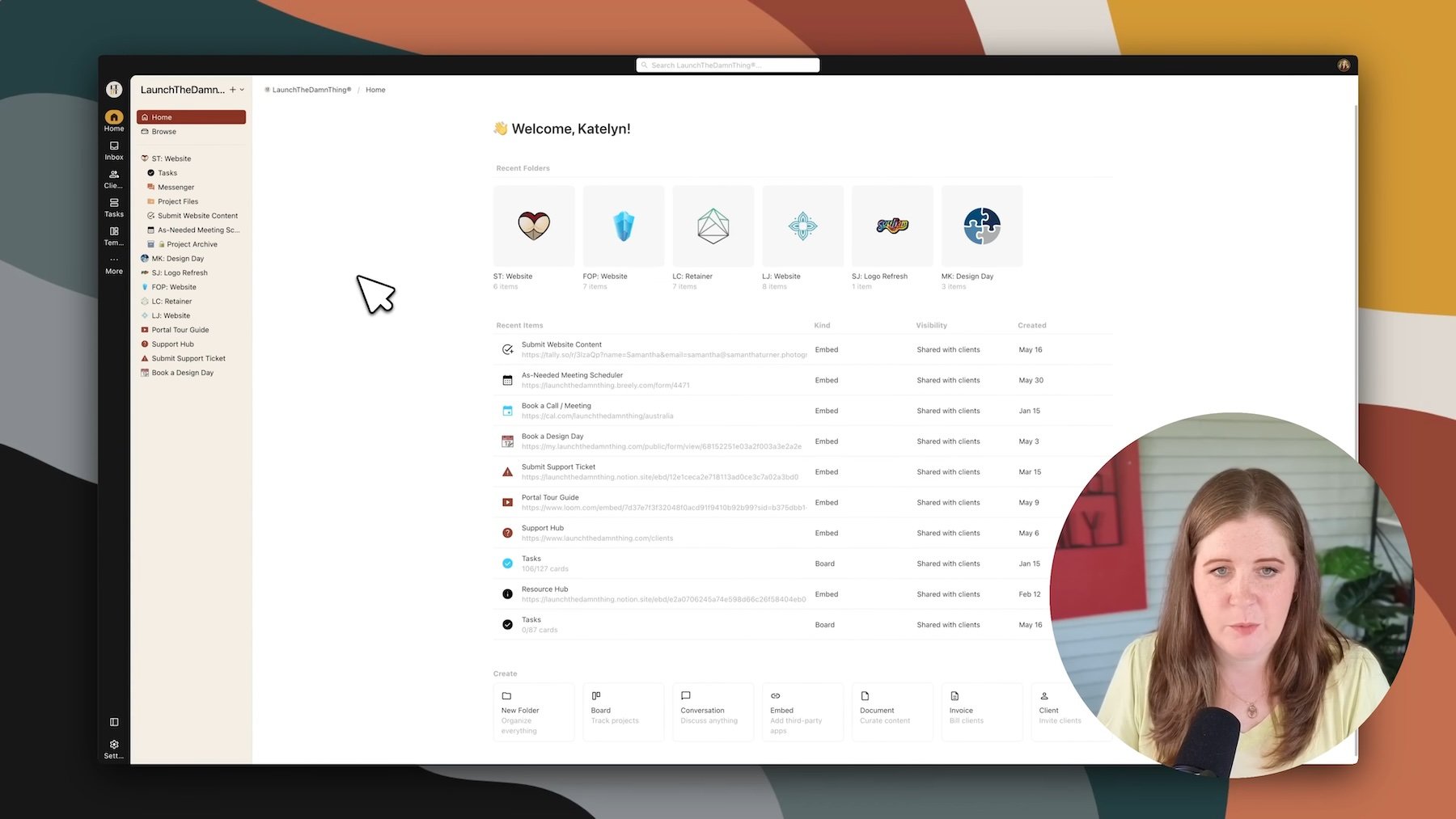
Here’s what’s inside my actual client portal, so you can see where the content guide form fits into the overall system, and peek at what my clients see every day while they’re working with me on a project.
Screenshot from the video walkthrough
A simple dashboard
When clients log into Kitchen, they see a clean, LTDT-branded version of their project hub. No overwhelming menus &/or confusing navigation, because they only see THEIR project(s) in the portal and their Home dashboard shows what they’ve visited recently so they can jump back in quickly.
When I log in, as the owner/designer, I see all my non-archived projects via:
Recent folders across the top of the Home dashboard for easy access
Quick create menu for adding new items, from the bottom of the Home dashboard
Browse options to see/access everything in one place, from the top of the sidebar menu
Listed projects in the sidebar for all my active projects & client-facing resources
Inbox to easily manage notifications, updates & messages
Each client gets their own sidebar folder with a custom icon (usually their brand favicon), so I can tell which folder belongs to which client at a glance and they feel more at home in being in the space. Inside each project folder, they have access to:
Essential project tools
Tasks (‘Boards’): Where all the “magic” (project’s task management) happens. I've got lists for:
Homework (their to-dos)
To-dos (my tasks for transparency & so I don’t forget anything!)
Doing (updates for work in progress)
Done (status updates for completed tasks)
Waiting (anything on hold)
Messenger (‘Conversations’): Direct communication without email chains, but also allows each of us to reply to messages from our inbox without losing those pieces of the conversation in the portal
Project Files: A central spot to upload brand assets, photos, videos, whatever
Files also have built-in approval buttons AND comment threads with pinnable comments to leave feedback on specific areas of the file preview
Content Guide: The form they fill out to submit their website’s information (more on this in a sec!)
Embedded Scheduler: So they can book any required or ad-hoc meetings for the project, within my availability
‘Extras’ Folder: A private-to-me folder for stuff they don't need to see yet, or that I need to get out of the way but am not ready to delete
The whole setup is designed around making both our lives easier. They know exactly where to find things, it’s easy to log in, it feels familiar, easy to navigate & use, ––and I know exactly where everything is.
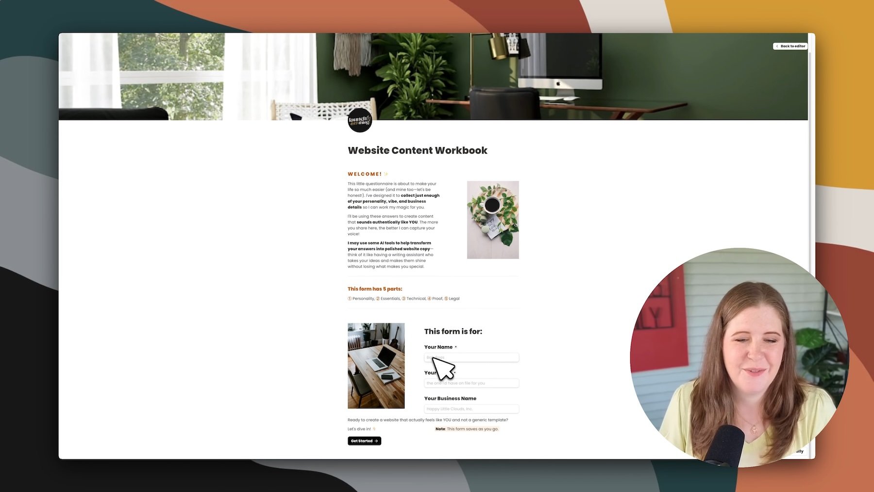
My Content Guide Form Template
Screenshot from the video walkthrough
Over the past 10 years of running my business, I’ve tried extracting info from endless email chains &/or discovery calls, and I’ve tried countless different ways of using tasks or custom forms per page of the website, to collect the content & info necessary to create a unique website that fits my client’s business. At one time, I was sending 10+ form/questionnaires with Dubsado, breaking the content collection down per page of the site (1 form for Home, 1 for About, 1 for Services ––you get the idea)! In task management apps, I created massive lists of tasks organized by statuses based on the phases of the project. In the Homework phase, when using ClickUp the client filled out multi-page Google Doc workbooks, and when I switched to Notion, I recreated those workbooks in Notion pages within their template… 😳
It was a lot to manage, sift through & keep updated for me, and likely also felt daunting to clients without my reassurance & guidance along the way as they had (inevitable) questions.
Now, I use a single comprehensive Tally form that does the heavy lifting upfront, with built-in conditional logic to hide fields/questions that aren’t relevant to their business (shortening the form, wherever possible).
Why Tally?
I’m using Tally.so* for the Content Guide form because Tally feels a bit like Notion, so the interface felt familiar and easy to use.
I'm also using their free plan, because it offers more than enough features (including their conditional logic and signatures) without a subscription or even entering a credit card! I tried building something similar in other form builders, but nothing else quite came as close to what Tally lets me do without paying a dime AND also let me templatize my form to share with students so they don’t have to recreate the wheel.
A ‘generic’ form, customized for each client
Here's a little Tally secret that'll blow your mind: you can pre-populate specific fields in the form using hidden fields + variables in the share link’s URL. When I send a client their form link, I can automatically fill in their name and email address for them, like this:
tally.so/your-form-url?name=Sarah&email=hi@sarahtakesphotos.com
Keep the ?name= then fill in the blank, keep the &email= and fill in the second blank, with your client’s info. When that client opens the form, it already feels personalized even though it's the exact same generic form I send everyone.
NOTE:
This doesn’t work unless you have the form setup to plug in those variable values using Hidden Fields in the form ––but my template already has that setup so it’ll be plug-and-play for you!
5 parts (pages) inside the form
The form is split into five main sections, and I'll walk you through what makes up each one. 👇🏼
screen capture of Part 1 of the Content Guide form template walkthrough in the video
Part 1: Brand Personality & Style
This section is all about understanding who they are and how they want to be perceived. I'm not really asking surface-level questions—I'm digging into the psychology behind their brand choices & the FEELING they want their brand & website to have, which influences my design choices.
Car Type Exercise: I show them different types of car and ask which one they'd choose + why. This isn't about cars—it's about values & what the car represents to them. (Someone who picks a Jeep tells me they're a bit more adventurous. Luxury car? They value premium experiences. Prius? Eco-consciousness matters to them.)
Interaction Words: I give them several lists of positive adjectives & character traits to help me narrow down what ‘personality’ their brand should have. For example, a list of words that must describe every client interaction—things like "professional," "warm," "efficient," "creative." Instead of making them think of descriptors from scratch, I'm giving them a menu to choose from.
Never Words: Just as important—I’m also providing a list of negative descriptions and asking what should never describe their business. This helps me understand their boundaries & what they’re afraid of being perceived as. (Example: things like "manipulative," "amateur," "boring.")
Client Feelings: Asking how they want their clients to feel gives me insights on how to talk about, show, organize, and design their content. (Example: cared for, confident, empowered, inspired—these emotional vibes can shape everything.)
Website Inspiration: Instead of vague "make it look professional" requests, I ask for specific website examples (or for a Pinterest inspiration board) and what they like about what they shared.
Style Personality Visuals: Are they feminine, masculine, or neutral leaning? I show custom-made visual examples of what I mean by each, so there's no confusion.
Colors & Fonts: I ask if they already have a color palette and font styles chosen. If they say yes to having brand colors, they see detailed questions to get their color codes for the palette. If no, those sections disappear entirely. Same with fonts; no wasted time on irrelevant questions!
screen capture of Part 2 of the Content Guide form template walkthrough in the video
Part 2: Business Content
Logo files: logo & alternate logo files, designed icons or graphics, patterns, favicon/browser icon, etc.
Business Info: their ‘about’ page / business story, what makes them different from their competitors, etc.
Service Info: package details for up to 3 services, process details, competitive advantages
screen capture of Part 3 of the Content Guide form template walkthrough in the video
Part 3: Essential Business Information
Contact Info: contact preferences, business hours, average response time, social media profile links,
Contact Form: what they want to collect in the inquiry form & which field types if they care
Answering Questions: listing common questions & answers they say over-and-over for FAQs
Optional Competitor Analysis: check their competitor website for weak spots or keyword inspiration to bolster my client’s website & SEO strategy
screen capture of Part 4 of the Content Guide form template walkthrough in the video
Part 4: Proof & Credibility
Testimonials: Space for up to 3 testimonials, or the option to share/upload a document listing more than 3 they want to use on the website
Credentials: Certifications, experience, or anything that builds trust or proves their industry authority & expertise
Primary Goals: What do they want the website to accomplish, and in what order (listing common goals for them to choose from)
screen capture of Part 5 of the Content Guide form template walkthrough in the video
Part 5: The Legal Stuff
Legal Policies: Here's where I educate rather than decide for them. I explain why they need privacy policies and should have terms of service, give them resources if needed (Termageddon*, or Creative Law Shop’s The Foundry™️*), and let them choose their approach. Again, conditional logic helps to simplify wherever possible.
Website Accessibility: I explain that I'll make accessibility decisions based on my current knowledge, and they need to be okay with that approach.
Disclaimer Notice + Signature: I make sure they understand the information I’m providing is for educational purposes only & I remind them to do their own due diligence before deciding which option works best for them, whether they follow my suggestions or not.
Writing the website copy
Once they submit their form, Tally sends me an emailed copy so I know it's been submitted/completed. My clients submit their ‘homework’ at least a week prior to starting the website design, so I don’t always need to do anything right when I receive their submission.
From form to website copy in minutes
When the project begins later, I use their form submission (what they typed, selected, etc) alongside AI to fill in the gaps and write the first draft of their website copy.
The prompts ask AI for help looking for these specific pieces of information in the form submission, then using that to determine their niche, tone, and messaging, BEFORE we draft the website copy. The personality questions help AI write with their brand’s personality/vibe, and my custom AI prompts work with the specific questions from my content guide, to bridge the gap between a general framework + the specific information submitted that’s based on each client’s unique business.
––In a matter of MINUTES. Not hours. Because fuck that! 😂
The AI prompt system
I copy all their responses and head over to Claude (my AI tool of choice for longer content writing), but you could use ChatGPT instead if that’s your preference.
Specifically my AI prompts are designed to:
Identify their target niche based on all the personality and business info they shared
Extract their unique voice from how they described themselves and their values
Create page-by-page, section-by-section, website copy that sounds like them, and complements their unique business
The result? Homepage hero sections, about page copy, service descriptions, team bios, FAQ content—all written in their voice using their specific information.
Using Claude vs ChatGPT
Since we're talking AI tools, I’ll share what works best for me.
First: PAY for the tool you decide to use. Sadly, ––and I say this from personal experience as an AI-skeptic myself–– the free plans are shit for customizable content. If you don’t need to achieve a specific ‘sound’ in the written content, then free plans work just fine. But if you’ve never liked anything you’ve gotten back from using AI tools like Claude or ChatGPT, I’d bet anything it’s at least partly due to using the free plan. The paid plans are DRASTICALLY better. And no, I’m not an affiliate for either tool, that’s just a fact!
Second: figure out which one you list best for this purpose. I actually do pay for both ChatGPT and Claude, but for writing website copy—like actual paragraphs of content—Claude consistently gives me better/longer results. ChatGPT is fantastic for bullet points, high-level overviews, and data analysis (too). But when I need flowing, natural-sounding copy that doesn't sound robotic & a minimum word count (vs a maximum)? Claude wins every time. Ask Chat to write a 2,000 word blog post & tell me I’m wrong. 😂 Claude can actually do that.
For this specific use case (turning form responses into website copy), I’ve found Claude almost always writes way more content and it sounds more human to me in the first draft. You’ll still need to do some editing, of course, and your experience may vary, but that's been my experience after months of testing both.
That said, if you’re just a Chat user, you can absolutely use ChatGPT for the research part first, if you want; then try writing the page copy section by section (one prompt at a time). It’ll do much better if you break it down into segments with just one thing to focus on at a time.
The Complete System: Portal → Forms → AI
Here's how it all works together:
Client onboarding flow
Client books project and gets forever-access to my portal in Kitchen
Welcome video & onboarding message explains how everything works
Content form link is shared in the Portal & in a ‘homework’ task with a due date
Client fills out comprehensive form at their own pace
I receive their submission and later run it through AI with my custom prompts to guide it
Website copy gets generated based on their specific responses
Content gets refined during the design phase (by me) and later by the client during revisions
Why this system actually works
For Clients:
No endless content calls. No more "I don't know what to write" overwhelm. They answer questions about themselves and their business, and later website copy magically appears!
During the project, they have a direct line to me from the portal or from their inbox so they never feel in-the-dark about anything.
After the project, clients have post-project access to resources to help them manage their website and easy access to book more projects if they need my help.
For Me:
No more pulling teeth to get information or follow-ups from me to chase down content. No more starting from scratch on every project because everything is templated.
I have one place to access EVERYTHING for the project: from files to messages & tasks. If I ever can’t find anything, I can search for it. If I need to add something else for a specific project or client, I can.
Kitchen’s portal features don’t negatively overlap or interfere with my other necessary tools as a business owner (my CRM: Dubsado, or my task management app: Asana)
For the Project:
Easier processes lead to happier clients & simpler projects.
A clear structure & location to put everything, helps reinforce boundaries for everyone.
Better content leads to better websites. When copy actually reflects their personality and goals, the whole site comes together more cohesively.
Real Results: What my students & clients are actually saying!
The difference is night and day, even from my own client’s perspective!
Here are some of the feedback I'm getting from my own clients.
Both of these ladies are repeat clients who used my old Notion or ClickUp ‘portal’ system with me in the past! 👇🏼
"I’m OBSESSED. Those updates to the homework?! Life-changing. This? I can do. This feels light, clear, and exactly what I needed. You crushed it."
"Good morning, Katelyn. I LOVE this new portal! Thank you for putting it all together and making it easy."
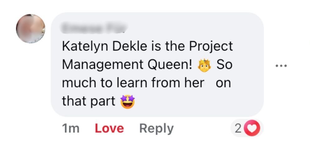
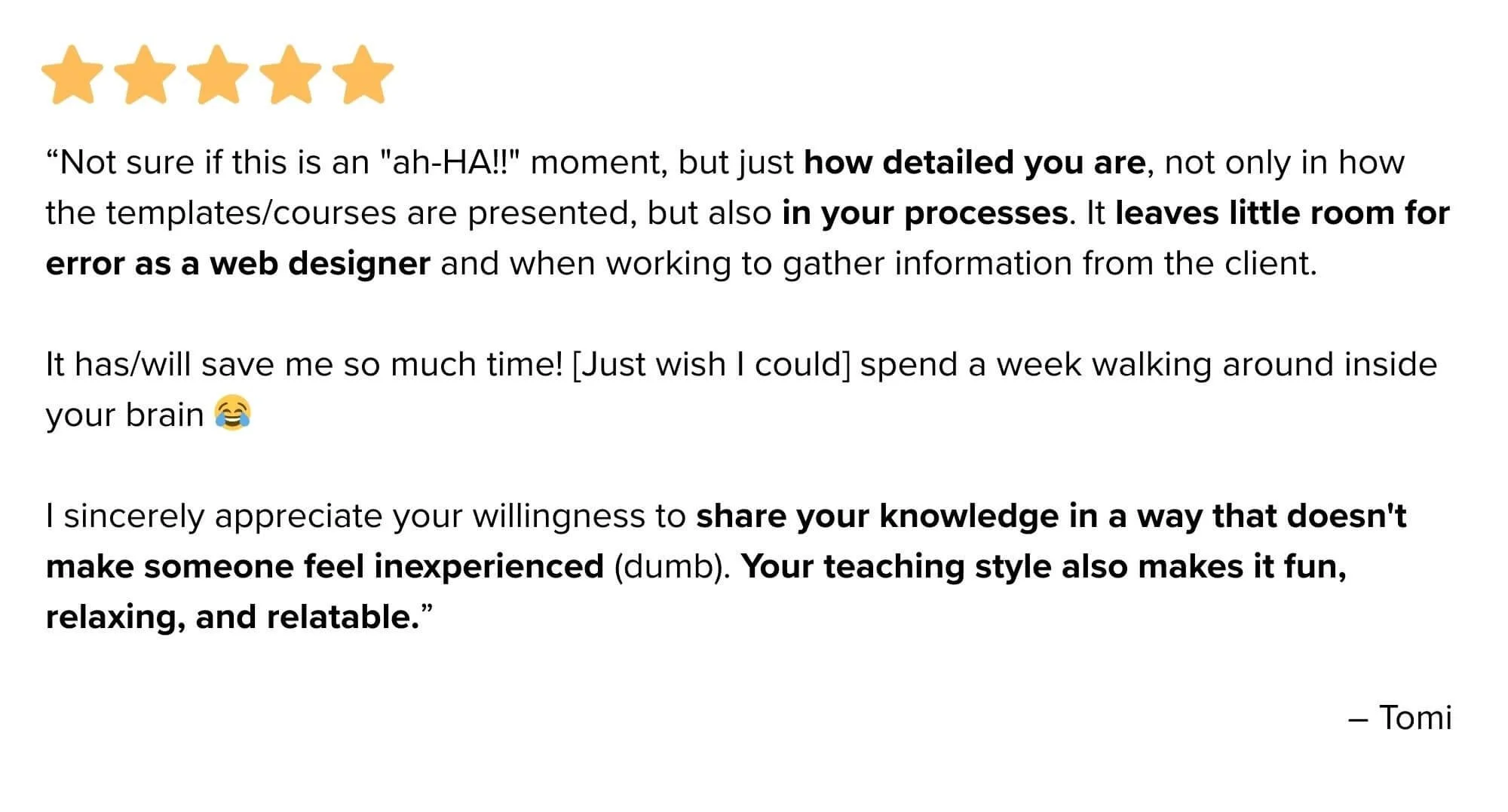
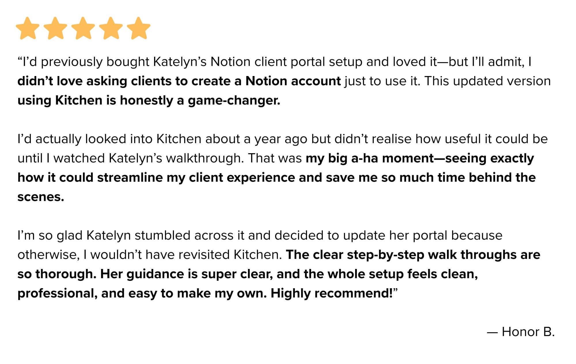
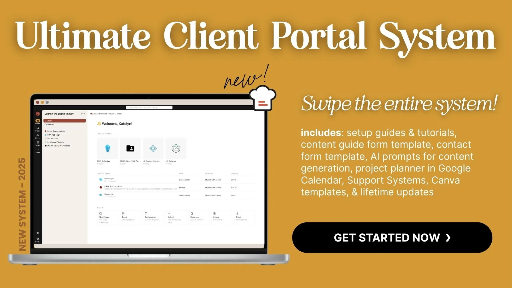
And here are some rave reviews from my students who took my Ultimate Client Portal System course to set up their own portal system for their clients:
Setting Up Your Own Version
Want to recreate this system for yourself? Here's what you'll need:
The tools
Kitchen* (for client portal): Yes, it's a paid tool, but the time savings and client experience improvements justify the cost
Tally* (for forms): Start with their free plan—it's legitimately robust
Claude or ChatGPT (for AI copy generation): Paid versions give better results for this use case!
Termageddon*: partner’s like us (designers) can use it for free on our own website, which helps familiarize us with it for use with our client’s sites & we get commission when our clients choose it.
The mindset shifts
Stop trying to be a copywriter if that's not your service. Use AI to bridge the gap between client information and usable copy.
Hire a copywriter if you want truly great website copy. AI doesn’t replace their expertise & experience ACTUALLY using the copy & getting results.
Embrace transparency with clients about your processes. They likely don't care that you use AI—they care that the end result sounds like them–– but tell them if you’re using it; don’t hide it!
Invest in repeatable, easy-to-use systems that save both you and your clients time. The upfront setup pays dividends on every. single. project. #promise!
Beyond the Basics: What's next?
This content collection system is just one piece of a bigger client management puzzle. Once you've got smooth content gathering down, you can focus on other areas like:
Project timeline automation
Feedback collection workflows
Invoice & payment processing
Post-launch support systems
The goal isn't to automate everything—it's to automate the stuff that doesn't need your creative brain, so you can focus on the parts that do. 😉
Main takeaway:
Content collection doesn't have to suck. With the right systems & tools (+ AI prompts), you can turn the most industry-dreaded part of website projects into something that actually adds value for everyone involved, including yourself.
Your clients get copy without being forced to write it themselves.
You get comprehensive information upfront.
Projects move faster & feel more professional.
And honestly? When a client says "This is the most organized process I've ever experienced," it makes all the setup work worth it!
The system I've shared here took years to hone, then months to refine, but now it runs like clockwork.
Every new client gets the same smooth experience, and I don't have to reinvent the wheel each time.
If you're tired of chasing content, tired of generic copy, and tired of helping clients who understandably don't know how to articulate what they want—this approach might just change how you work, forever.
Your future self (and clients) will thank you for making this switch.
Have follow-up questions? Drop them in the comments!




![★★★★★ “Lady you have outdone yourself once again! … I love the content prompts. I am blown away [by] how much is in here! Once again OUTSTANDING work! I’ll say it again - you’ve outdone yourself - the incredible detail and amount of work is insane!”](https://images.squarespace-cdn.com/content/v1/5f7cd69ca445a016c48eecdc/c9a11835-0662-43cb-9fe5-5f13b1802df9/Gray+Minimalist+Photography+Review+Instagram+Post.png)


