

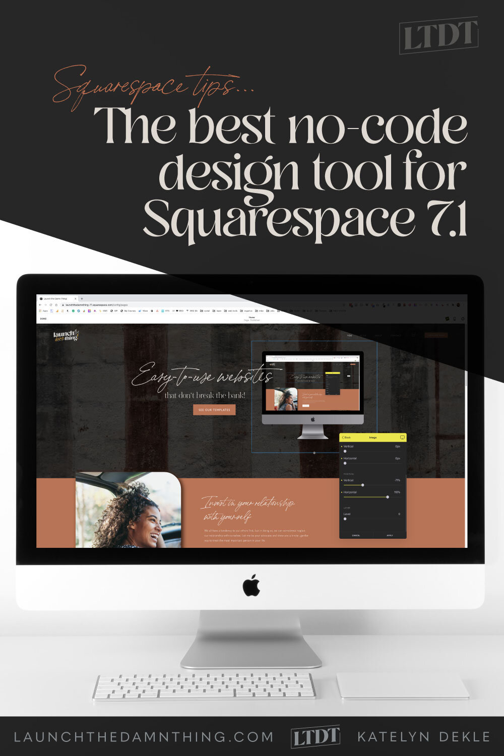
The best no-code design tool for Squarespace 7.1
Recently, I was helping someone with a snippet of custom CSS to help her change the size of her Add to Cart button on her 7.0 product page. It got me thinking about how wickedly handy adding some custom code can be, but also how inaccessible it seems.
Now, I’m certainly no developer, but I know enough to skate by successfully with (what I consider) relatively minor edits, but being able to help her with those 5 or so lines of CSS felt really good, because she was soooo grateful.
There is an obvious problem though: not everyone knows the CSS to make those extra changes, beyond what you can do in the editor or Site Styles panel.
Now, it's honestly taken me a few years of experience to pick up what I've learned + an HTML & CSS textbook, some basic code classes, and a course on CSS specifically for Squarespace.
But as a designer, adding code also poses a problem for us: how can we make the site user-friendly AND use custom code to achieve the best design for each client?
Many clients really don’t want to touch any code. Don’t get me wrong, you can achieve great results without it, too! But sometimes ya just need a little “extra” something.
And sometimes a client-requested tweak does require some CSS because Squarespace lacks the editing capability for that element, otherwise.
If you're still reading this, I know you feel my pain!
That being the case, this new no-code design plugin for Squarespace 7.1 sites, is a seriously awesome solution for the bulk of this problem.
To jump in & see all the fun things it's capable of + get easy access to their promo video to see it in action, keep reading!
*There are affiliate links in this post! I LOVE SquareKicker so much (for both myself & my clients) that I’m now an affiliate for SK. I’ll get a small percentage of your first payment to SK, at no extra cost to you. My reading fund thanks you! 🤓
Introducing SquareKicker*
What is it?
This little plugin is a powerhouse of design ‘extra-ness!’ The install is super simple (just copy/paste a line of code & type in your Squarespace url in your SK account).
Yes, it does require a subscription for access, but it’s absolutely worth it.
They also have a 14 day, no-credit-card-required, Free Trial too –of course. In the free trial mode, any changes made will only show in edit mode (not on the public site); you’ll have to upgrade to a paid plan for the changes to show on your public site. You can cancel your subscription any time though and the changes you’ve made with the plugin will stay (you just couldn’t make further changes, without a paid subscription). Makes sense! 🤷🏻♀️
How does it work?
After you’ve installed the plugin, its icon shows up in many of the blocks we know & love, giving you even more options to edit each one.
Basically, as you choose options within the plugin for each block, you’re simultaneously adding extra CSS to the code that Site Styles inherently creates when you choose options there, without writing a single line of code yourself.
It effectively works the exact same way as if I were adding Custom CSS to the site. This plugin is literally custom-coding for you, and lets you see the options live, visually, in a way that feels relatively native to the Squarespace platform, not unlike using Site Styles. 🤯
In other words: using it feels like using most of the other Squarespace style options, and yet it gives you extra capabilities that Squarespace’s own platform doesn’t currently offer (again, not without adding custom code).
Yes, but what’s the catch?
It doesn’t currently work on any 7.0 sites, sadly! So I feel your pain if you just got excited AND let down in the span of a single sentence. 😔
It can also be a little quirky while adjusting elements between device sizes.
And it doesn’t include editing options for every block, section or page.
BUT they’re still working on expanding functionality & are happy to take your suggestions & support requests, too! Their support is –to use an admittedly dumb millennial phrase– amaze-balls!
What can SquareKicker* do?
This is actually so new that I don’t yet fully know everything it’s capable of quite yet & they’re adding functionality regularly too. But here are a few things I do know that I got really excited about, –and that’s what made me so excited to share it with you!
Edit fonts
It has a great menu for editing fonts & access to over 1,000 different styles (Google fonts, mostly, but Adobe fonts are coming soon!) Great for changing the font style in 1 place, adding a background, changing the spacing around the block, moving the text around within the block and so many more options!
Normally, within Site Styles for 7.1, you can select whatever font groupings you want for H1-H4, then P1-P3. All the Headers have to be the same font but can be different sizes or colors of it; same for Paragraph fonts.
Great for brand consistency, –but can be super stale or boring.
Say you want your Headings and paragraphs to generally be those fonts sitewide, with a handful of exceptions. This is where Squarekicker* will keep you from kicking yourself while you write code, trial-and-error style (because hey, we’re all on some kind of budget & not everyone can hire a developer to write a snippet for them at any given moment, –am I right?!)
SK will let you choose which Heading/Paragraph to target, then change it simply within their own plugin.
In the example below, I’ve targeted the H1 font and all I’ve done is adjust the font size slider, to make it bigger than I have it set in Site Styles, for this one text block. 🙌🏻 Easy-peazy & it doesn’t affect the global (site-wide) styling I chose in Site Styles.
Adjusting font styles per block, without affecting global styling
Edit images
Want to crop your image into a circle? Add rounded corners? –to specific corners? Add a shadow or a border?! Move it behind some text or overlap it onto another section?!?
Yes, yes, yes, –yes, –yes and yes. SquareKicker can do all of that!
editing Image Blocks with SquareKicker
Text options inside SquareKicker for the Image Card block
Edit buttons
Want your button to be full-width? More padding? Less padding? Different font? Yeah, it can do that too. 😉
Adding a transparent background to a text block + editing a button
Edit mobile design
This one is a bit tricky, I think, BUT I love that it’s available & it will be a great help once I’ve gotten used to using it & they work out the initial bugs.
When you’re editing a block with SquareKicker*, you have the option to show/hide it or edit it for any device: Desktop, laptop, tablet, or phone. (Yes, 4 options, –not 3! They’ve added a size for Laptops!)
Making adjustments per device size can make the plug-in bugout a little, but they’re working on stabilizing this & have already made it better. I think there’s still some work to do here, but I do have every confidence that they’re going to stabilize this must-have feature.
The Visibility setting also allows you to “turn off” elements on various screen sizes when they don’t make sense in the design anymore, and that is powerful, since Squarespace has never had a native way of doing this without media queries in the Custom CSS.
If you click the device icon in the yellow bar at the top of your SK panel, you can change the options per device screen size & see a preview of it at the same time.
For the most part, this is a really great feature, –again just needs some stability fixes on the adjustments made, so they hold when editing the design for all 4 screen sizes.
Adjusting block visibility settings for various device screen sizes.
Levels (layering)
This is another really fun tool! You can effectively edit the z-index in the CSS with the Level function by choosing a value on the slider there.
So in the above example, I have added an image block below the text & button blocks, then used the position sliders to slide it up by the text.
Then I used the level slider for the text block to make sure its # value was higher than the image block, pushing it on top of the image (changing the z-index in the code, which is how it’s typically coded).
Level = 0 (which puts it behind everything with a # above 0)
Level = 10 (which puts the text above the image which has a level #0)
Waay easier to edit!
But it can be finicky. When you’re playing around with position & layering with levels though, make sure you check the view on multiple device sizes.
This one (above), for example looks terrible right now on anything smaller than a laptop because I haven’t adjusted the demo content for that size screen yet. If that was for a client, and I’d forgotten to check anything other than the desktop view I’m working in, –that’d be a disastrous error!
See for yourself, below:
Mobile
Tablet
Laptop
Here’s a quick video tutorial from SquareKicker* to show you how truly powerful this little plug-in can be, especially for layering elements in your designs! Or check out their post covering this, here.
See SquareKicker in action:
Some of SquareKicker’s editing options:
Not all available options are listed here, and some options change based on its associated block. For example, Image Layout blocks will have slightly different options than a regular Inline Image block, since the Layout options also have text & buttons.
*Indicates the settings available are the same set listed in the Image section
Image
Layout
Width
Ratio
Position (Vertical or Horizontal)
Layer
Overlay
Color
Gradient Top Color
Gradient Bottom Color
Gradient Direction
Filter
Blur
Brightness
Contrast
Grayscale
Sepia
Hue Rotate
Border
Style
Color
Size
Sides
Rounded
Corners
Shadow
Color
Spread
Blur
Position (Vertical or Horizontal)
Visibility
Desktop
Laptop
Tablet
Mobile
Text
Font
H1, H2, H3, H4, P1, P2, P3
Family
Size
Color
Font Weight
Line Height
Line Spacing
Bottom Spacing
Text Transform
Layout
Size (width)
Spacing (Vertical or Horizontal)
Layer Level
Background
Color
Gradient Top Color
Gradient Bottom Color
Gradient Direction
Border*
Shadow*
Rotate
Rotate Z axis
Rotate X axis
Rotate Y axis
Visibility*
Button
Font*
Layout
Size (width)
Spacing (Vertical or Horizontal)
Position (Vertical or Horizontal)
Layer Level
Background*
Border*
Shadow*
Rotate*
Visibility*
With a new tool comes a new learning curve, as always!
I am an affiliate for SquareKicker,* but I use it for both myself & my clients and was also part of their private Beta round and have absolutely been itching to share how truly one-of-a-kind this little plugin can be for the Squarespace platform!
So, are you ready to give it a spin? Ya gonna need a 7.1 website first. 😉👇🏻
Need this tool in your website-life?
It only works on 7.1 sites. Need one of those too? Get started QUICK with a unique template from my shop!