

5 affordable ways to make your Squarespace Blog more user-friendly
What's inside this post: Hide
📌 Pin it!
These days I feel like every time I go to write a 'how to' post, it turns into a novella and I'd apologize, but I'm not really sorry. 😂 I'm long-winded and detail-oriented, and that's just how I am. 🤷🏼♀️
That said, there are a few things I've been working on adding to allllllll my old blog posts (albeit slowly), and that I always add to my new posts which should help with that! ––Among other things.
Maybe you've noticed, and maybe you haven't. (If you haven't, it's okay. This is not a test. 🤣)
Anyway, that's what this post is covering! Because the almighty Google looooves long-form content, but maybe our "readers" or fans don't.
Which begs the question, how can we find a compromise that meets in the middle of those extremes?
Squarespace's blog is (at least I think so) easy & fun to use, generally speaking, once ya get into the habit of blogging. But the platform itself has a few somewhat minor limitations that are very real and ya might not notice what they are until you have 25+ posts.
I've been blogging regularly for years, started with 2x monthly, then 1x weekly, then 2x weekly... and back to 1x weekly –all since 2015! (Side note: holy crap! How have that many years passed by already?!)
Over the years, I've found a few ways to remedy some of those limitations and now I'm sharing those methods with YOU so you can apply them on your own blog.
But wait, –if you're not on Squarespace, the specific "how to" won't apply, but the concepts will and I'm sure there are equivalent ways to get these types of features on your platform too, if ya know what to look for!
Why does any of this matter?
Because I wholeheartedly believe that an online business can be successful WITHOUT ads, only doing some form of content marketing ––ie: blogging, podcasting, YouTubing, etc.
But the only way that works, for real life, is if the blog content is user friendly (so people actually WANT to come back), your content is interesting & what they want to be reading/watching/seeing/listening, AND if the posts themselves are strategic.
I spent 6+ posts talking about website strategy in 2022, so if ya missed those you can dive into website strategy posts below, or jump straight into my mini-course on the topic over here.
I can't help ya with interesting or well written/produced content... yet 😉 (there will be a post coming soon that may help!).
But I can help you with strategy & better user-experience!
So, let's dive right into that, shall we?!
Only TWO of these solutions are paid, and both of those are well under $50 USD, each. In fact, the list starts with the cheapest plugin & one of my favorites. And no, I'm NOT an affiliate for any of the resources shared today!
The other solutions are totally DIY and I'm even sharing the Custom CSS that will help you style those things, where applicable. (But ya still have to get the code yourself, from the original source.)
I know you’re excited––I am always thrilled to talk ‘shop’ and share them with you––so let’s just dive right in!
Oh, but one quick note first: I’m NOT currently an affiliate for ANY of these shops, designers, or developers, I’ve just used their resources a lot on my own site or on client sites & I know they’re stable and trustworthy features worth sharing!
Upgrade your Squarespace blog with these 5 must-have extra features!
❶ Numbered Pagination, from SquareWebsites*
Support the phenomenal developer over there with a widely respected rep among the Squarespace Pros world & in the Squarespace Circle Members Forum, and fork out just $10 USD for the code plugin that adds numbered pages to your blog collection.
It rids your blog of the Older / Newer pagination style and replaces it with numbers AND Prev / Next buttons to the left or right of the numbers, so visitors can sift through the pages and see how much content is actually available for them.
It’s a super easy installation too because the code snippet is short and easy to install.
Here’s what you’ll want to customize within that code to change the styles
In the section of that code which starts with insert { these are the codes that control the styles of the numbered pagination boxes:
borderWidth: '2px'
change the 2 value to 0 if you don’t want a border, or to a larger number if you want a thicker border widthmargin: '20px'
this pixel value dictates the space between the buttons/boxes –eg, how far apart they are from each otherbackgroundColor: '#fff'
this is the default background color for the boxes; swap out with your brand color’s HEX codeactiveBackgroundColor: '#555'
this is the background color for the numbered page the viewer is currently looking at (active page); swap out with your brand color’s HEX codecolor: '#000'
this is the default text color for the numbers or Prev/Next text inside each of the boxes; swap out with your brand color’s HEX codeactiveColor: '#fff'
this is the text color for the numbered page the viewer is currently looking at (active page); swap out with your brand color’s HEX code
Since the plugin will default to using whatever your Paragraph font is on your website, you shouldn’t need to change the font style as it will inherit that for you!
❷ Add breadcrumb navigation for filtered Blog Category or Tag pages, from Will Myers
This is a GREAT little feature that Will isn’t currently charging for, so you can grab it for FREE over on his blog post. What does it do?
Well, in a past post I’ve talked about using Search Blocks and Archive Blocks to help your visitors navigate through your blog content better, right? Well, what happens when someone clicks on a category in the Archive Block dropdown menu? The page reloads with a filtered view of posts ONLY from that category.
Great! So what’s the problem with it?
Squarespace doesn’t actually TELL US what’s being shown. There’s no filter label to indicate that the posts below are filtered to whatever category or tag they clicked on, so our visitors may not know what happened.
This is where Will’s custom code comes in & performs a bit of magic that ONLY displays when a person has filtered the blog contents down to a category or tag.
🤯 I know, that was my reaction too! ––Thank you, Will!
It’s a small, but mighty tweak that will give our fans a better user experience on our blogs!
The code I’m sharing below, of course, isn’t the entire bit of code for the installation, so make sure you go grab & install the full code from Will, then you can get some ideas for extra styling from my snippet of CSS below. He has a great video walk-through that shows ya how & what to do!
// Category & Tag Collection Page Breadcrumb Text //
/*Text*/
#crumb .text {
  color: #555;
  font-size: 2rem;
}
/*Active Category or Tag*/
#crumb .filter {
  color: #fff;
  border-bottom: solid 0px @black; //removes link underline
  font-size: 2rem;
  font-weight: bold; //changes the weight of the font
}
❸ Add an automatic Table of Contents to your blog posts, from Adlytic Marketing
Yes, just like the one at the top of this post!
This simple plugin will cost ya about $30 USD and requires a couple small bits of code to be installed, then you can style it with some Custom CSS of your own.
Let me preface this by saying first that this table of contents won’t just automatically appear at the top of all blog pages, you must have the code block in place in all blog posts, but the contents themselves within that code block will automatically populate as long as the code block exists on the blog page.
I actually like that it’s not automatically added to every blog, because that gives us a choice of when to add it or when to leave it off! Not all blogs have long-form content, so it may not make sense to have it on every post. I, however, tend to be long-winded & detailed, so I do tend to add it to every new post, but I have a secret weapon that adds it for me (SquareWebsites’ Tools Pro Chrome extension has custom PRE-SETS 😉 just sayin’)
With that in mind, just follow the instructions ya get with the purchase of this handy little plugin & you’ll be good to go with a bit of extra Custom CSS. Here’s the custom code I added to mine shown below.
Please note this IS NOT the entire code that installs the plugin, just some of the styling I use. To get the rest of the code, you have to buy the plugin.
// AUTOMATIC TABLE OF CONTENTS //
/** Text of "Table of Contents" **/
.table-of-contents p {
  font-size: 1rem;
  text-transform: uppercase;
  letter-spacing: 2px;
  font-weight: 700;
  color: #000;
  border-bottom: solid 1px #555;
  padding-bottom: 2px;
}
/** add space beneath the TOC **/
.table-of-contents {
  margin-bottom: 17px !important;
}
/** Change padding & background color **/
.table-of-contents {
  background-color: rgba(0,0,0,.05); // 5% transparent black
  border-radius: 0px;
  padding: 20px;
}
/** HOVER EFFECT of the content links inside **/
.table-of-contents a:hover {
  font-weight: bold;
  transition: ease-in-out 250ms;
}
/** Add () around the SHOW/HIDE **/
#expand-toggle:before {
  content: '(';
}
#expand-toggle:after {
  content: ')';
}
❹ Make your Comments section more user-friendly with some Custom CSS
If you’re unhappy with the way the Comments area looks on your blog posts, you can add a snippet of Custom CSS to upgrade it a little! Here’s the code I wrote for mine, below. Just copy/paste and change out the colors, fonts & sizes where needed so that the styling matches your brand!
Any notes or labels for the code are written between a double backslash like this // –or between /** and **/ and are not part of the code itself; just meant to help you understand what the next bit of code does.
// COMMENTS ADJUSTMENTS //
/** comment button **/
.squarespace-comments .comment-btn {
    background-color: #000 !important;
}
/** comment button HOVER **/
.squarespace-comments .comment-btn:hover, .squarespace-comments .comment-btn:focus {
    background-color: #555 !important;
}
/* comment box TITLE font size */
.blog-item-wrapper #comments .header-controls .comment-count {
  font-size: 1.3rem;
  font-family: 'Font Name Here' !important;
  letter-spacing: 1px;
}
/* comment box FILTER labels */
.blog-item-wrapper #comments .header-controls, {
  font-size: 1rem !important;
}
/* SORT COMMENTS BY button size & spacing */
.squarespace-comments .header-controls .controls .comment-controls .comment-sort {
  font-size: 1rem;
  word-spacing: .25rem;
}
/* Add arrow icon after the comments sorting button */
.squarespace-comments .header-controls .controls .comment-controls .comment-sort:after {
  content: '⤵';
}
/* Add "Sort by" before the comments sorting button */
.squarespace-comments .header-controls .controls .comment-controls .comment-sort:before {
  content: 'Sort by: ';
  font-weight: bold;
  word-spacing: 0rem;
  padding-right: 5px;
}
/* make 'PREVIEW' comment button look like a button */
.squarespace-comments .comment-btn-wrapper .btn-text {
  font-weight: bold;
  text-transform: uppercase;
  letter-spacing: 1px;
  margin-right: 25px;
  border: solid 1px #555;
  padding: 3px 8px;
  color: #555;
}
/** add 'it first' to the button text **/
.squarespace-comments .comment-btn-wrapper .btn-text:after {
  content: ' it first';
}
/** change the HOVER color for the Comment Preview button **/
.squarespace-comments .comment-btn-wrapper .btn-text:hover {
  background-color: #000;
  color: #fff;
}
❺ Create a scalable library of Opt-ins or Call-To-Actions with Summary Blocks
Okay, so maybe I saved the best for last, but in all honesty, this topic could be a mini course or a very long post all by itself. I’ll try to keep it short & sweet ––but no guarantees because this is a big one.
📣 First things first: I gotta give a shoutout to my fellow non-coder Squarespace guru, the lovely Paige Brunton, for coming up with the idea in the first place which sent me on a journey to figuring out how I was going to implement it on my own blog. 🙌🏻 I’ll share her original blog post with ya here.
I’d thought up this basic concept for ads on a client’s site months before, but it never occurred to me that we could also use it in the blog for this purpose too!
The basic concepts:
What is a Call-to-Action? It’s literally just an ask of the visitor to do a thing on/off your website: apply to work with you, follow you on Instagram, download a freebie, go to another page, buy a product, etc.
What is an opt-in? This is just the opportunity for a visitor to literally opt-in to your email list, waitlist, or whatever the exchange is for your business. It’s a trade basically: the visitor’s email address for something of value that they’re (ideally) actually interested in.
Why use those?
Every blog post should be doing double duty on your site, –otherwise, why the hell are you spending so much time creating & publishing each post if it might not also bring you potential clients? 🤔
What I was doing before reading Paige’s blog post (linked above) was adding text & a button to the bottom of every post, either manually or with a templated solution & just editing the link & instruction text above it to fit the theme of the post.
But after posting well over 150 blogs or pieces of content, I realized that it was going to be an incredible headache to go back through & update any of those Calls-To-Actions on older posts if they ever needed to change.
And let’s face it - that does/did happen and yes, it was a HUGE pain in my ass.
The solution:
Since blog collection pages don’t have an item limit (in other words: you can literally have an unlimited amount of blogs in EACH collection, and have multiple collection pages per website), then you can create a new blog collection specifically to house all of your opt-in “ads.”
Think of each entry in your Opt-in blog collection page as an ‘ad’ for something you want to… well, advertise to your site visitors.
Why use a blog collection for these & not just image blocks? Because Summary Blocks can be used to display those “ads” (the thumbnails for each opt-in’s “blog post”), anywhere else on your site –automatically, based on how they are tagged or categorized.
If it’s starting to click into place now, GOOD. You’re following along –and I’m proud of you! Because this can start to feel a bit like blog inception. 😂
Because Summary Blocks help you display data hosted in ONE single place, but still show in a bunch of other places, that means you only have ONE place to edit the “ad” that shows up in all those other places.
Mic f*ckin’ drop. 🤯 Right?!
Creating the new collection & designing the ads:
I created my “opt-in blog collection” with an empty post for everthing I wanted an “ad” for, gave each one a generic name (like Mini-Course 1, Affiliate 1, or Custom Design 1) so it could be changed out easily and designed a thumbnail graphic in Canva that was the “ad” itself.
Yes, as a designer I could absolutely also design this in Adobe Illustrator, Photoshop, XD, or Figma, etc. The ‘where’ doesn’t matter, so just use whatever you’re comfortable with. I wanted to design GIFs for the looping animation, so I designed mine in Canva.
Implementation:
This is the most important part, so pay close attention!
SETUP THE OPT-IN BLOG:
In each opt-in “blog” entry that hosts an “ad” you want to make sure the minimal “post” settings are as follows:
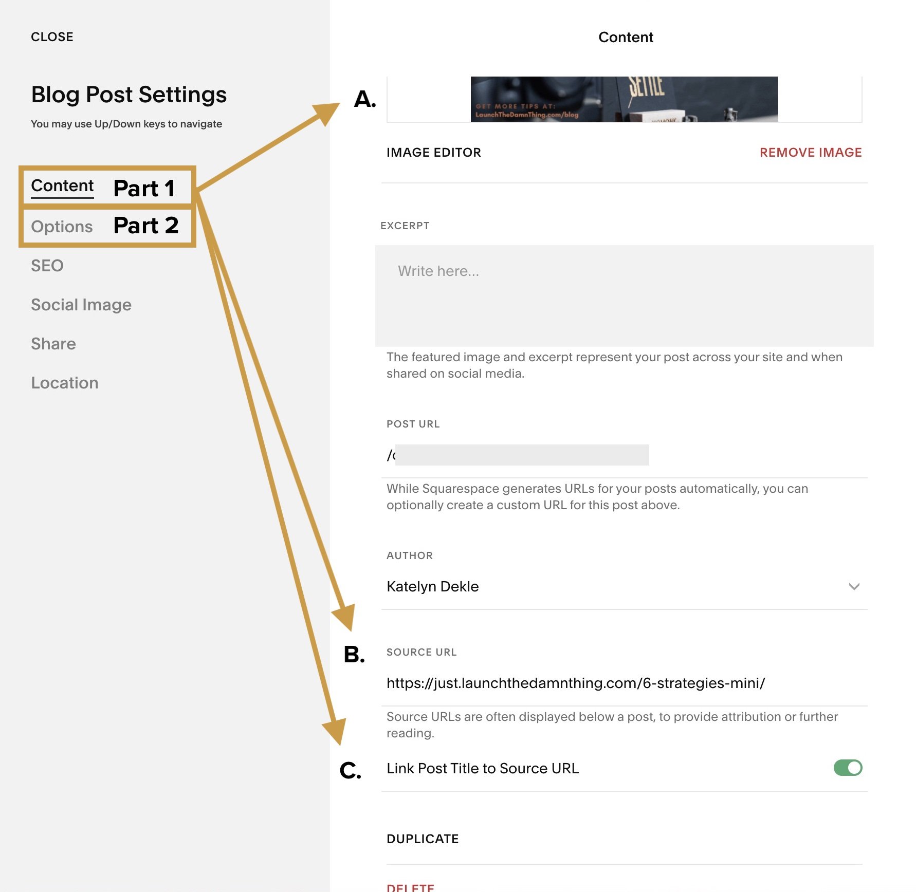
Thumbnail image: upload your ad graphic here; it can be a JPG or a GIF!
Source URL: paste in THE LINK that takes the visitor to wherever you want the image to link to, whether it’s your services page, an opt-in/subscribe form page, a checkout page, another blog post –whatever.
Link Post Title to Source URL: turn this toggle ON; this will allow the image to be linked to the Source URL, even when you don’t display the title in the Summary Block which shows this “ad”
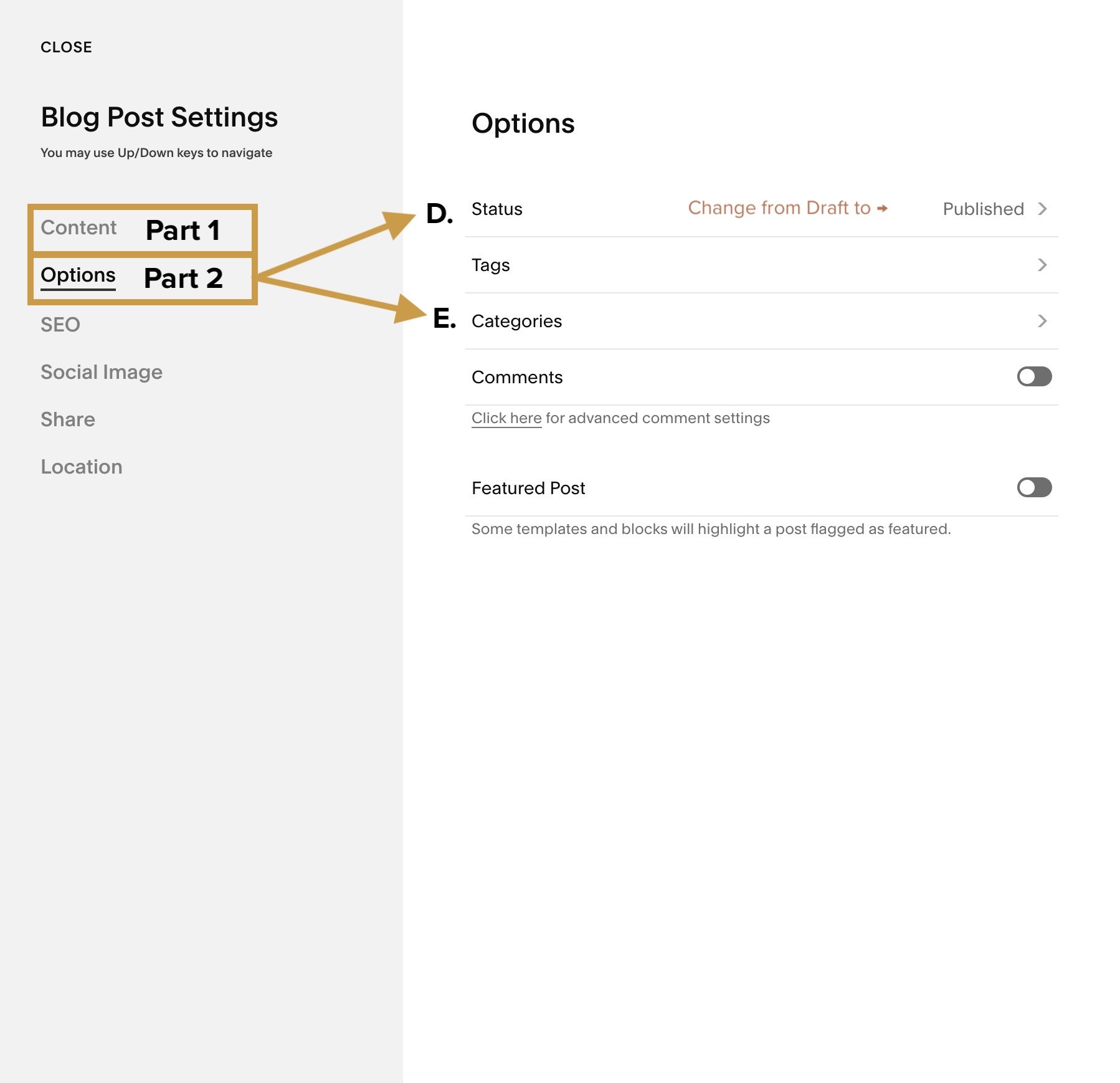
Under Options,
assign a generic Category to this “ad”
choose Publish
Save your changes & Publish!
Quick Pro tips:
The post’s URL slug doesn’t really matter because no one will be going to this “blog’s” page.
To make sure Google doesn’t show this collection page in search results, go to the main Opt-ins blog home page, click the ⚙️ for the page settings, then under SEO turn ON the toggle to hide that collection from search results.
The category you choose needs to be reflective of the TYPE of “ad” that opt-in will be, but not specific to the thing itself. For example:
“Affiliate 1” could be the category for 1 of 5+ different ads for any of the products or services you’re an affiliate for, but you don’t have to name the Category “Dubsado” (or whatever) because that could get tricky to swap out later if you ever stop being an affiliate for that thing.
Instead, you can SEE the ad for Dubsado in the Thumbnail image on “Affiliate 1’s” opt-in entry so you know that’s what it is. In the future, should you need to change out that ad graphic & use the “Affiliate 1” slot for something else, you can do that without having to rename the category; just upload a new graphic to that “blog entry"!”
ONE item per CATEGORY. that way when you filter a Summary Block (in the next step) to a category, it won’t pull multiple items into the block
INSTALLING the ads/Summary Blocks:
You’ve done the fun & relatively simple part! Next is the “fun” part, for those of you who already have an established blog. 😏
You have to go into every published blog post and add the Summary Block wherever you want any of your newly created ads to show up, BUT you only have to do it once if you’ve through the setup carefully.
This is where your Categorization comes in handy!
Step-by-step:
In the blog post, you add a Summary block (or blocks) to display the ad you want. It’s best if whatever the ad is, is actually relevant to the post’s content. So, for example I wouldn’t put an ad for my Creative Law Shop affiliate relationship in THIS post, because it’s not a related topic.
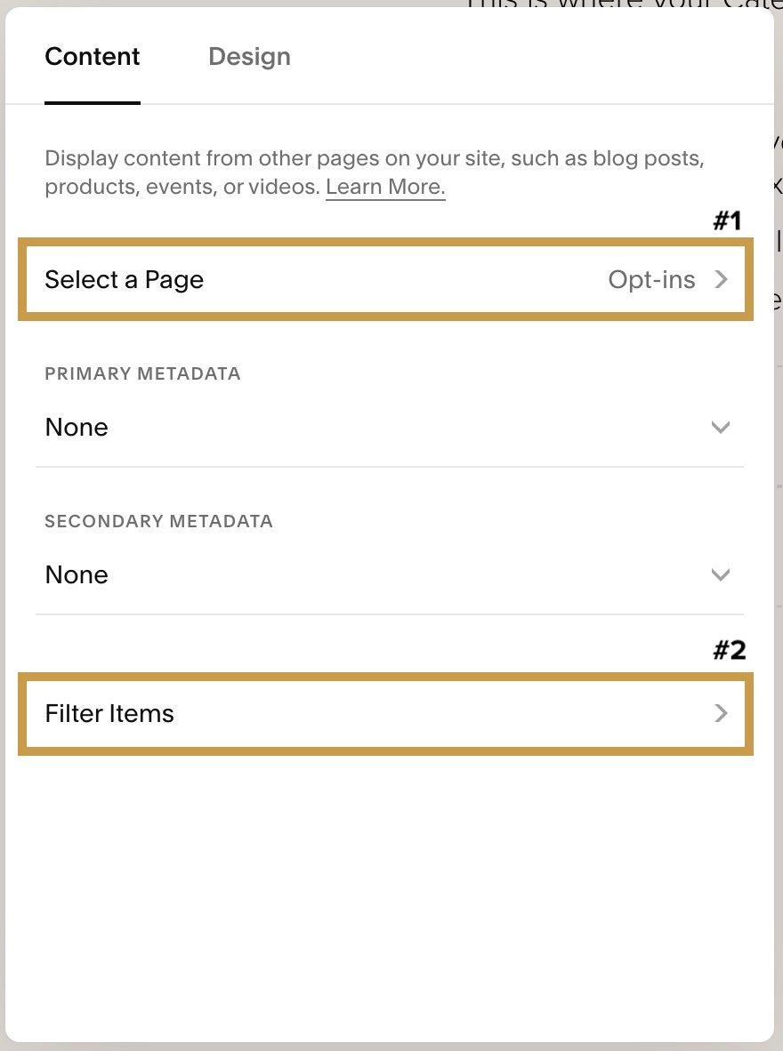
In the Summary Block settings, make the following changes:
Under Content,
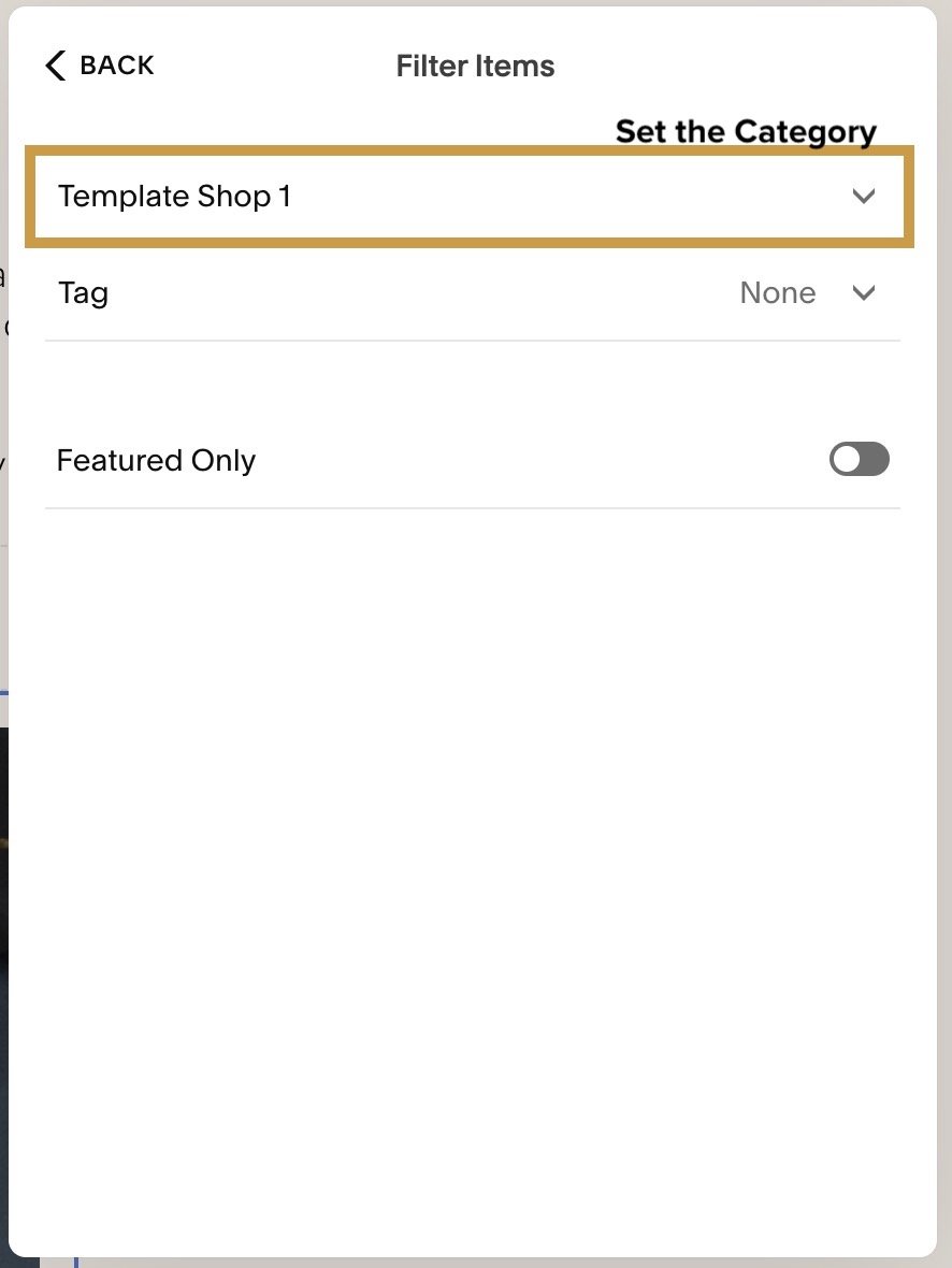
select your Opt-in collection page, that’s how it will look for the right data to pull into the Summary Block
next, under Filter, choose the Category you’re using for the opt-in you want to pull into this block
turn off (select “None”) from the Primary & Secondary Metadata dropdowns in this section, you won’t need those
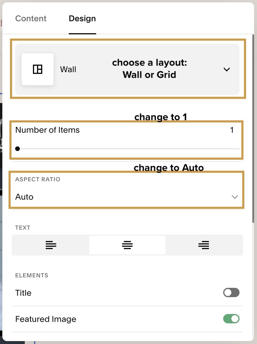
Under Design,
Select Wall or Grid for the layout
change the “Number of items” slider to 1
set the “Aspect Ratio” to Auto (no auto-cropping, as I assume you designed the graphics to be whatever size you wanted to show
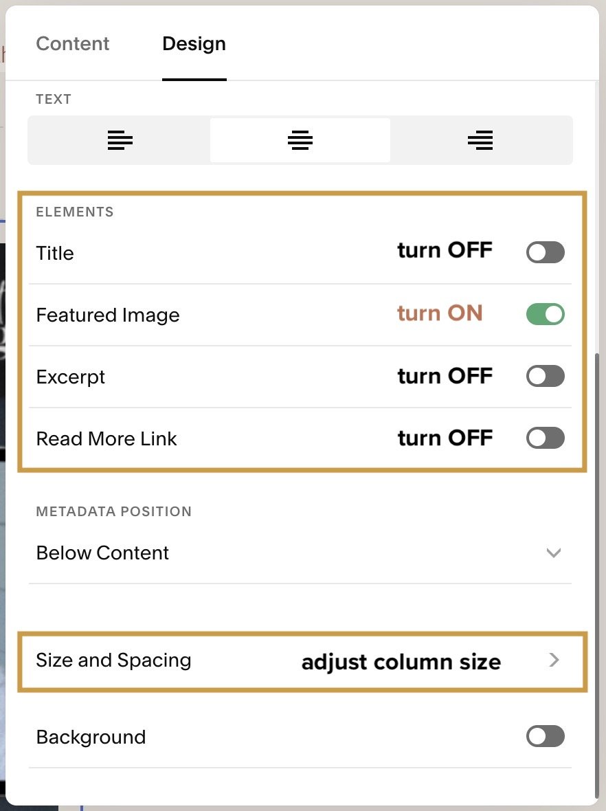
Turn OFF the following Element toggles: Title, Excerpt, and Read More link; only leave ON the Featured Image.
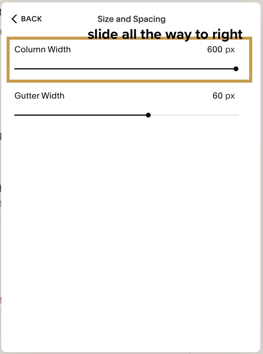
under Size & Spacing, change the column width slider to 600px (all the way to the right) so the column will be the full width of the block, no matter what size you make it
Save your changes!
Now go click on that thumbnail graphic to see if it goes to the Source URL you put in that “blog post.”
If it doesn’t, you missed a step in the settings somewhere so double-check those first.
If it does, then you’re all set! Repeat for every blog post you want to display an ad! 🤪 Have fun implementing!
Making Changes in the Future:
Next time you want to swap out the graphic for ALL the places you have an ad for your Dubsado affiliate relationship, –or whatever the ad is for– whether it’s just updating the wording in the ad or you’ve switched from Dubsado to Honeybook and want to update all of those ads across your entire blog… all you have to do is navigate to your Opt-ins blog collection, look for the post for Dubsado, change out the graphic inside the opt-in post, change the source link & save!
Now all the blogs with the Summary block displaying that Dubsado ad, will now display you’re Honeybook ad!
C-R-A-Z-Y. P-A-N-T-S. 🤣
But SO worth it!
Again, this could be a mini-course all by itself, so if I’ve confused you, make sure ya go check out Paige’s post detailing the hack with a video & see if that helps ya take it all in a bit better.
Psst! Want to see an example of a Summary Block “ad?” 👇🏻 Look below. 😉