

How to keep the mobile style menu on desktop

If you like a simple, clean & minimal landscape for your website’s navigation then today’s Squarespace tutorial will help you achieve that in just a few minutes, with NO code. That’s right! You can do this entirely in Squarespace’s settings.
I’ll also tell you some pros and cons for condensing the menu in this way, and let you decide for yourself whether this will work for your business website or not. Here goes!
In today’s tutorial I’ll specifically be using the Brine template family (version 7.0) in the video walkthrough at the bottom. You can achieve either look in most templates, but the Brine family is by far my favorite because it’s the most flexible.
To access the 7.0 templates for new Squarespace users, you must click here (not an aff link) to see those templates, because the new template page only lists 7.1 templates, unless you’re a Circle Member like me. 🙃
What I know of 7.1 so far, is that even though it’s gone public, it still seems QUITE “beta” like in my opinion, missing many of the features 7.0 templates currently & still have. Squarespace says they will continue working on & beefing up the 7.1 templates, but for now they don’t offer all of the same features that 7.0 templates offer, so be aware!
Here’s a breakdown of known feature differences between 7.0 & 7.1 as of mid Jan. 2020 (see chart; click to enlarge).
Hate reading? Skip ahead & go straight to the video!
How to create a minimal navigation menu for Desktop view in Squarespace
Now, as I mentioned, I think it’s fair to mention both sides of the arguments related to this topic before we get started. No use in making changes only to learn it isn’t a good fit.
PROS:
a clean, simplistic look
minimal design
creates a clear navigation area
looks the same on all devices (desktop, tablet, phone)
CONS:
adds an extra step to get to other pages
repetitive, redundant motion to navigate the website
prevents people from seeing what other pages are available, at a glance
could potentially keep people from moving through your site
especially if you don’t have many call-to-action buttons throughout your pages
Now that we’ve covered that, only you can decide which navigation method will work best for your design, your website & your business.
METHOD #1:
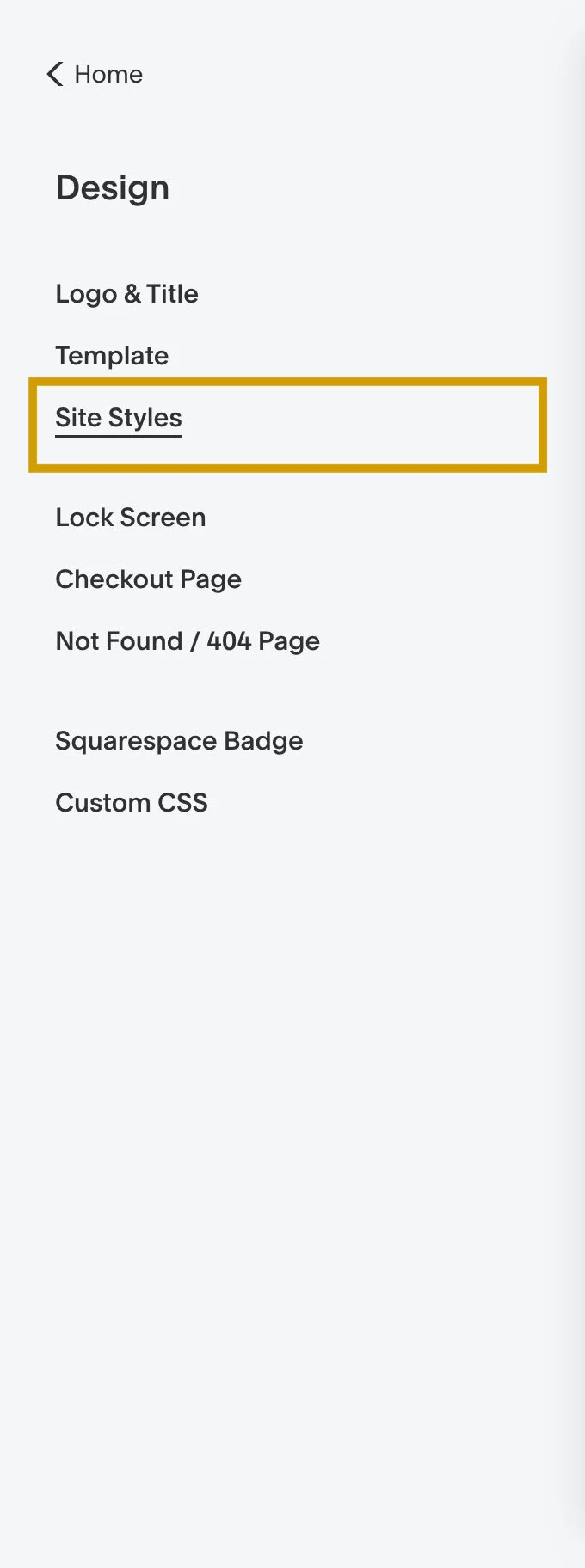
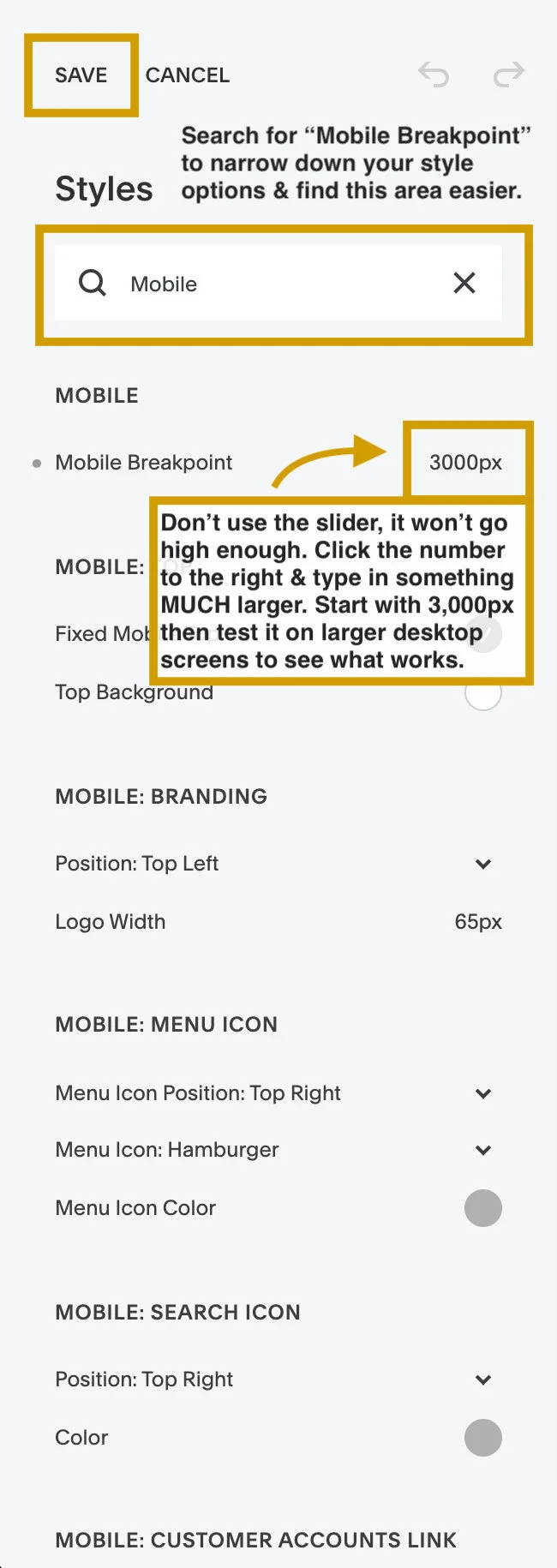
Change the Mobile Breakpoint in your Site Styles.
The mobile breakpoint, to help ya understand that language, just means the pixel width of the size screen in which you wish your desktop design to switch to mobile view. Mine is set to about 850px, so it switches over for smaller tablets & phones.
You may have found this feature, saw the slider, and assumed you could only go up to whatever the number was if you slid it all the way to the right, but you’d be wrong!
Thankfully, Squarespace gives us control over this by allowing you to click the number itself, to the immediate right of the slider, and type in any number you wish.
So to force the site to convert to mobile navigation on desktop, you just make that number much bigger. Start with something around 3,000 to 5,000 pixels (typed 3000px or 5000px –no comma, no space between the number & px abbreviation).
Check the preview & if it looks okay to you, click Save and you’re done!
📷 courtesy of GoLive HQ
METHOD #2:
Create a folder in your Primary Navigation to house all of your main navigation links.
This one will create a similar look as mobile by condensing everything into a dropdown menu, but it will differ on mobile & tablet view (since the site will still switch to those settings at whatever the mobile breakpoint is).
To do this you click the plus sign at the top of your pages menu, then select the “folder” icon. Give it a name, something like “Menu” will be what you’re aiming for. I’d suggest making this a very clear navigational term, instead of something unique like “Nav” or “Start Here.” Sadly not everyone will get that, and the last thing you want viewers to be on your site, is confused about how to move around within it.
Next you’ll drag & drop all your main navigation pages into that folder. Index pages won’t go inside folders, but you can create a new link to that index page and put that link inside the folder instead; it’ll work the same as putting the entire index in there.
Watch me set this up, and go over Method #1 at the top of this post, in this quick video walkthrough:
See? I told you. No code necessary for two easy ways to customize the main menu navigation in your Squarespace site.
Comment below with the link to your website so I can see your edits in action!