

How to start a new site on v7.1 + tips to build it fast

If you’re new to Squarespace there’s a lot to get acquainted with, even though the platform is very simple. While 7.1 is easier to design in, some of the styling is compartmentalized a bit too much and some things may be hard to find or understand.
If you’re not new around here, then you may know that with 7.0, you had to pick your template carefully depending on features you wanted & structure, –none of which is readily apparent from the template page where you choose. 🤦🏻♀️
Where do you you start?
Which one do you choose?
What happens after I pick one?
Am I stuck with it?
After you pick one, now what?
Let’s answer all of those questions, now!
How to pick a template on Squarespace 7.1
Where do you I start?
Which one do I choose?
Okay, are you ready? You may want to be sitting down for this:
It doesn’t matter which template you choose.
They all have the same features & functionality. That’s the up-side.
What happens after I pick one?
Am I stuck with it?
The down-side (if you can even call it that) is that you can’t switch to another template in 7.1 after you’ve chosen one, so yes you are “stuck” with it.
The reason is because, well, there’s no reason to have to switch again.
They all have exactly the same customizations, they all have access to the same set of features & all have the same structural base. If you choose one, you basically have access to them all!
If that’s true, then how do I pick?
I’d start with the one that gets ya closest to the end result.
If you know you want a button in the header, or social media links up there. Start with that.
If you know you want big banner images and lots of galleries, choose a template with those features to get ya started.
But remember to use the template as inspiration & don’t just start filling in your content to all the demo pages, or your site won’t be very unique.
Head over here to read more on How To Keep Your Squarespace Site From Looking Like Everyone Else’s.
How to design your 7.1 site, fast
The best tips I can give you are:
#1 Delete all the demo content, or move it all to the Not Linked section, which means all the links to those pages are moved out of your header completely. (If you move them, rather than delete them, make sure you delete them before you launch, just to clean up your page list.)
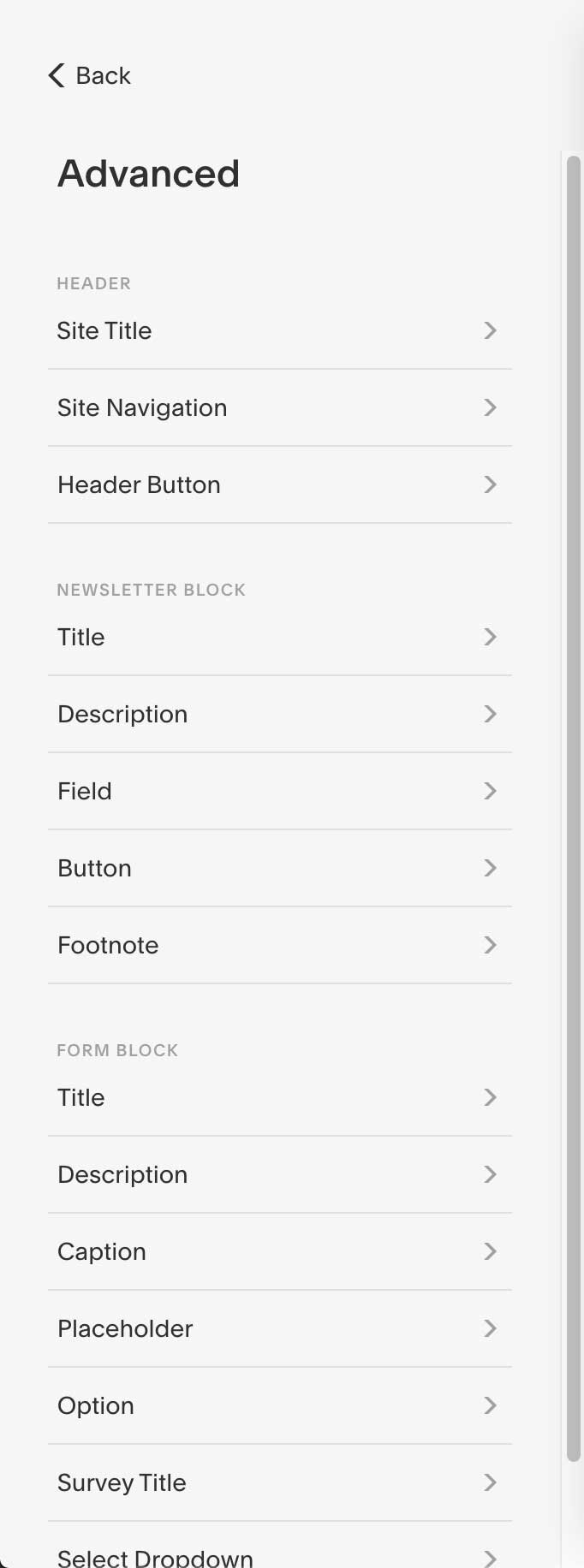
#2 Build a Template Style Guide page, and put all the blocks you think you’ll use on it!
Reason being, the Site Styles area doesn’t show you options for items that aren’t already on the page (in order to keep things simpler), which means if you don’t have a Newsletter block on the page you likely won’t see how to style it. Once that part is done, you can build your whole site, lightning quick!
BUILDING YOUR TEMPLATE STYLE GUIDE
Here’s an example of what I typically use to get a new site started (& yes, I build one every time):
Adding page content:
You can see in the example screenshot here that I’ve pasted the same filler text for each of the font styles: Heading 1-4 and Paragraph 1-3.
In case you want to use it yourself, that filler text is:
Heading 1 HEADING 1
Lorem ipsum dolor sit amet, consectetur adipiscing elit. Nulla ac nunc et ligula posuere porta eu nec elit. Aenean nibh augue, tristique eget nisl at, eleifend mollis massa. Donec imperdiet tortor enim, ac varius tellus ultrices sit amet.
The purpose for that is to simulate a real title (in Title Case, or UPPERCASE to see how it looks), and to simulate a small paragraph so you can see how your font choices will look & edit your line heights appropriately.
Too little space between lines of text in paragraph (aka, “line height”) & it’ll be hard to read; too much space & the lines inside the paragraph will look like separate sentences.
Paste the same filler text 7 times & change the number in the title for each to keep things organized for adjusting each in the settings later:
1x for Heading 1
1x for Heading 2
1x for Heading 3
1x for Heading 4
1x for Paragraph 1
1x for Paragraph 2
1x for Paragraph 3
Then add your buttons:
Small
Medium
Large
Then add your Image Blocks!
Image Block: Poster
Image Block: Card
Image Block: Overlap
Image Block: Collage
Image Block: Stack

Hover over the Image Block, then click the Pencil icon to get to the Settings inside that Block.
Make sure you add sample titles & subtitles to these. Also make sure the link is set to display in a button for each, since you’ll be able to style all of those pieces for each Image Block. The settings for that will be in the Image Block, under Edit (pencil icon), then the Design tab.

Click the Design tab to choose the layout style, then in the Image Link Dropdown, choose either On Image, or Button. If you choose Button, label the text for the button, then scroll down to choose or paste the linked page it will go to.
Then add anything else that you think you’ll be using on your website, from your Instagram feed (the Instagram Block), a Newsletter Block, a Form Block, a Summary Block (often used to show a summary of recent posts in a collection like a Blog, Events, or a Portfolio page).
Here in my example full page screenshot above, I have also added:
a Newsletter Block
a Form Block
a Summary Block
Now that everything is added, click the Done button in the upper left corner, then click Save.
Choosing Fonts:
Then head over to your main menu area and choose Design, while you’re still on the Template Style Guide page.
Click Fonts and choose a combo you like. If you want to customize it further, click the gear wheel ⚙️ icon on the font-pack card to change it up a little. Here’s what that looks like:


Choosing Colors:
Once you’ve done that, move down to the Colors area inside the Design Settings for your site.
This is where you might get a little confused, especially if you’re coming from v7.0, because Squarespace has quite a few color Section Themes settings now.
Before I explain that, here’s what that looks like in the menu:
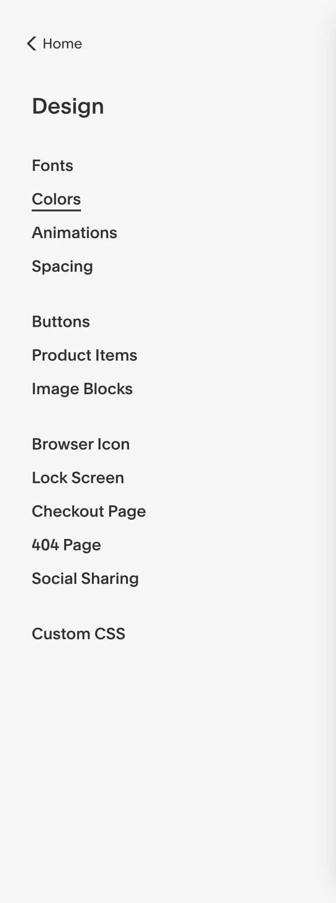


Each color Section Theme allows you to choose your own color settings for everything on the Template Style Guide page you just created & saved earlier.
One of those Section Themes in the list will be marked as default, which you can change by selecting a new one in the list.
(Color) Section Themes:
To edit the Section Theme itself, hover over the Theme you want to edit and click the Pencil icon. From there, scroll through the list of options & make your changes.
If you need or want specific color palettes to look at and specific Hex color codes to paste in, Coolors.co is a great free resource for that!
The key that makes choosing colors easy, is to not do this blindly!
#1 Go back to your Template Style Guide
(You may have to back out of the Design settings a little bit, otherwise clicking on anything in the preview area may just highlight the setting for it in the Color Settings panel you’re in).
#2 Click edit on the style guide page you made (top left corner on the preview side), then scroll down a bit until you’re looking at only the top of the page where the Headings start.
#3 Click the Pencil icon to bring up that page’s design settings menu, then select the Colors tab from that menu. It will likely be pre-selected on the default color Section Theme.
Default Section Themes that came with your original template will not necessarily match your brand’s color palette yet, unless you’ve already edited the Color Palette in the Color Settings area. You may only see: 2 white ones, 2 black ones, and 2 grey ones, the remaining being more basic options that fit the original template you started with.
#4 Choose a different color theme from the list, maybe the 3rd one from the top to start (or one that’s already different the default one), and wait a couple seconds. The page will change to accommodate the new Section Color settings.

#5 Click Done in the top left, then Save. And go back to your Color Settings in the left-hand panel.
In my example, I’ve changed my Template Style Guide page’s Section Theme to the Dark Bold Section Theme, and this is what happened to the page (shown first) after I chose it & adjusted all the settings inside the color Section Theme area (compared to the original white default, shown second).
Dark Bold, section theme
White Minimal, section theme
See the differences? You can’t miss them! Almost all the colors have swapped over to the new theme.
This new Section Theme’s color settings, once setup, allows you to change out everything on the page, with just a couple clicks.
1 thing to keep top of mind: the header area will always have the styling of the section at the top of the page. That means on the white default background, pieces the logo are ‘missing’ in my example above with the white background, because those pieces are also white. White won’t show up on a white background. 😉
Go through all the Section Theme color palettes & set the color settings for each one.
Or at least for 2-4 of them to get ya started. (I’m an 110% effort kinda gal, so I just did them all, but you don’t have to use all of them!)
To get started on this, I change the Section Theme color, of the Template Style Guide to something I haven’t edited the color settings for yet. Then I go to that Section Theme in the Color settings (Design < Color < Section Themes) to edit all of the elements on the page to fit the new color scheme for that Section Theme.
Then I save the changes, back out of the color settings panel a little bit so I can edit the Template Style Guide page again & change the theme to another one in the list.
Then I go back to the Section Themes settings and edit the color choices for that one. And so on.
READY, SET, BUILD!
Once you’ve completed this process for all the Section Themes in the list, you’re ready to start building out your site!
It may sound tedious to do it this way, but honestly: if you get this part out of the way first, methodically, then you will save yourself a lot of time, confusion & headaches later.
Trust me, it’s a lot more confusing to edit stuff like this, mid-website-build. Doing the bulk of it beforehand makes things much simpler.
That’s not to say you won’t have design setting tweaks to make as you go, but you won’t have nearly as many!
How do you use the Section Builder in v7.1?
Easier shown than said, so check out this quick video:
Picking Squarespace templates for 7.0
Let’s backtrack a tiny bit.
Picking a template on 7.0 was hard, prior to the introduction of the Brine family. You picked based on what you could see in the template shop, but often there was “more under the hood” that you couldn’t tell from the demo site, or worse, nothing to be discovered.
It was hard to tell which templates had the structure you wanted if you didn’t know what you were looking for.
Even worse, the setup for choosing a template was organized by category, which pushed people to only look in the category that fit their own business type, which was not mandatory. Any template will work for any business, IF it had the structure you needed.
That meant, if you’re a restaurant owner you weren’t limited to only the restaurant templates.
That confusion left a big decision for designers, because we’d have to know which templates did what & had which specific set of features. I had a big spreadsheet that mapped out what each one did, and I’d have to look for the features the client wanted & choose the template based on which one had the most of that list.
What a cumbersome, pain in the ass. Right?
So you can imagine our utter delight when the Brine family templates were released! Nearly 50 templates that ALL did the same thing. All offered the same features. All had the same underlying structure, –and just so happened to be the most customizable.
If you’re switching templates inside the 7.0 version, stay within or switch to the Brine family of templates. You’ll have the most amount of code-free customization capabilities there, and have access to all the best features of the entire 7.0 platform.
Don’t know which templates are in that family?
You can literally search ‘Brine Family’ in the 7.0 template area (doesn’t work in the new 7.1 template area, since Brine isn’t part of 7.1), or head over here to find out why Brine Is Still The Best 7.0 Template.
There’s a link there to get ya to the old templates for 7.0 in case ya need it, and it isn’t an affiliate link!
Don’t want to start from scratch?
Grab a badass, unique Squarespace Template in my shop!