3 tips for a smoother design process
What's inside this post: Hide

📌 Pin it!
These are my Top 3 Tips for a Smoother start to the Design Process (they also happen to be pet peeves, just because they tend to be such time-sucks).
These 3 points are essentially just tips to help the design process start moving along more smoothly. It will honestly SAVE each of you (designer + client) loads of TIME, if you both can avoid doing these three things when you start each project! Okay, here we go!
3 tips to make life easier for you & your designer
❶ Don't send your design ideas in a Microsoft document
I know, I know; Microsoft is everywhere and pretty much everyone has it. So why not? What’s so bad about using software that pretty much anyone has? There are 3 problems I find with this, no matter which format (.pptx, .pub, .docx, etc.):
missing fonts
formatting loss
photos/images
FONTS
Let’s talk about that first one for a minute. What about fonts? People are generally becoming more aware of trending font styles these days, and some people even know where to download new fonts on the interwebs.
Sometimes I get requests for a new font I’ve never heard of and end up tracking it down on a free download site. This is both good AND bad for designers like myself.
It’s good, because it means you’re paying attention and care about these kinds of details (me too!).
There are 5 reasons it can be a bad thing though.
you may not understand how font licenses work or how important they are
you may not realize the document formats you send me do not embed font styles
you may have the font but I may not, especially if you downloaded it yourself just to use inside that .doc
you may be choosing a font strictly for its aesthetic appeal to you & not your ideal customer type
you may not be choosing a font for its effectiveness or functionality
The top 2 things from that list I have to address here are: font license basics and embedded fonts. The rest of that list is either self-explanatory, or you'll probably understand after I explain these 2 things below (and if not, feel free to leave a comment with your questions!).
FONT LICENSES
As I briefly addressed in my last article, How To Choose & Pair Fonts Like A Pro, fonts have designers, just like basically everything else you use on a daily basis.
There are a few which are considered standard and come on most computers. The rest of them (and there are probably millions) can be downloaded for free or purchased on various websites.
These other additional fonts almost always have a license for different types of uses, which basically explains when you can/can’t legally use that font with/without a specific license from the designer (such as: commercial use vs. personal use only, etc.).
Some free fonts have designers that don’t care how the font is used, but most designers (or the type foundry they design for) do and that means some kind of license must be purchased with the font, depending on how the user intends to incorporate the font into a design, which typically makes the purchase more expensive.
An example: using a font like Helvetica Regular on your website. If you were to purchase a license to use that single web font, your license would likely depend on how many website visitors you receive on average. If you were to purchase the entire Helvetica font family for web it’d be a lot more expensive, because essentially you’d be licensing all 30+ fonts within that family, which includes weights like: Light, Ultralight, Semi-Bold, Bold, Italic, Extended (wide), and Condensed (narrow) versions.
EMBED A FONT
What does embed mean in this case? Basically, the font file info is included in the document (coded, so you can’t see it), so that no matter who opens it, that font will still be shown, even if the viewer does not own or have that font on their computer.
PRO TIP: most software programs do NOT embed fonts.
If you have a specific font you want to use, send the font file (.ttf or .otf) to your designer, with the licensing information you received with the download or purchase.
Why does it matter if the font is embedded or not? Let’s say your computer has a set list of 50 fonts that came on it, or that you've added to it. The problem is that your computer & my computer have vastly differing lists.
Because Microsoft programs don't embed the font file information into the document for the computer to read, it means I have to have the same font (or set of fonts) on my computer, in order for me to see the same formatting on my end, as you see on yours. If I don’t have the font, any text using that font will revert to whatever is default on my computer, which is usually a sans-serif style like Myriad Pro, Helvetica or Arial.
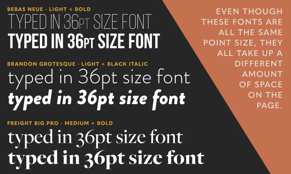
Every font style is different and takes up a unique amount of space per letter, even in the same font family (see the example below). Changing it abruptly, because of a missing font, can really effect the formatting inside the document (i.e. the length of the paragraphs, spacing between letters, etc.).
FORMATTING ISSUES
That led me perfectly into the next issue, which is formatting. Embedded fonts doesn’t sound like a big deal to you? It’s definitely not a huge deal, but a missing font in a document like that can throw off the entire formatting of whatever you’ve set up, and I may not even realize that you were using a different font than what I’m seeing.
With the example above, you can see how formatting can quickly get totally out of whack, just by a simple unintended font change. All 3 of those examples are typed in the same 36pt size, but as the font changes so does the space that the text takes up on the page.
Any hard work you put into setting up a certain layout (placing text on top of a photo, etc.), could change easily from computer to computer, just because of missing fonts.
I’m sure you (Gen Z and Millennials) dealt with this exact problem when you worked on a computer document at home for homework, and brought it in for the presentation, only to find that everything looked wrong, just because a font was substituted. You may have even attempted to fix it, only to find that computer didn’t have the font you wanted.
PHOTOS / IMAGERY
Inserting an image into a document is not the best way to send that image to a designer. I am going to need the original file by itself, whenever possible. That means the original jpeg, png, or whatever format it originally was.
PRO TIP: A Good Rule of Thumb for resolution questions
If you zoom in on the image until it’s about the final size it will need to be (whether printed or digital) on screen, and it’s pixelated or distorted in any way, it will be for me too.
You can’t take a low res image and make it high res.
(For more on that PRO TIP, read 6 Common Design Terms Explained)
Grabbing an image from a Microsoft document isn’t ever ideal and often makes it hard for me to actually pull the image out of the document. Unlike fonts, images can be embedded in Microsoft Office programs like Word, but they aren't meant to be placed in and then taken out and placed elsewhere. They're not meant to be used like a file folder.
If designers have trouble getting the file out, why not just leave it in that file & do the design in that program?
No, –and I say that as kindly as possible! 🙂 Professional designers, like myself, have industry standard programs that can do things well beyond Microsoft Office’s wildest dreams, and it would not be beneficial for either party involved, to do the design in a document like that even in Publisher. Ultimately it will save us both time, and probably headache(s), to use the industry-standard design programs I know well and trust with this kind of work.
❷ Don't send your actual design in Microsoft document
Don't be tempted to do this; just let me handle it for you. It's one thing to set up a basic idea in a document like this, and send it just to get the idea across (but again, formatting & font issues!). It's quite another to do a "final" design in a program like Word, and expect the printing company to be able to use that file (unless of course, they're just printing it straight to a copy machine/all-in-one printer, and essentially just making a bunch of copies).
Whether we are talking about sending this Microsoft file to printers (people with that skillset), a designer or whoever, at best they will print out your design and use it as a reference to redesign your design. At worst they may have to charge you a setup fee to redo your design, because they can't use the file you sent to print from, among the other reasons I’ve also addressed in this article.
If the design is redone, it wastes everyone’s time (including yours, while you wait) and we all know how valuable our time is! If there is a setup fee involved in redoing the design, then it also wastes your money.
Microsoft's software is not design-industry standard and they don't have the editing capabilities, nor do they retain the formatting as well between recipients, as I mentioned earlier.
Microsoft’s print windows don’t have enough print options either. That means controlling specifics (like dot gain, frequency, angle, spot colors vs process colors, registration or crop marks, etc.) that printers may need to control for a good print, which is not available in Microsoft’s print window options.
❸ Read emails in full
I naturally zero in on details like this and tend to (personally) agonize over what I’m saying in an email, or read someone else’s email a few times to make sure I’ve gotten all the details down that you meant for me to have.
I’ll gladly take an hour if need be, to write an email in a way that you will understand, especially if it involves any kind of design terminology. I try to explain things thoroughly and include necessary details, and will read and re-read, and read again before I hit send. That’s just me, and I totally get that you probably aren’t like that. In fact, I’d guess that most people aren’t! 😉
QUESTIONS
When i send an email with a list of numbered or bulleted questions, and the recipient only answers the first one or maybe just the first part of a two-part question, it wastes both our time.
I will never ask questions I don’t need the answers to. I wouldn’t waste your time purposefully doing so, or mine.
I know you’re busy. Hell, we all are. But because I still need the answers I asked for, now I have to awkwardly ask you again, and asking again wastes time. That’s not good for anyone, and frankly, it feels a bit disrespectful of MY time because you’ve ignored me, whether on purpose or not.
DETAILS
I know some emails can be on the lengthy side. I get it; who has time to read all of that anyway? Just know that any details I include in an email are either important for you to know, or helpful to know in that circumstance, so you understand as much as possible about whatever we’re discussing–especially if we aren’t able to discuss this over video or phone.
Professionals, like myself, have experience with these things. Anything I ask of you is only to save us both the time, money & hassle! 🙂
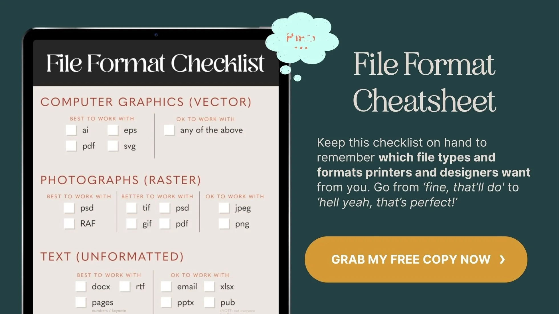
Was that too much information to retain at once? If so, grab your FREE File Format Checklist for file submissions to graphic designers, like myself!